4 Prediction 1: Regression
Let’s step back for a moment and ask: Why are we doing Data Science?
When we apply data science to a given applied problem, we are typically trying to do one of three things:
Explanation. These are mostly “why” questions, and usually involve the causal inference lessons we discussed earlier. Sometimes, we are trying to understand why a particular event occurred (“What caused the Second World War?”, “what \(X\)s caused \(Y\)?); sometimes, we are trying to understand how a particular (causal) factor changes outcomes (”What happens to your heart health if you follow the Keto diet?“,”how does \(Y\) depend on \(X\)?“). An example above was Snow trying to understand why some people contracted cholera.
Policy evaluation. Here, the problem involves some causal reasoning, but is narrower in terms of what we are investigating and trying to conclude. In policy evaluation we are studying the effects of a given intervention, which could be a government action, or some change that a firm made to a product, or even some norm shift in the public. We focus particularly on whether a policy “worked” or not, and in what ways it was successful. We don’t necessarily try to explain why it worked (or did not). An example above might be the various government acts to clean up the water supply in 19th Century London. There was a change in policy, and we want to understand what its effects were—potentially, but not necessarily, because we are contemplating rolling out the policy to other places.
Prediction. In prediction, we are not necessarily interested in causality at all—at least not directly. Instead, we want to understand the relationship—causal or not—between some \(X\) and some \(Y\). The goal now is to forecast, often with careful attention to uncertainty, what will happen in the future. The “future” here could be in a few minutes (e.g. predicting the outcome of some soccer match), or a few days (e.g. the weather), or many years (e.g. demographic dependency ratios). Importantly, we may not be able to explain exactly why \(X\) effects \(Y\) in the way it does, and by extension we may not be able to suggest policy interventions based on our work. But we can, nonetheless, be good at estimating what will happen.
It perhaps goes without saying that prediction is important for much of our daily lives. The gamut runs from fairly trivial things like suggesting movies a Netflix user is likely to enjoy, to very serious things like inferring what treatment someone will need depending on what drug they have taken. In any case, it is a core part of data science—especially “machine learning”—so we will spend some time on it here.
4.1 Predicting Heights
A very early example of a prediction problem is Francis Galton’s attempts to understand the relationship between parent’s heights and the heights their children would grow to as adults. For clarity note that Galton was interested in heredity and promoted troubling ideas on eugenics. His particular concern was the notion that societies might become more mediocre (“regress to the mean”) over time without direct material incentives to avoid this. To be abundantly clear: while his methods are influential, we strongly reject his ideas about eugenics.
Galton’s theory was that the mid-parent height (essentially the mean of the mother’s and father’s height with an adjustment for the sex of the child) should be a excellent predictor of the child’s height. In particular, he assumed that the latter would be exactly proportional to the former. In other words: taller parents would have taller children, and every inch of extra parent height would add an extra inch to the child’s height.
Curiously, this is not what he found. Let’s load his data, and take a look.
galton <- read.csv("data/galton_data.csv")
plot(galton$mid_parent, galton$child, xlab = "mid parent height",
     ylab="child height", xlim=c(62,74), ylim=c(62,74), pch=16,
     col="darkblue", cex=1.2)
grid()
abline(0, 1, col="red", lwd=2)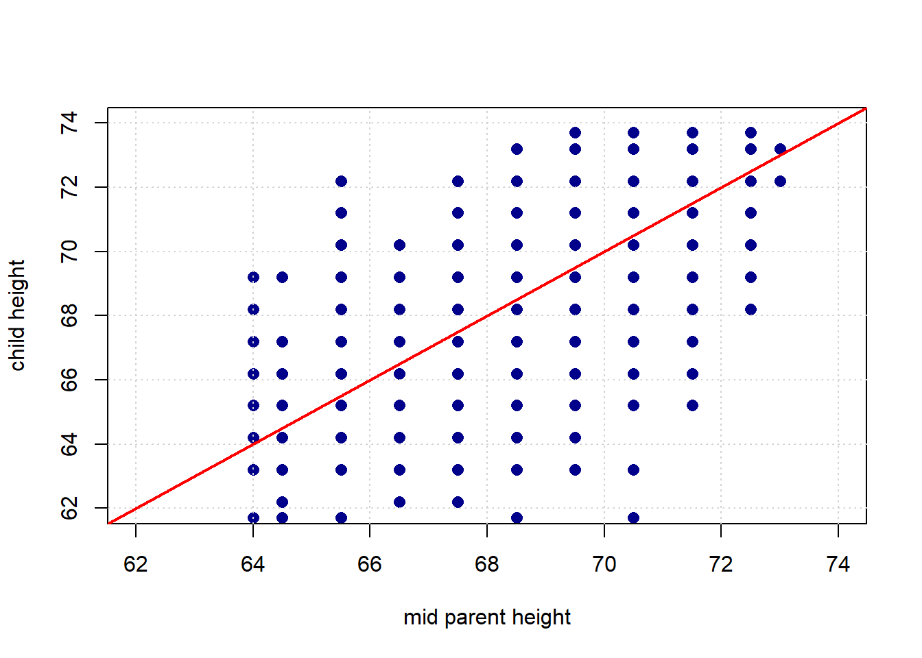
The red line is what Galton expected to see: it has a slope of 1.
Given his expectations, what is surprising about the plot? Take a look at the same figure, but this time with two highlighted areas: one in green, one in purple.
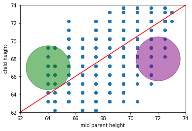
What’s “odd” (from Galton’s perspective) about observations in those areas? * in the green part, we have children who are (much) taller than their parent’s heights would predict (if Galton was right) * in the purple part, we have children who are (much) shorter than their parent’s heights would predict (if Galton was right)
We will return to these ideas below in more detail, but on this version of the plot we include the actual (linear) best fit line through the data in blue. Notice that it has a shallower slope than in the case of Galton’s predicted relationship.
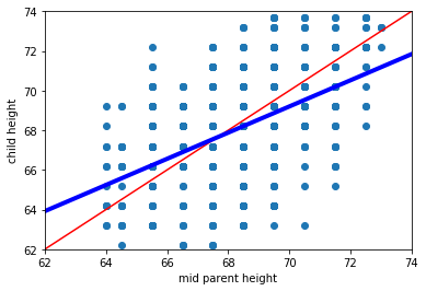
This makes sense insofar as, while we still expect taller parents to have taller children, it isn’t as strong a relationship as Galton hypothesized.
4.2 Linear association: correlation
Let’s take another look at the original Galton data, and ask about the association between the variables.
Intuitively, this is a question about two things:
- how tightly packed the points are around a single best fit line and
- the nature of the relationship between the variables: is it positive? negative? or nothing at all?
Here, the relationship is positive, in the sense that as one variable “goes up” the other “goes up”. But obviously there are some exceptions along the way: that is, there some observations with, say, bigger values of \(X\) but smaller values of \(Y\). It also is not especially tightly packed—there are some observations that are not on the same line (from bottom left to top right) as others.
It is not hard to find other variables with different apparent associations. Let’s load up the states data—which has information on many variables from the US states—and take a look.
We will start with the degree to which the state has gun restrictions (gun_scale11, higher is more restrictions) with the proportion of state residents who hold pro_life views. Is this positive? negative? How linear is it?
plot(states_data$gun_scale11, states_data$prolife,
     pch=21, bg="darkblue", col="black", cex=1.5,
     xlab="gun scale", ylab="pro-life")
grid()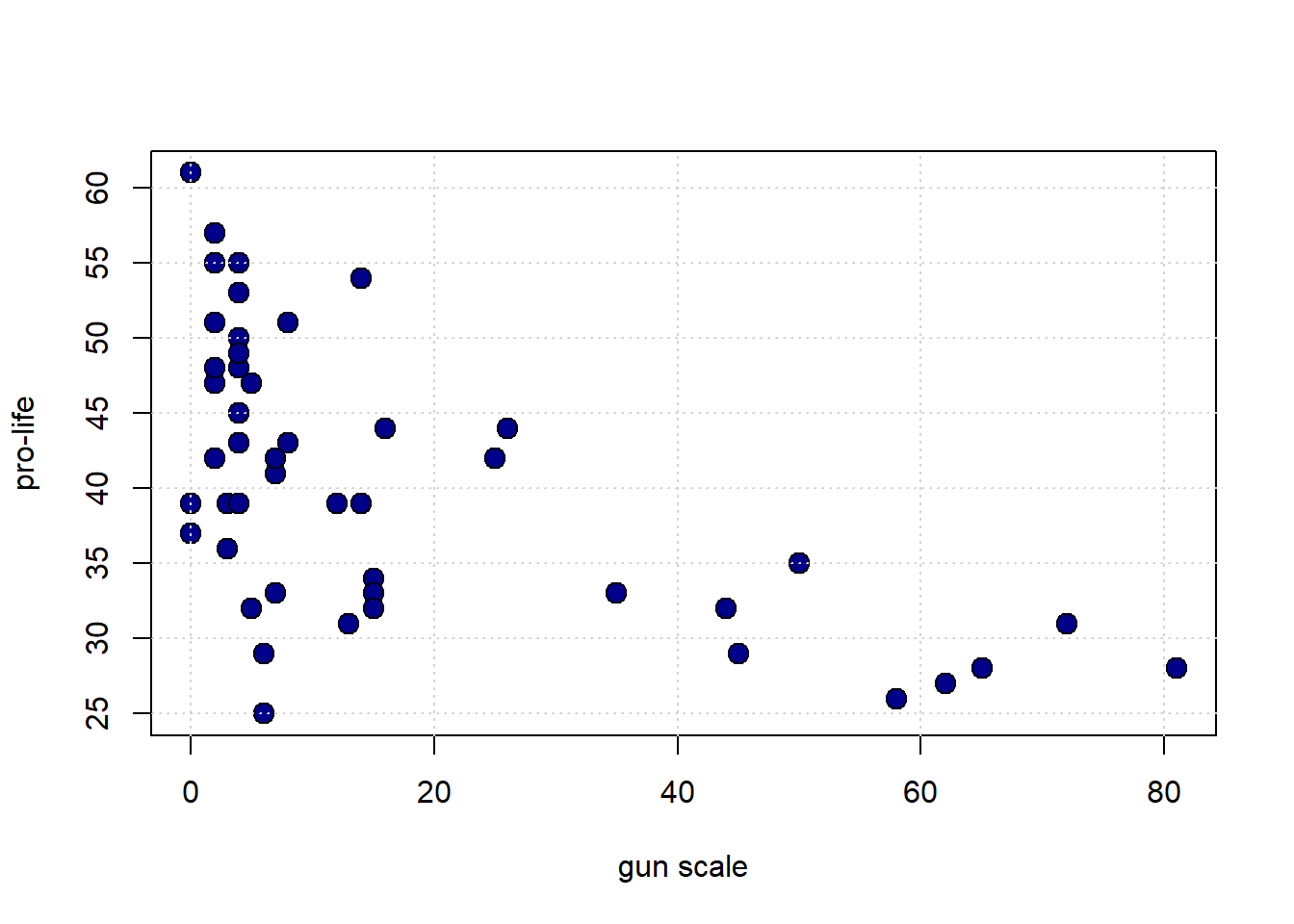
What about the proportion who are pro-choice versus the proportion who voted for Obama in 2012?
plot(states_data$prochoice, states_data$obama2012,
     pch=21, bg="darkblue", col="black", cex=1.5,
     xlab="prochoice", ylab="obama2012")
grid()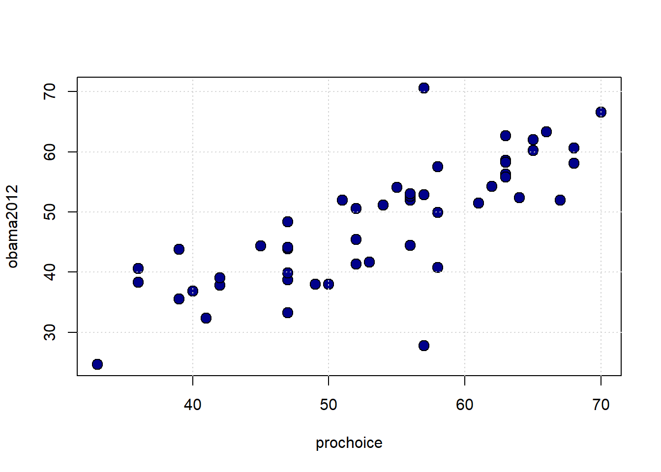
Finally, what about the size of the population of the state and the unemployment rate of the state?
plot(states_data$pop2010, states_data$unemploy,
     pch=21, bg="darkblue", col="black", cex=1.5,
     xlab="population", ylab="unemployment")
grid()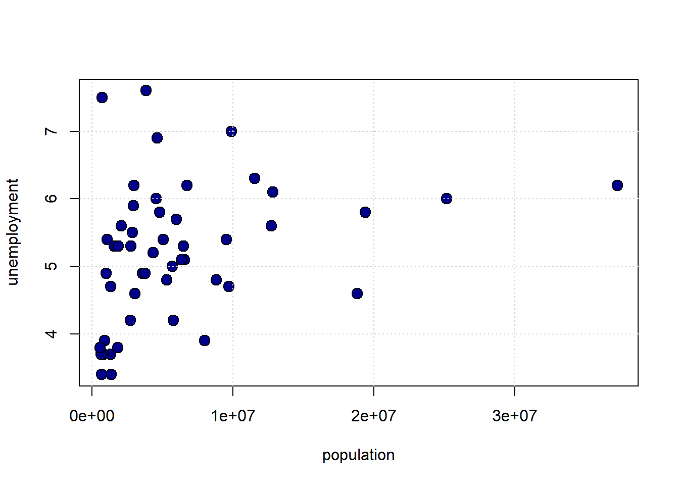
4.2.1 Linear Association
To get a sense of the association—that is, the direction and strength—of the relationship between the variables above, we didn’t need to look at their units. For example, the pro-Choice/Obama relationship looks more positive and stronger than the population/unemployment one, and we don’t need to know how these things were measured to say that.
This leads to two important observations:
- if the specific units don’t matter for interpretation, then we can presumably present everything in some sort of standard units
- and if we do that, and all the relationships are measured the same way, then we can very easily compare across scatterplots.
4.2.1.1 Standard Units
The idea of putting variables into standard units is not new to us. Recall when defined the \(Z\)-Score of an observation as
the value of the observation minus the mean of the distribution, divided by the standard deviation of the distribution.
That is:
\[ Z= \frac{X-\mu}{\sigma} \]
where:
- \(X\) is the value of the observation (the specific height, or weight, or income or whatever)
- \(\mu\) is the value of the mean of the normal distribution from which it is drawn
- \(\sigma\) is the value of the standard deviation of the normal distribution from which it is drawn
Subtracting the mean, and dividing by the standard deviation is a straightforward operation. Let’s do it for the pro-Choice/Obama figure. We begin by writing a simple function to do the standardizing:
Next, we will convert the variables of interest, and then plot them:
obamastd <- standard_units(states_data$obama2012)
prochoicestd <- standard_units(states_data$prochoice)
plot(prochoicestd, obamastd,
pch=21, bg="darkblue", col="black", cex=1.5,
xlab="prochoice (std units)", ylab="obama2012 (std units)",
xlim=c(-3, 3), ylim=c(-3, 3))
abline(h=0, col="red")
abline(v=0, col="red")
grid()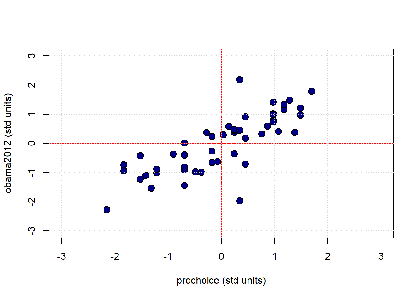
The red vertical and horizontal lines mark the means of the standardized variables (which are now zero). Once standardized like this, we can see that for this mostly positive association, the observations in the top left and bottom right quadrants are ‘unusual’ as regards the trend. That is, they do not ‘help’ the general positive relationship; they weaken it, in some sense. This is logical insofar as they represent states with “low” pro-Choice values but “high” Obama votes (top left) or “high” pro-Choice values but “low” Obama votes (bottom right).
4.2.2 Measuring the Association: Correlation Coefficient
Plots are helpful, but we would like something more precise. We would like a measure of association. Intuitively, that measure will answer the question
how well does a straight line fit the relationship between these variables?
This will be informative about the two elements we have already discussed: * the direction of the relationship (positive, negative, zero) * the strength of the relationship (from very strong, to weak, to zero)
In particular, we will use the Correlation Coefficient. This is often denoted as \(r\), and the correlation between variables \(x\) and \(y\) is sometimes written as \(r_{xy}\).
To the extent that it is helpful, here is the mathematical definition of the (sample) correlation coefficient between \(x\) and \(y\):
\[ r_{xy}=\frac{1}{n-1}\sum^{n}_{i=1}\left(\frac{x_i-\bar{x}}{s_x}\right)\left(\frac{y_i-\bar{y}}{s_y}\right) \]
This may look complicated, but is actually very simple, and we have met all the elements before:
- \(\frac{x_i-\bar{x}}{s_x}\) is the \(Z\)-score for each value of the \(x\) variable. Literally, it is just the value of that observation on that variable, minus the mean of the variable, all divided out by the standard deviation of \(x\) (which here we are writing as \(s_x\))
- \(\frac{y_i-\bar{y}}{y_x}\) is the \(Z\)-score for each value of the \(y\) variable.
- \(\sum^{n}_{i=1}\left(\frac{x_i-\bar{x}}{s_x}\right)\left(\frac{y_i-\bar{y}}{s_y}\right)\) part is telling us to multiply the \(Z\)-score for the observations’ \(x\) variable values by the \(Z\)-scores for the observation’s \(y\) variable values and then just add those products up
- finally, \(\frac{1}{n-1}\) tells us to divide that number by the sample size minus one.
4.2.2.1 Properties and features
The correlation coefficient
measures the linear association between the variables
It takes value between \(-1\) and \(1\). These end points correspond are
- a perfect negative correlation if \(r=-1\)
- a perfect positive correlation if \(r= 1\)
If \(r=0\) we say the correlation is zero, or that there is no correlation, or that the variables are orthogonal.
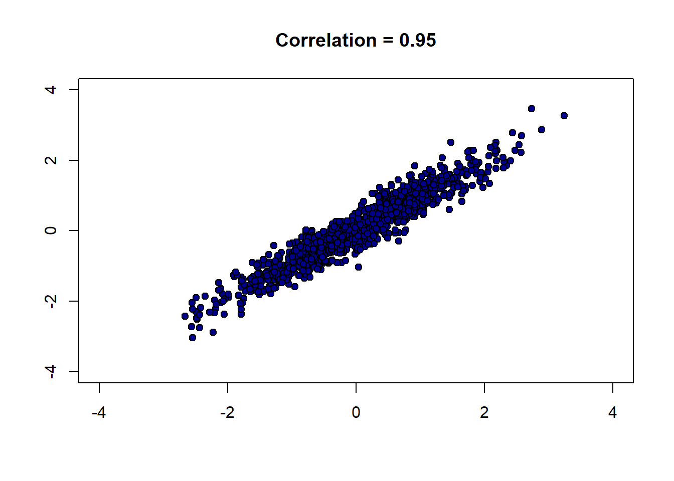
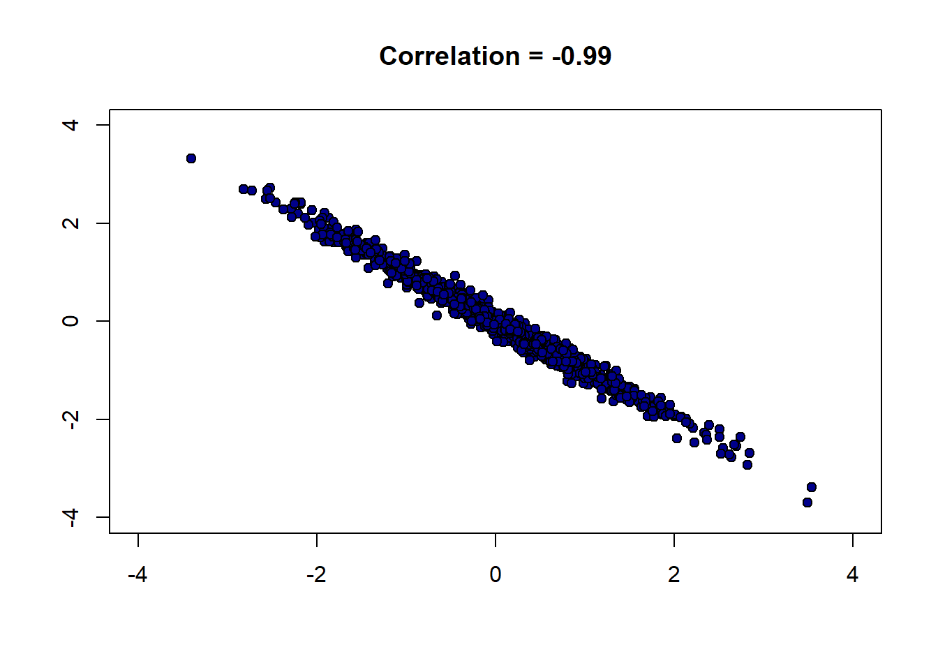
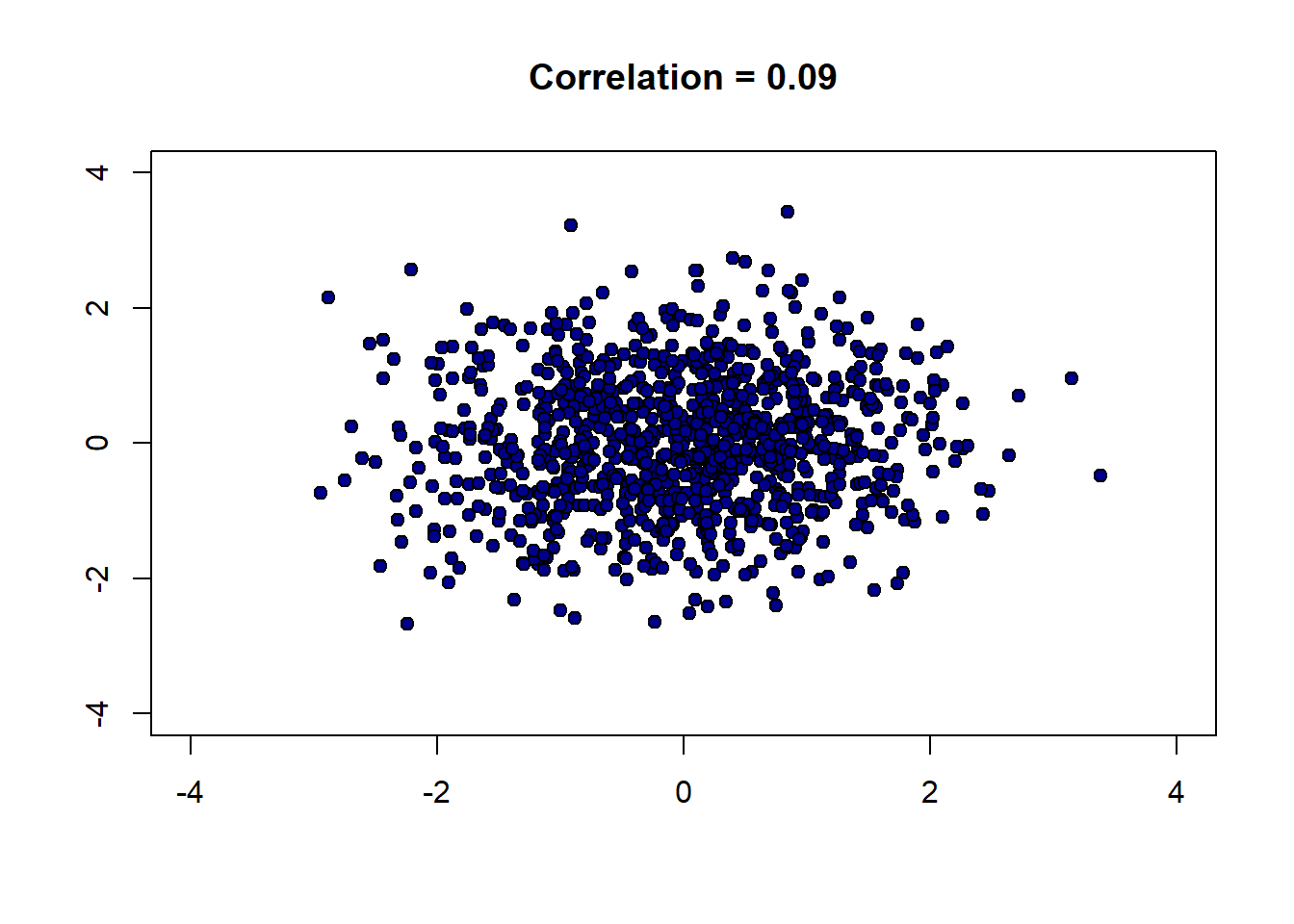
To get a feel for how different correlations “look”, we can write a function to generate \(x\) and \(y\) variables that have a specific correlation, and then plot them. Here it is:
r_scatter <- function(r) {
# Generate x and z from standard normal
x <- rnorm(1000, mean = 0, sd = 1)
z <- rnorm(1000, mean = 0, sd = 1)
# Construct y with the specified correlation
y <- r * x + sqrt(1 - r^2) * z
# Plot
plot(x, y,
pch = 21, bg = "darkblue", col = "black",
xlim = c(-4, 4), ylim = c(-4, 4),
main = paste("Correlation =", r),
xlab = "", ylab = "")
}Let’s start out with a strong, positive correlation like \(+0.95\):
And now a strong negative correlation:
Finally, a weak correlation that is close to zero:
There are several important features of correlation to be aware of:
4.2.2.1.1 1. It is unitless.
Unlike the standard deviation or the original variable, correlation has no units. This makes sense given it involves standardizing the variables that go into the calculation.
4.2.2.1.2 2. A linear rescaling of the variables has no effect on correlation.
That is, if we multiply/divide and/or add/subtract a number from one or both variables, it will not affect the correlation. To give an example, suppose we measure the temperatures in Fahrenheit for Boston and NYC, every day for a year. We find these temperatures to have a correlation of 0.58. Now suppose we convert the NYC temperatures to centigrade. This means we take our current temperatures (\(x\)) and do the following transformation:
\[ (x - 32) \times \frac{5}{9} \]
But this involves subtracting a constant number (32) and multiplying by a constant number (\(\frac{5}{9}\)) and is a linear transformation. So the correlation will not change. Indeed, we could transform the Boston temperatures too, and still the correlation will stay at 0.58.
This only works for linear transformations. If we use a non-linear transformation (like the logarithm) the correlation may change.
4.2.2.1.3 3. The correlation of a variable with itself is 1
The correlation of \(x\) with \(x\) (or \(y\) with \(y\)) is one. It doesn’t matter what the underlying values are.
4.2.2.1.4 4. Correlation is symmetric
The correlation of \(y\) with \(x\) is the same as the correlation of \(x\) with \(y\).
We can demonstrate these properties with some simple code. First, we will define a correlation function:
correlation <- function(t, x, y) {
one_over_n_minus1 <- 1/(length(t[[x]]) - 1)
x_part <- standard_units(t[[x]])
y_part <- standard_units(t[[y]])
cor_out <- one_over_n_minus1*sum(x_part*y_part)
cor_out
}This is identical to our definition above. First, we will show that correlations are symmetric:
## [1] 0.7903092## [1] 0.7903092These are identical, as expected. Next, we can show that the correlation of a variable with itself is one :
## [1] 14.2.3 Calculating Correlation in R
Given how useful correlation is, there are built-in functions that calculate it. Most simply, you can use cor:
## [1] 0.7903092You can also call it on a subset of the data directly, to obtain the correlation matrix:
## obama2012 prochoice
## obama2012 1.0000000 0.7903092
## prochoice 0.7903092 1.0000000The diagonal elements here (from top left to bottom right) are ones: this reminds us that the correlation of a variable with itself is 1. Meanwhile, the off-diagonal elements are the (symmetric) correlation of the one variable with the other one.
4.2.4 Correlation, Causation, Prediction
As correlation is a measure of (linear) association. And in our earlier chapters we established that association does not imply causation. We may therefore conclude that correlation does not imply causation. It is, of course, easy to find correlated variables that are not causally related: for example, our earlier classic case of ice cream consumption versus drowning.
What about prediction? Well, in the ice cream versus drowning case, we can imagine that even though correlation does tell us directly about causation, it might help us predict. For example, if we know that ice cream consumption is high (and nothing else) that tells us to expect more drowning deaths. There are several cases like this. For instance, knowing your neighbors’ first names is a good predictor of whether you will turn out to vote at the next election (relative to not knowing their names). This doesn’t seem likely to be causal: telling you your neighbors’ names seems unlikely to get you to vote if you were not already intending to. But it may still be a good predictor. Similarly, having yellow stained fingers is a good predictor of poor lung health—but it isn’t causal per se. That is, painting someone’s fingers yellow won’t make their lungs worse.
The general point here, and an important one for data science, is that we may be able to predict something well while not really understanding the causal mechanism behind it.
A final, natural question at this point is to reverse the inquiry above: we know that correlation does not imply causation, but does causation imply correlation? That is, if \(X\) causes \(Y\), can be guarantee that \(Y\) will be correlated with \(X\) (i.e. the correlation will not be zero). The answer is “no”, but it is somewhat subtle.
For one thing, depending on how our data arrives and is selected, correlations can be zero even if there is a strong underlying causal relationship. For example, it turns out that basketball ability and height are correlated in the population. But this is not true in the National Basketball Association (the pro-league): or at least, tall players are not paid more. This is due to a phenomenon called conditioning on a collider, which we will cover later.
The main idea here is that NBA players are selected in a way that their other skills exactly offset their height disadvantage: for example, a player who is shorter, is in a team for some non-height related reason. Maybe they are more athletic, more skilled, better at leading. When looking at the league as a whole, this reduces the correlation between height and salary to zero.
Another way that variables may have causal relationships with each other but no (or low) correlations is because the relationship is non-linear.
4.2.4.1 Correlation and non-linear relationships
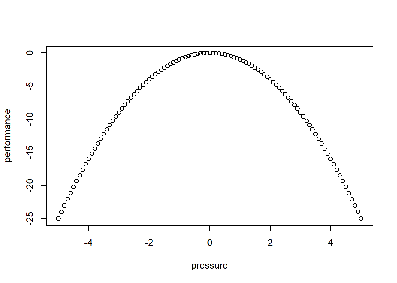
Consider the following figure of (an archetypal) proposed relationship between pressure (“arousal”) and performance.
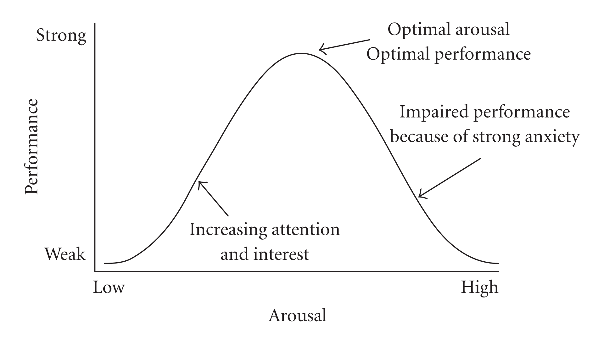
The original work that produced the theory behind this plot is due to Yerkes and Dodson (1908). The basic idea is that as pressure increases on a subject, they perform at a higher capacity – perhaps athletically or in an exam. But when the pressure becomes too much, they start to become anxious and perform less well.
Suppose the theory holds exactly as stated, and the curve is symmetric as pictured. What is the correlation between pressure and performance? It is zero. This is because correlation measures linear associations, and this is certainly not linear (a straight line cannot capture it). Yet there is surely a causal relationship here.
We can see this for ourselves by generating some outcome that is simply the predictor variable squared: \(y=-x^2\):
The correlation is (approximately) zero:
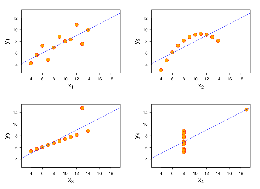
## [1] 0A final comment here is that a particular correlation value is consistent with many different types of relationships. The figure shows “Anscombe’s quartet”. Each subfigure is from one of four different data sets. The correlation in each data set between \(x\) and \(y\) is 0.816. Yet the nature of the relationship varies considerably!
4.3 Being careful with correlation
We have already seen that correlation can be deceptive: for example, it measures linear association, yet many relationships of interest are non-linear. Here we look at two further problems you should be aware of.
4.3.1 Outliers
Outliers are
observations that are very far from others in the data. They are extreme insofar as they are typically the maximum or minimum of the data in some dimension.
They can cause problems for all statistical analysis, and correlation is no different. To get a sense of this, consider the following data taken from the Death Penalty Information Center. We will be interested in the number of executions per state since 1976. For many states this number is zero, and we will not consider them below. We want to understand the relationship between the number of executions (historically), and the number of people currently sentenced to death in these states. Note that the “states” here includes the US Federal Government, which also executes people.
Let’s plot the points, and record the correlation.
plot(dr_data$death_row_current, dr_data$total_exec_post76,
pch=21, bg="lightblue", col="black", xlab="Number of people on death row",
ylab="Executions (post 1976)")
grid()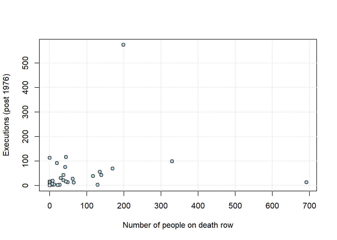
## death_row_current
## death_row_current 1.0000000
## total_exec_post76 0.2218978
## total_exec_post76
## death_row_current 0.2218978
## total_exec_post76 1.0000000As we might expect, states that have more people on death row (a rough proxy for the death penalty, perhaps) have generally executed more people historically. The correlation is positive, and around \(0.22\). But there is an outlier: Texas. We show it in red below.
texas <- dr_data[dr_data$state == "Texas", ]
plot(dr_data$death_row_current, dr_data$total_exec_post76,
pch=21, bg="lightblue", col="black", xlab="Number of people on death row",
ylab="Executions (post 1976)")
points(texas$death_row_current, texas$total_exec_post76,
col="red", pch=19, cex=2)
grid()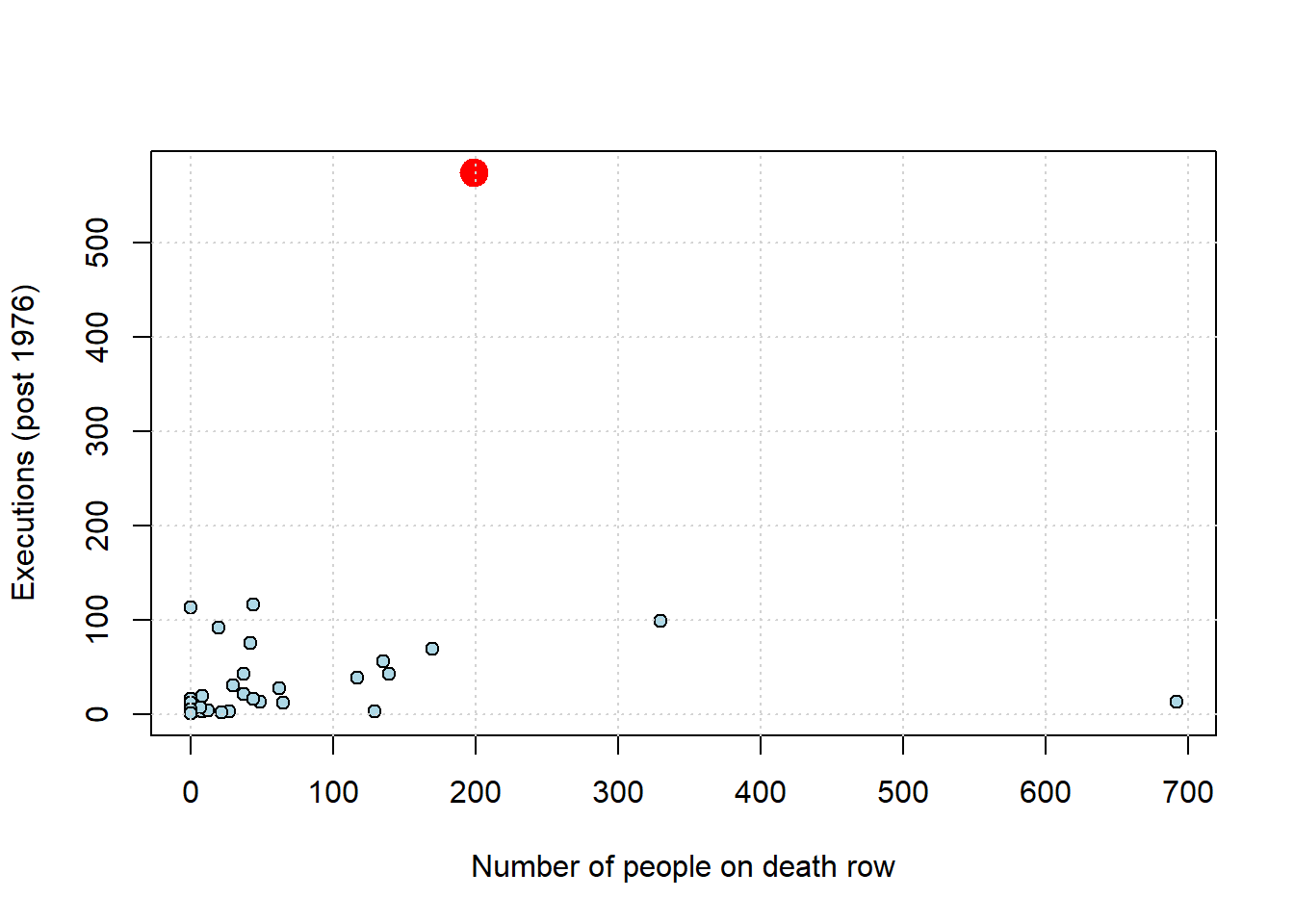
What happens to the correlation if we remove Texas from the data?
no_tex <- subset(dr_data, state != "Texas")
no_tex_check <- no_tex[, c("death_row_current", "total_exec_post76")]
cor(no_tex_check)## death_row_current
## death_row_current 1.0000000
## total_exec_post76 0.1742691
## total_exec_post76
## death_row_current 0.1742691
## total_exec_post76 1.0000000The answer is that it drops, considerably (down to \(\sim 0.17\)). So, not quite zero, but not far off it. Exactly what one should do about outliers is not a resolved issue in data science. On the one hand, they may be part of the data (as here), so should perhaps just be left in. On the other, perhaps they are “misleading” in some sense and should be removed. For now, just note that outliers can make associations look larger (or smaller) and more general than they “really” are.
4.3.2 Ecological Fallacy
To motivate the problem here, consider this map from Wikipedia of the 2020 US Presidential election.
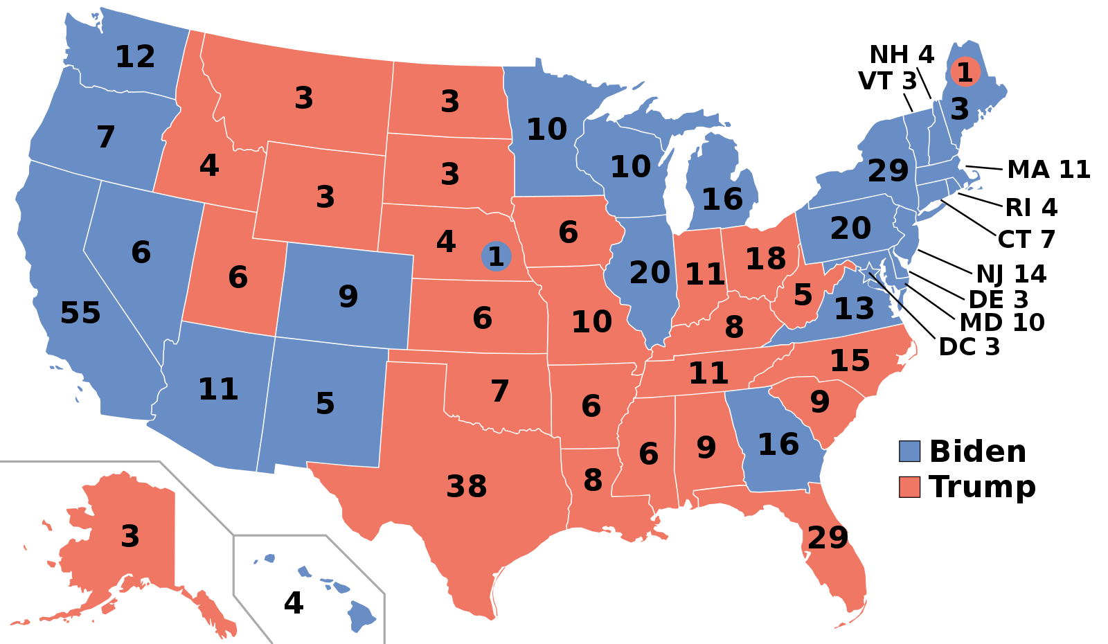
Let’s look particularly at the states won by Biden, the Democratic candidate. He typically did well on the coasts: California, Oregon, Washington and then New York, Pennsylvania and New England. Meanwhile, Trump, the Republican candidate, did well in the South, and the middle of the country. Very roughly, the Democrats won the richest states (by income per capita), whereas the Republicans won the poorest states.
At the state level, it is the case that income per capita is correlated positively with Democratic share of the vote. Suppose now then, we are told about a very poor person living Alabama, a relatively poor state and one that Trump won with over 60% of the vote. Would we expect them to vote Republican for sure – as in, with a high degree of certainty? The answer to this is generally no: poor people tend to vote Democrat. In fact, around 50% of voters from households making less than $30,000 a year identify as Democrats, while only about 27% identify as Republicans.
In short, we have a potential inference problem: a correlation about states leads to erroneous conclusions about correlations about people who live in those states.
This logical error is very general and is known as (committing the) Ecological Fallacy. It says that, generally speaking,
you cannot use correlations based on aggregates to draw conclusions about the individual units that make up those aggregates.
4.4 Correlation, prediction and linear functions
At least in the case of linear relationships, correlation is useful for measuring association. But it is not so useful for prediction. In particular, prediction usually requires two things:
- a predicted value of the outcome (\(Y\)) for a given value of the inputs (the \(X\)s). For example, we would like to know what product from our website someone is likely to buy (\(Y\)) who is, say, age 35 (\(X_1\)), of moderate income (\(X_2\)), in good health (\(X_3\)), with two children (\(X_4\)) etc.
- some notion of the “effect” on the outcome of a change to the inputs. For example, we would like to know what will happen to inflation (\(Y\)) if, say, unemployment rises by 1% (\(X\)).
We will now explore a very basic predictor, the linear model, that does both. To motivate this model, we will consider a public health example of the relationship between cigarette tax levels (tax in dollars on a pack of 20 cigarettes, cig_tax12) and the proportion of a state’s population that smokes (smoking). Let’s load the data and take a look at the relevant variables:
states_data <- read.csv("data/states_data.csv")
plot(states_data$cig_tax12, states_data$smokers12,
pch=21, bg="darkblue", col="black", cex=1.5,
xlab="cigarette tax", ylab="smoking")
grid()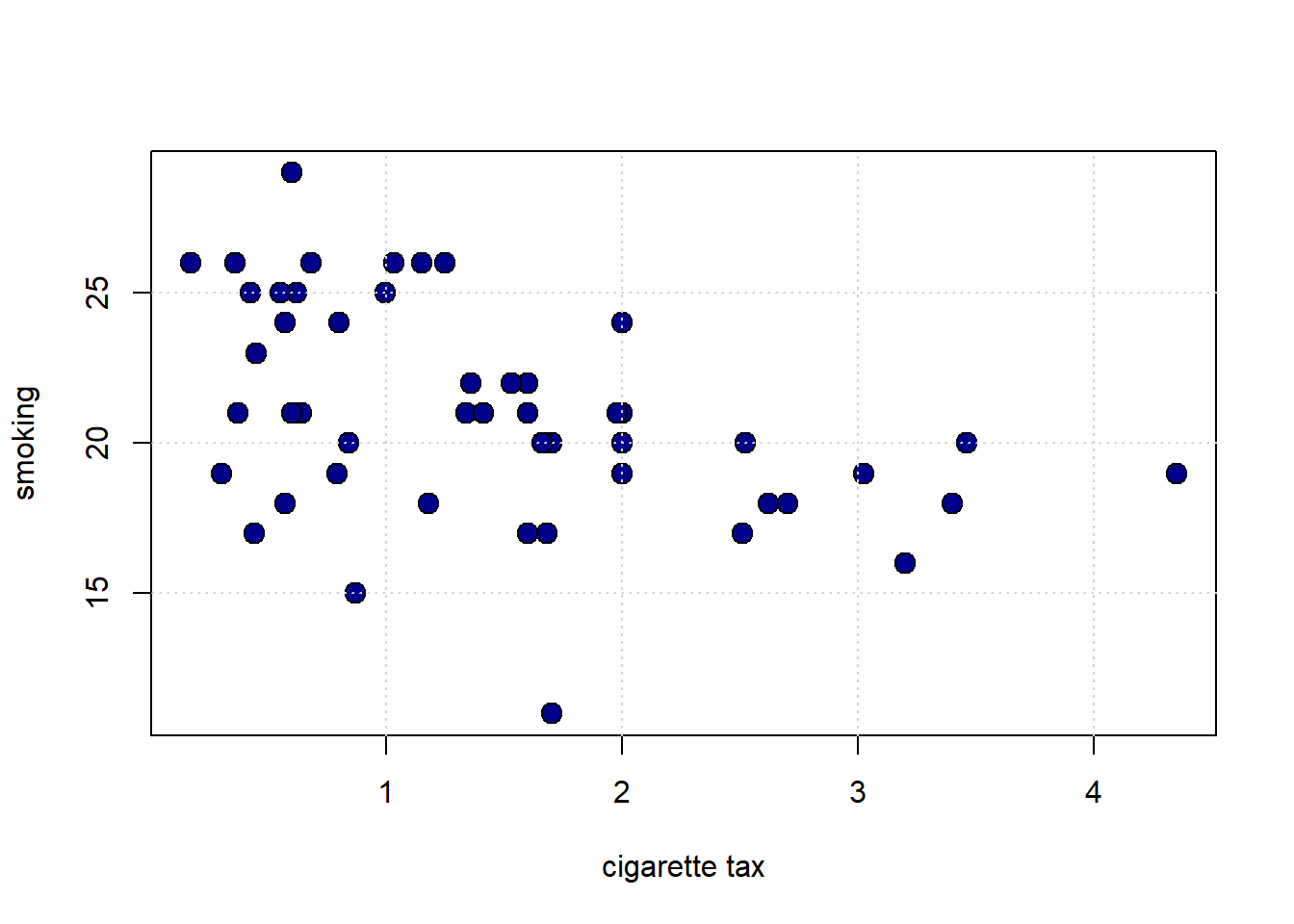
The plot suggests the relationship between \(X\) and \(Y\) is negative: when taxes are high, smoking is low (at the state level). This belief is confirmed by the correlation:
## cig_tax12 smokers12
## cig_tax12 1.0000000 -0.4315039
## smokers12 -0.4315039 1.00000004.4.1 Proposing a Linear Relationship
What is the nature of the relationship between \(X\) and \(Y\)? It is not completely linear, but for now, we will assume it is. Indeed, a straight line of “best fit” from top left to bottom right would not seem wildly inappropriate here. That is, a straight line would do a seemingly decent (but not perfect!) job of describing how these variables are related to each other.
We can formalize this idea by asserting that \(Y\) depends on \(X\) in the following way:
\[ Y=\underbrace{a}_{\mbox{intercept}}+ (\underbrace{b}_{\mbox{slope}}\times X) \]
or
\[ Y=a + bX \]
We will call
- \(a\) the “intercept” (or the “constant”). It is the value that \(Y\) takes when \(X\) is zero.
- \(b\) the “slope”. It is the effect of a one unit change in \(X\) on \(Y\).
This equation is equivalent to saying that \(Y\) is a linear function of \(X\). Specifically here, the percentage of people in a state that smoke is a linear function of the tax on cigarettes in that state.
Notice: this is an assertion or an assumption: we have not “proved” the relationship is linear; we are saying that a linear relationship seems a reasonable approximation for the truth. We will see what that linear assumption would imply about the way that \(X\) affects \(Y\), and what our estimates (our predictions) of \(Y\) would be. In this way, we will move beyond what correlation, alone, can do.
So, if you give me a value for \(a\) and \(b\), I will return to you a particular straight line that gives us what we want. The question is: where do we get the values for \(a\) and \(b\)?
4.4.2 Recap: Linear Functions
Suppose that you are told two facts:
- when \(x=1\), \(y=6\)
- when \(x=2\), \(y=8\)
What is the relationship between \(x\) and \(y\)? Let’s plot it:

What is the intercept? We can get a sense of that by drawing a line through both points, and seeing where it crosses the \(y\) axis:
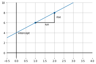
It looks like \(y\) is 4 when \(x\) is zero. So the intercept is 4.
What is the slope of this function? Well, it is \(\frac{\mbox{rise}}{\mbox{run}}\); taken between the points, this is shown by the lines in black. In particular: \(\frac{2}{1}\) because we move along 1 unit on the \(x\) axis, and go up \(2\) on the \(y\)-axis. So that’s 2.
To recap, we have:
\[ y = a + bx \]
which is:
\[ y = \mbox{intercept} + \mbox{slope} \times x \]
In our example, this is:
\[ 6 = \mbox{4} + (\mbox{2} \times 1) \]
and
\[ 8 = \mbox{4} + (\mbox{2} \times 2) \]
Obviously, this was not real data: these were just some numbers as an example. But the general idea will now be the same: we will fit the “best” straight line to the data and thereby learn a value for \(a\) and \(b\).
4.4.3 Modeling the mean of \(Y\)
In our math example above, \(y\) took one value for a given value of \(x\). But in the real world, that won’t generally be the case: for example, people of the same height (\(x\)) might vary somewhat in terms of their weights (\(y\)). And states with the same tax rate (\(x\)) might vary somewhat in terms of their smoking percentage (\(y\)).
So we have to make a decision as to what exactly about \(y\) we will try to model as a linear function of \(x\). Here “to model as” means, basically, “simplify the relationship as.”
And for now, our interest will be in the average (that is, the mean) value that \(y\) takes for a specific value of \(x\). And it is this average that we will make a linear function of \(x\). This is sometimes written as:
\[ \mathbb{E}(Y|X) = a + bX \]
Here, \(\mathbb{E}\) is called the “expectations operator” and it is telling us to take the “average of \(Y\), given \(X\)”. That means, essentially, the “average of \(Y\), taking into account how \(X\) varies in the data”. And the particular way we will do that “taking into account” is by making the average a linear function of \(X\) via \(a\) and \(b\).
It is worth noting what this assumption rules out. For example, it will rule out non-linear functions where, say, a change of one unit in \(X\) at some points in the data has a different effect (on \(Y\)) relative to a change of one unit in \(X\) at some other point in the data.
To see this, take a look at the next code snippet. It draws \(y\) as a linear function of \(x\) in blue. And it draws \(y\) as a non-linear function of \(x\) in red (in particular, this is called a log function). Notice that the slope of the linear function is constant—it doesn’t matter where you calculate the rise over the run: it is always the same. This is not true of the non-linear function: for example, the increase in \(y\) as \(x\) goes from 1 to 20 is much larger than the increase in \(y\) as \(x\) goes from 40 to 60.
xnon <- seq(1, 100, length.out = 50)
ynon <- log(xnon)
# Plot log curve
plot(xnon, ynon, type = "l", col = "red",
xlab = "x", ylab = "y", xlim = c(0, 100), ylim = c(0, 5))
grid()
# Add straight line from (1,0) to (100,4.6)
lines(c(1, 100), c(0, 4.6), col = "blue")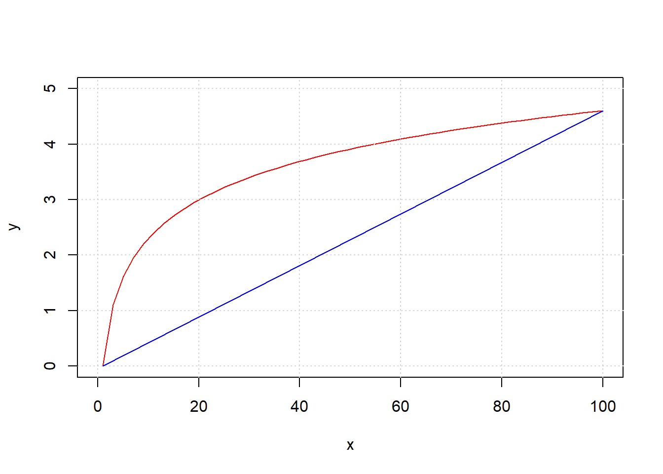
4.5 Linear regression: fitting and interpreting”
We call the fitting of the straight line function through our data, such that we obtain \(a\) and \(b\) in the way we mentioned above, a linear regression. In fact, we will occasionally use it as a verb and talk of regressing \(Y\) on \(X\).
The origin of the “linear” part of the name is perhaps obvious, but the “regression” part may be more mysterious. Ultimately, it comes from Galton’s work on heights that we mentioned above: he called the best fitting linear function the “regression” line, and the name has stuck. You will also sometimes hear data scientists talking of fitting a “linear model” to the data, and this typically means the same thing.
To return to our state public health example, let’s redraw our scatterplot, this time using the state’s abbreviations for each observation:
states_data <- read.csv("data/states_data.csv")
plot(states_data$cig_tax12, states_data$smokers12,
type="n", xlim=c(0, 5), ylim=c(5, 35),
xlab="tax", ylab="smoking")
grid()
text(states_data$cig_tax12, states_data$smokers12,
labels=states_data$stateid, col="gray", cex=0.8)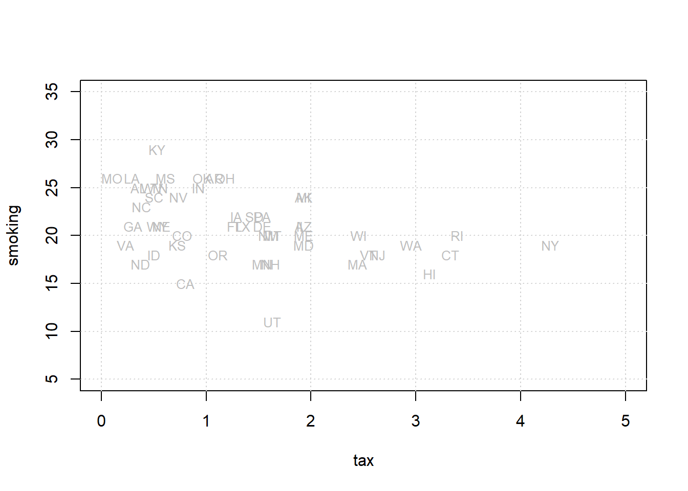
We will return to how this is calculated momentarily, but let us also add the “best fitting” line to this figure.
xx <- c(0, 5)
yy <- c(23.39, 23.39 + (-1.59 * 5))
plot(states_data$cig_tax12, states_data$smokers12,
type="n", xlim=c(0, 5), ylim=c(5, 35),
xlab="tax", ylab="smoking")
grid()
text(states_data$cig_tax12, states_data$smokers12,
labels=states_data$stateid, col="gray", cex=0.8)
lines(xx, yy, col="purple", lwd=4)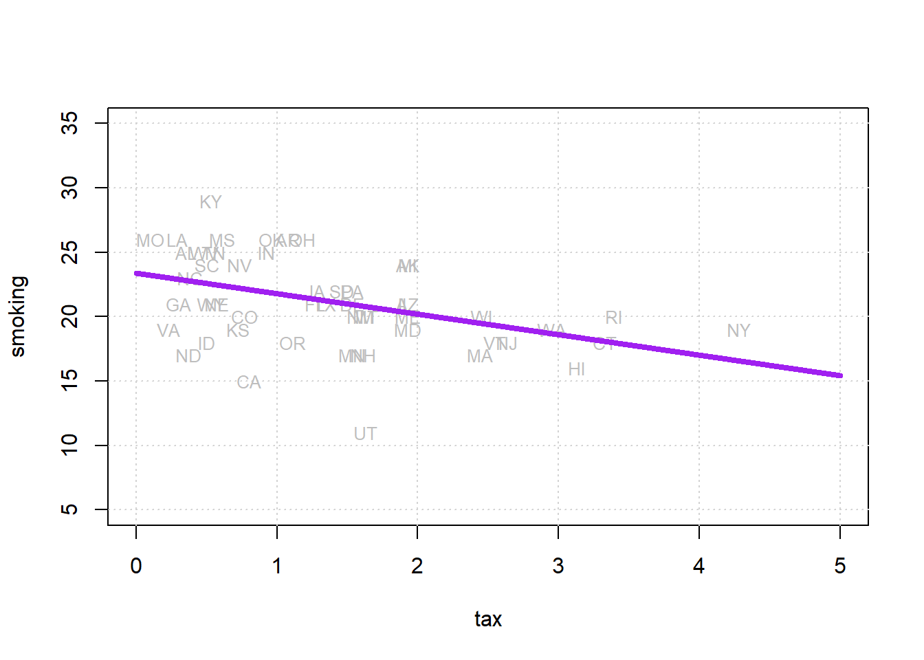
Where the line crosses the \(y\) axis is the intercept, \(a\). And the slope of the line, which is constant throughout its length, is the value of \(b\). The equation for this line is \(Y=a+bX\).
If you have \(a\) and \(b\), you can draw the line just by plugging in the various values of \(X\) to get a value for \(Y\); if you can draw the line (that is, you the relevant \(Y\) value for every \(X\) value), you have \(a\) and \(b\).
4.5.1 Fitting the line
There are a large number of different, but equivalent, ways to fit the linear regression line to the data. This is especially true in the case where one has a single independent variable as we do here. It is not important in this course to understand the technical details of exactly how these methods work, or why they are equivalent. It will suffice to note that we can use a combination of things we already know and have to obtain the estimates. Those things are
- the function for standardizing observations
- the function for producing correlations
- a function that uses the means and standard deviations of the variables to produce a slope estimate
- a function that uses the slope estimate and other objects to produce the intercept estimate.
We now turn to these in order.
In particular, note that we can obtain the slope \(b\) via the following calculation:
\[ b = r_{XY} \times \frac{s_Y}{s_X} \] and then obtain the intercept \(a\) via
\[ a = \bar{Y} - (b\times \bar{X}) \]
where:
- \(r_{XY}\) is the correlation of \(X\) and \(Y\)
- \(s_Y\) and \(s_X\) are the standard deviations of \(Y\) and \(X\), respectively
- \(\bar{Y}\) and \(\bar{X}\) are the means of \(X\) and \(Y\), respectively
standard_units <- function(x) {
  (x - mean(x)) / sd(x)
}
correlation <- function(t, x, y) {
one_over_n_minus1 <- 1/(length(t[[x]]) - 1)
x_part <- standard_units(t[[x]])
y_part <- standard_units(t[[y]])
cor_out <- one_over_n_minus1*sum(x_part*y_part)
cor_out}Now let’s use them to do calculate the slope and the intercept.
slope <- function(df, x, y) {
r <- correlation(df, x, y)
r * sd(df[[y]]) / sd(df[[x]])
}
intercept <- function(df, x, y) {
mean(df[[y]]) - slope(df, x, y) * mean(df[[x]])
}All we need to do now is call these functions on our data and print the answers:
model_slope <- slope(states_data, 'cig_tax12', 'smokers12')
model_intercept <- intercept(states_data, 'cig_tax12', 'smokers12')
cat("\n intercept...",model_intercept,"\n")##
## intercept... 23.38888##
## model slope... -1.5908934.5.2 Interpreting the results
The estimated intercept here is \(23.38\). This is, by definition, the point where the linear function crosses the \(Y\)-axis. It is telling us that when \(X\)—the tax—is zero, \(Y\)—the percentage of smokers—will be \(23.38\).
The estimated slope here is \(-1.59\). On average, \(Y\) changes by slope (Y’s units) for a 1 (X’s) unit increase in \(X\).
This means that the percentage of smokers changes by minus 1.59 percentage points for every one dollar increase in tax per packet
Another way to put this is that, on average, increasing cigarette tax by one dollar decreases the percentage of smokers in the state by 1.59 percentage points.
We say “on average” to make the point that the relationship is not deterministic. That is, our maintained belief is not that every unit (every state) with the same \(X\) value will have the same \(Y\) value; and by extension, we do not believe that changing a unit’s \(X\) value will have the same effect on that unit’s \(Y\) value in every case. Rather, our claims are about our expectations of what will happen: some individual units may be above or below our claimed effects. So we state the effects “on average”.
4.5.3 Code aside: other packages
We won’t belabor the point here, but notice that there are many ways to fit linear regressions in R. The most popular way is with the lm function which outputs a nicely formatted regression table:
##
## Call:
## lm(formula = smokers12 ~ cig_tax12, data = states_data)
##
## Residuals:
## Min 1Q Median 3Q Max
## -9.6844 -1.7088 0.2418 2.4364 6.5657
##
## Coefficients:
## Estimate Std. Error t value
## (Intercept) 23.3889 0.8385 27.895
## cig_tax12 -1.5909 0.4801 -3.314
## Pr(>|t|)
## (Intercept) < 2e-16 ***
## cig_tax12 0.00176 **
## ---
## Signif. codes:
## 0 '***' 0.001 '**' 0.01 '*' 0.05 '.' 0.1 ' ' 1
##
## Residual standard error: 3.234 on 48 degrees of freedom
## Multiple R-squared: 0.1862, Adjusted R-squared: 0.1692
## F-statistic: 10.98 on 1 and 48 DF, p-value: 0.001756Here, you can read off the estimate (Estimate) for the Intercept and the slope (the coefficient on cig_tax12) and see they are \(23.38\) and \(-1.59\), exactly as expected.
4.5.4 Notes on regression
A few observations follow at this point. Notice that:
unlike correlation, regression is not symmetric. That is, the regression of \(Y\) on \(X\) is different to the regression of \(X\) on \(Y\). That difference is in terms of both set up and interpretation.
like correlation, regression need not be causal. It is not difficult to think of confounders for the tax/smoking relationship above but, more generally, we cannot claim that the slope is the causal effect of \(X\) and \(Y\) without many more assumptions.
unlike correlation, units matter. We are interpreting the slope as the effect on \(Y\) of a one unit change in \(X\). So clearly, the way \(X\) is measured (i.e. its units) will matter for our interpretation.
4.6 Prediction and Diagnostics
Let’s refit our linear regression model to our data.
states_data <- read.csv("data/states_data.csv")
standard_units <- function(x) {
(x - mean(x)) / sd(x)
}
correlation <- function(t, x, y) {
  one_over_n_minus1 <- 1/(length(t[[x]]) - 1)
  x_part <- standard_units(t[[x]])
  y_part <- standard_units(t[[y]])
  cor_out <- one_over_n_minus1*sum(x_part*y_part)
  cor_out
}
slope <- function(df, x, y) {
  r <- correlation(df, x, y)
  r * sd(df[[y]]) / sd(df[[x]])
}

intercept <- function(df, x, y) {
  mean(df[[y]]) - slope(df, x, y) * mean(df[[x]])
}
model_slope <- slope(states_data, "cig_tax12", "smokers12")
model_intercept <- intercept(states_data, "cig_tax12", "smokers12")
print(model_intercept)## [1] 23.38888## [1] -1.5908934.6.1 Simple Prediction
Now that we have the slope and the intercept, we can provide simple predictions. In particular, if you give me an \(X\) value, I can tell you what the linear regression predicts will be \(Y\) value for that observation. The formula, which is the formula of the line on our graph, is:
\[ \text{predicted $Y$}= 23.39 + (-1.59)x \]
So, if the tax per pack is \(\$5\), the predicted percentage of smokers is
\[ \text{predicted $Y$}= 23.39 + (-1.59)5 \]
or 15.44%. If the tax becomes a subsidy (i.e. it reduces the cost of a pack) of \(\$10\), the predicted percentage of smokers is
\[ \text{predicted $Y$}= 23.39 + (-1.59)-10 \]
or 39.29%. Notice that nothing in the model forces the predictions to be “sensible” (i.e. forces the percentage to be between 0 and 100). For example, if we raise the tax to $17 per packet, our prediction is that the percentage of smokers is
\[ \text{predicted $Y$}= 23.39 + (-1.59)17 \]
which implies the percentage of the state population that smokes is \(-3.64\)%. And that’s not a possible value. So some care is required when we extrapolate (go far beyond) the current data (in terms of actual \(x\) and \(y\) values).
Just for completeness, here is a simple function that predicts a \(Y\) value for any \(X\) value of interest:
fit <- function(df, x, y) {
  beta <- slope(df, x, y)
  alpha <- intercept(df, x, y)
  beta * df[[x]] + alpha
}
Here we apply the function to our entire dataset just to get the prediction line (the linear regression line) for every observation:
regression_prediction <- fit(states_data, "cig_tax12", "smokers12")

plot(states_data$cig_tax12, states_data$smokers12,
     pch=21, bg="white", col="darkblue", xlab="tax", ylab="smoking")
lines(states_data$cig_tax12, regression_prediction, col="black", lwd=2)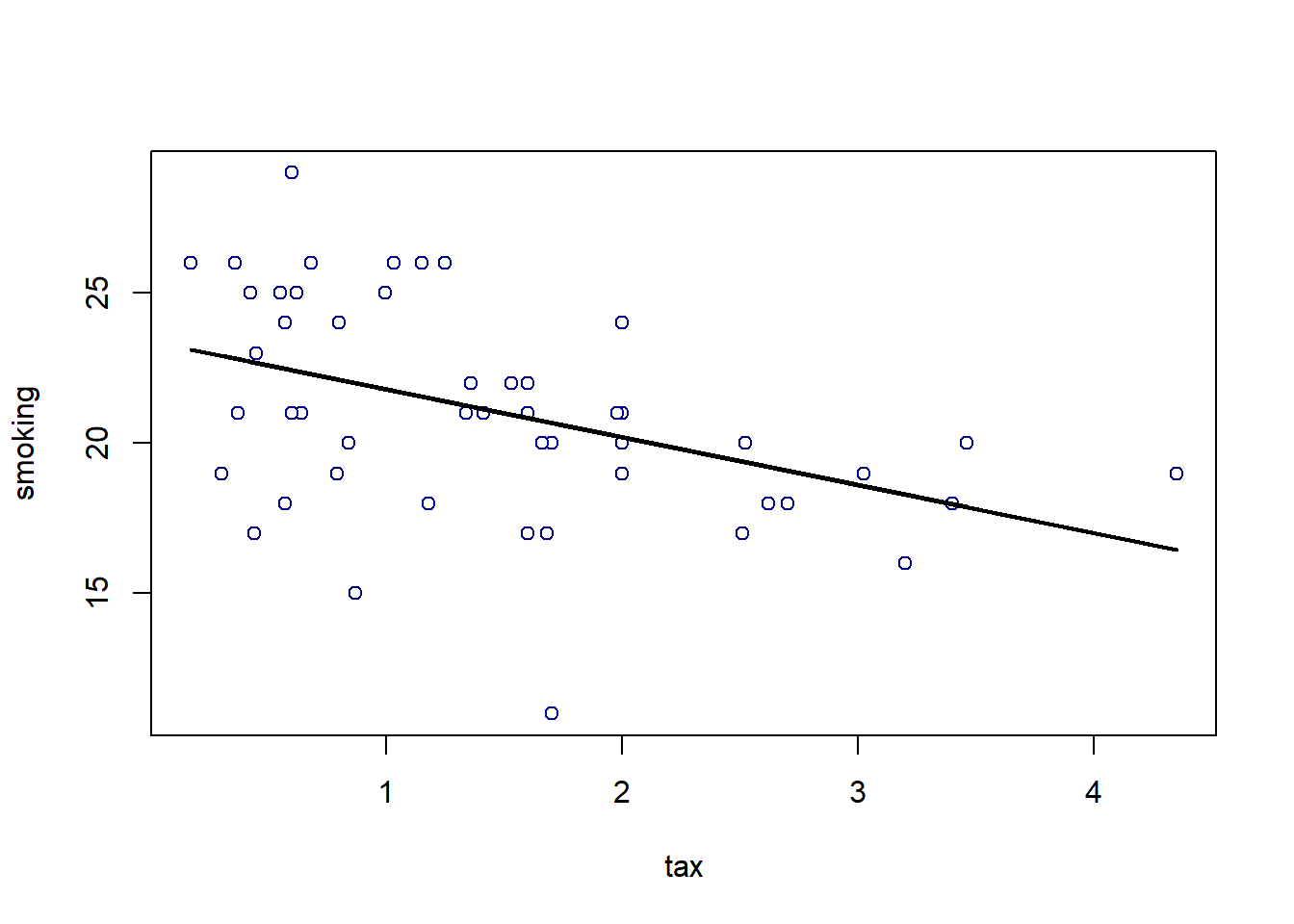
4.6.2 Residuals
For every actual observation in our data, we have a prediction for it from the regression model. This is what the line tells us, and you can think of it as what we would expect the state’s \(Y\) value to be if our linear model was completely accurate. Take a look at this snippet of our earlier graph, which shows the far right portion of the regression line.
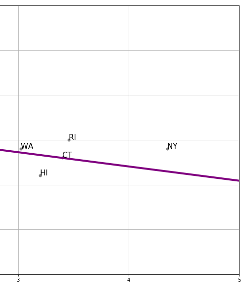
We can see that the actual observation for New York (NY) is above the regression line. Meanwhile, the actual observation for Hawaii (HI) is below the regression line. This tells us that, in some sense, New York’s tax (\(x\)-value) is consistent with a lower smoking percentage than we actually see in that state. Meanwhile, Hawaii’s tax rate is consistent with a higher smoking percentage than we actually see in that state.
In fact, we can be more precise. The actual value for New York’s \(Y\) is 19% (smoking). But the predicted value for New York, sometimes written \(\hat{Y}\) and said “Y-hat” is 16.46. We can write a function to provide this predicted value for any observation we want:
make_reg_prediction <- function(state = "NY") {
  states_data$clean_stateid <- trimws(states_data$stateid)
  the_obs <- states_data[states_data$clean_stateid == state, ]
  pred <- model_slope * the_obs$cig_tax12 + model_intercept
  pred
}
For New York, this is:
## [1] 16.46849This brings us to an important term. We can define a residual as being the difference between \(Y\) and \(\hat{Y}\). In particular, the residual for a given observation is
\(Y-\hat{Y}\) for that observation
For New York, the residual is thus: \(19-16.46\), or \(2.54\).
We say this is a positive residual because it is greater than zero. Meanwhile, Hawaii had a negative residual, because this number (\(Y-\hat{Y}\) for Hawaii) was less than zero.
We will use the sum of the squared residuals momentarily, but for now notice that there are some important facts about residuals themselves:
- residuals in a regression sum to zero. The intuitive reason is that, if they didn’t—that is, if the positive ones weren’t completely offset by the negative ones—we could alter \(a\) and \(b\) little to get the sum to zero. And that would suggest a better fitting line. Similarly, the residuals are on average zero.
- the residuals are uncorrelated with our predictor variable (our \(X\)). This follows from fact 1, but we won’t explore exactly why in this course.
- the residuals are informative about model fit. That is, they can tell us how well our straight line describes the data. We will return to this idea below.
4.6.3 Residuals and the best fit line
In what sense does is our linear regression line the line that fits the data “best”? Well, it is the line that minimizes the all the residuals. Specifically, it is the ordinary least squares line that
minimizes the sum of the squared residuals
For obvious reasons, the ordinary least squares line, and indeed the technique in general, is sometimes referred to by its initials, OLS.
4.6.3.1 Best fit line
We are fitting via OLS, which minimizes the sum of squared residuals. Literally, it is finding a value of \(a\) and \(b\) that will minimize (make as small as possible) this sum:
\[ \sum (y_i - (a+bx_i))^2 \]
This is another way of describing the residual, above. For a given row of the data, the \(y_i\) is the actual value of the dependent variable. Meanwhile, \(a+bx_i\) is our linear model of that dependent variable. That is, it is the point on the regression line—our prediction—for that observation. But then \(y_i- (a+bx_i)\) is just another way of writing \(y_i-\hat{y_i}\)
The idea is that the sum, \(\sum\), is happening over every row \(i\) in the data. For each observation we have a value of the dependent variable \(y_i\) and the independent variable \(x_i\). So, for the first observation the calculation (the square of the residual) is
\[ (y_1 - (a+bx_1))^2 \]
this is added to the second squared residual
\[ (y_2 - (a+bx_2))^2 \]
And so on, down the data. Intuitively, it is as if we are trying out different values of \(a\) and \(b\) until we find the one that minimizes that sum. Indeed, a linear model that fits perfectly would have \(y_i\) equal to \(a+bx_i\) for all observations and thus the sum would be zero.
Now, in fact, we don’t literally try each possible value of \(a\) and \(b\)—there is a matrix algebra solution that finds the minimum very quickly. Notice that this solution will be unique: there is only one best fit line possible for a given linear regression problem.
4.6.4 Residuals and diagnostics
As the logic above suggests, it is straightforward to calculate the residual for any given observation. Ideally, we would like these residuals to be approximately the same size, no matter what the particular value of \(X\). This is equivalent to saying we want the spread of the residuals to look similar throughout the data. We call that spread of the residuals the error variance.
Another way to put this is that we don’t want the line to fit systematically better for some values of \(X\) and worse for others. If it does, i.e. if the nature of the residuals changes as \(X\) increases or decreases, we have evidence of non-constant error variance, which sometimes goes by the name heteroscedasticity.
The consequences of heteroscedasticity are twofold from our perspective:
- first, it can generate problems with interpreting coefficients. In particular, it can lead to make type-I or type-II errors when declaring that a specific coefficient (so the \(b\) for a specific variable) is “statistically significant” or not
- second, it is emblematic of a specification error. That is, non-constant error variance potentially tells that a linear regression is not appropriate, and perhaps we should have allowed for a non-linear model (line) through our data instead.
To get a sense of the diagnosis procedure, let’s start by writing a simple function to calculate the residuals for a given regression of \(y\) on \(x\) (this uses the fit() function above):
To get a sense of how constant error variance looks, we can generate some (fake) data which we know does not suffer from heteroscedasticity. We won’t belabor the details, but we make our \(x\) variable to be 200 random draws from a normal distribution, and our \(y\) variable to be 200 random draws from a different normal distribution. Then we will put these in a data frame and call the residual function from the regression of the (fake) \(y\) on the (fake) \(x\).
set.seed(5)
fake_x <- rnorm(200, mean = 3, sd = 1)
fake_y <- rnorm(200, mean = 2, sd = 2)
fake_data <- data.frame(x = fake_x, y = fake_y)

perfect_residuals <- as.matrix( residual(fake_data, "x", "y") )
Now, we just want to plot these (fake) residuals in terms of the value of the predictor variable on the \(x\)-axis, versus the value of the residuals themselves on the \(y\)-axis. They should have a mean of zero, but importantly, they should also be spread above and below the line to roughly the same degree whatever the value of \(x\).
plot(fake_data$x, perfect_residuals,
     col = "red", pch = 21, bg = "red",
     xlab = "x", ylab = "Residuals",
     xlim = c(0, max(fake_data$x, na.rm = TRUE)),
     frame.plot = FALSE)

abline(h = 0, col = "blue", lwd=2)
grid()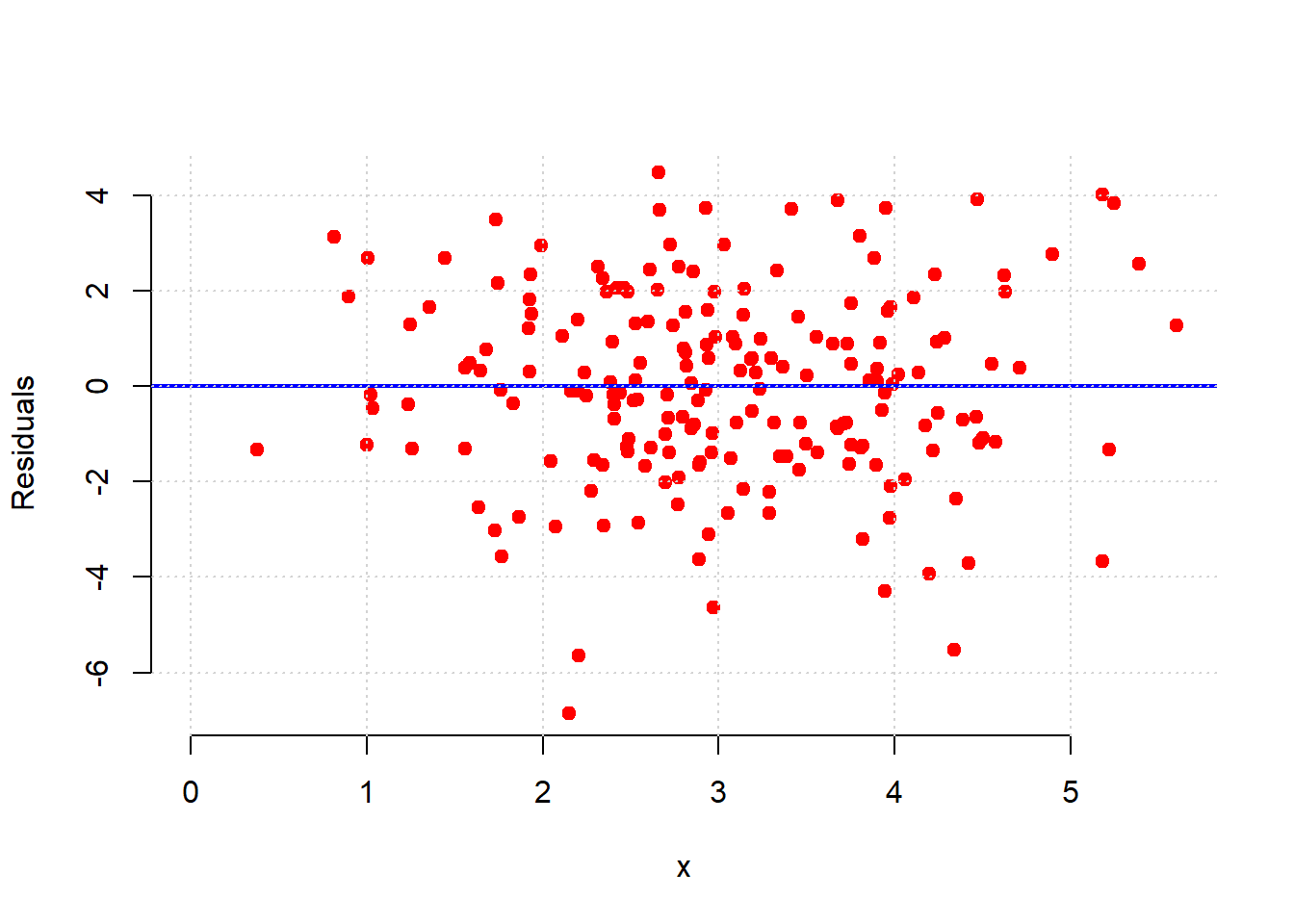
That is approximately what we see: as we move from low values of \(x\) (so, zero or one) to high values of \(x\) (so, four or five), the variance of the red dots around the blue zero line doesn’t change very much. This is constant error variance.
What about for our regression above?
model_residuals <- as.matrix( residual(states_data, "cig_tax12", "smokers12"))
plot(states_data$cig_tax12, model_residuals,
     col = "red", pch = 21, bg = "red",
     xlab = "x", ylab = "Residuals",
     xlim = c(0, max(states_data$cig_tax12, na.rm = TRUE)),
     frame.plot = FALSE)

abline(h = 0, col = "blue", lwd=2)
grid()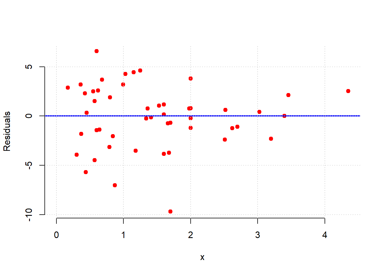
Here, the error variance for low values of the tax variable are more evenly spread than for high values. And, for high tax states, the residuals are smaller. This suggests our model does a better job of fitting the observations for high-tax states. In general then, it seems we may have some non-constant error variance.
For an even sharper example, consider a regression of the percentage of a state’s population that is pro-Choice (prochoice) on its proportion of Hispanic residents (hispanic08).
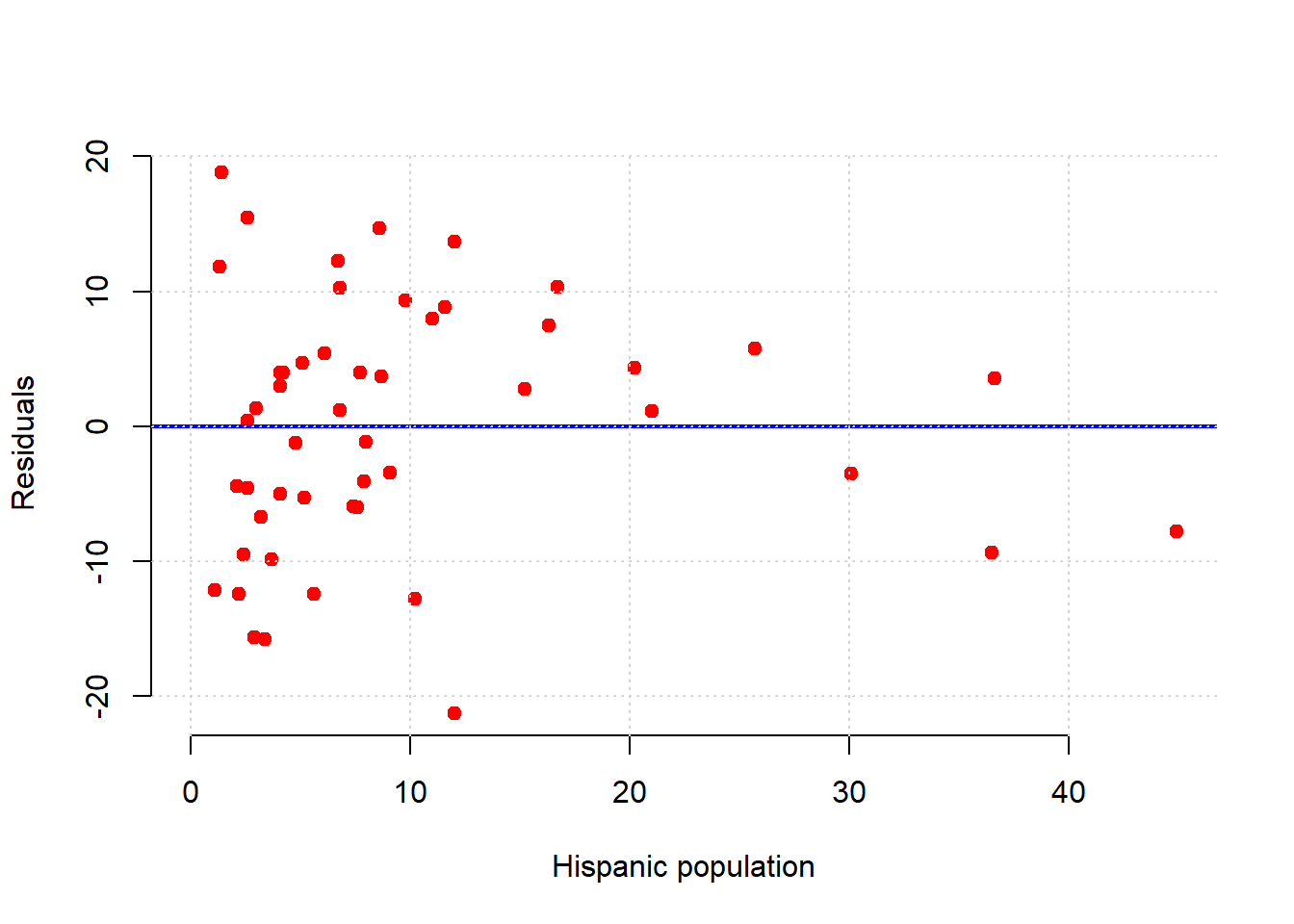
We see something quite different here. For low Hispanic population values, the error variance looks somewhat constant. But for mid-levels, the residuals are mostly above the line (we underpredict for these states). For relatively large values of Hispanic population, the residuals are mostly below the line (we overpredict for these states). This suggests that \(y\) might not be linear in \(x\) and that a different model is called for.
Indeed, looking at the regression line for this example suggests it should perhaps be more of a curve:
regression_prediction2 <- fit(states_data, 'hispanic08', 'prochoice')

plot(states_data$hispanic08, states_data$prochoice,
     xlab = "Hispanic population", ylab = "prochoice",
     pch = 21, bg = "darkblue", col = "black")  # mimics black edge with white fill

lines(states_data$hispanic08, regression_prediction2,
      col = "black", lwd = 2)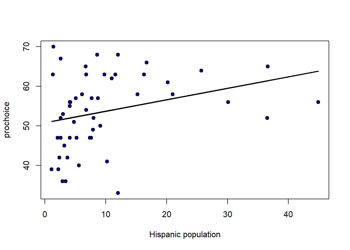
4.6.5 Model fit
How well does our regression fit our data? One common way to think about it is in terms of the amount of variation in \(y\) (the thing we are trying to predict) that is explained by our linear model that uses \(x\). When this number is large, we are saying that, overall, we can predict \(y\) very well using our model; when it is small, we are saying that, overall, we cannot predict \(y\) very well using our model.
The particular measure we will use is called R-squared or R-square or \(\mathbf{R^2}\). It is
the proportion of the variance in the outcome (\(y\)) that our linear regression explains; and it is the square of the correlation between \(x\) and \(y\).
Perhaps unsurprisingly, when \(x\) and \(y\) are highly correlated (\(r_{XY}\) is large), we expect to do a better job of predicting \(y\) from \(x\) and the model.
As with the slope and the intercept, there are many ways to calculate \(R^2\). We will use this method:
\[ R^2 = \frac{\mbox{variance of fitted values}}{\mbox{variance of } y} \]
From the formula, we can see that when the variance of the fitted values is the same as the variance of \(y\), then \(R^2\) will be one, which is the highest it can be. By contrast, if the fitted values don’t have any variance – meaning we are predicting the same value of \(y\) for every \(x\) – then \(R^2\) is zero, which is the worst-fitting model possible.
The fact that \(R^2\) is just the correlation squared makes it easy to write a function for:
Applied to our model, we see that proportion of variance explained is about 0.19 (19% of the variance in \(Y\) is explained by our model).
## [1] 0.1861956Unsurprisingly, the lm function will also allow one to calculate \(R^2\):
## [1] 0.18619564.7 Inference and Prediction for Linear Regression
As is often the case, we will be working with a sample. In the regression context, this means that our sample values of \(a\) and \(b\) are actually estimates of the true \(a\) and \(b\) in the population. For clarity and consistency, those parameters are often written as the Greek letters \(\alpha\) and \(\beta\)—and the statistics (the estimates) from our sample may be written as \(\hat{\alpha}\) and \(\hat{\beta}\), respectively. As usual, the “hats” remind us we have estimates.
But recall: estimates imply uncertainty, and we want to quantify that uncertainty. In particular, we to know how far off, on average, we can expect our estimates to be from the truth.
4.7.1 Data science terminology: signal and noise
Note that if we are using a linear regression to estimate the population parameters, we are assuming that there is a “true” straight line relationship between \(X\) and \(Y\) in that population. As usual, we cannot observe it directly: it is the signal we want to obtain.
The problem is noise. That is, random error around the signal. This is why, in our sample, the points do not line perfectly on our regression function.
In this context, the purpose of the regression is to separate signal from noise: that is, for us to work out what is systematic (and important for understanding the population) about the relationship we observe, and what is merely random error.
We will review how to make inferences in more detail below, but first let’s rerun our “main” regression and define the fit function (again).
states_data <- read.csv("data/states_data.csv")
standard_units <- function(x) {
  (x - mean(x)) / sd(x)
}

correlation <- function(t, x, y) {
  one_over_n_minus1 <- 1/(length(t[[x]]) - 1)
  x_part <- standard_units(t[[x]])
  y_part <- standard_units(t[[y]])
  cor_out <- one_over_n_minus1*sum(x_part*y_part)
  cor_out
}


slope <- function(df, x, y) {
  r <- correlation(df, x, y)
  r * sd(df[[y]]) / sd(df[[x]])
}
intercept <- function(df, x, y) {
  mean(df[[y]]) - slope(df, x, y) * mean(df[[x]])
}
fit <- function(df, x, y) {
  beta <- slope(df, x, y)
  alpha <- intercept(df, x, y)
  beta * df[[x]] + alpha
}
4.7.2 Inference for the slope: bootstrapping
In principle, we could be concerned with inference for both the intercept and the slope. But our efforts are mostly concerned with the latter. The reason for this is because it is slope that links \(x\) to \(y\) directly. That is, it tells us the effect of \(x\) of \(y\), which is typically the entity we care about most when contemplating an intervention (i.e. a change to \(x\)).
Above, we estimated the slope for the states data. But that was our estimate based on particular instantiation of the data: the sample could have come out differently (say, on the day it was taken). Naturally, we would like to know how it could have differed had the sample been different. And the tool we have been using for this question is the bootstrap. We can use that again here.
We apply the boostrap exactly as before:
- we will take a random resample (of size \(n\)) of our data, with replacement
- we will fit our linear model to that resample and record the value of our slope (our \(b\) value)
- we will repeat steps 1 and 2 a very large number of times
At the end, we will have a large number of slope estimates. Plotting the histogram of those estimates yields the sampling distribution of the slope. And from there, we can produce confidence intervals and other quantities of interest.
To see the basic idea, consider taking one (random) resample of our data and plotting the regression line for it:
set.seed(123)
bootstrap_sample <- states_data[sample(nrow(states_data), replace=TRUE), ]
regression_prediction_re <- fit(bootstrap_sample, "cig_tax12", "smokers12")
plot(bootstrap_sample$cig_tax12, bootstrap_sample$smokers12,
     pch=21, bg="white", col="black", xlab="tax", ylab="smoking")
lines(bootstrap_sample$cig_tax12, regression_prediction_re, col="black", lwd=2)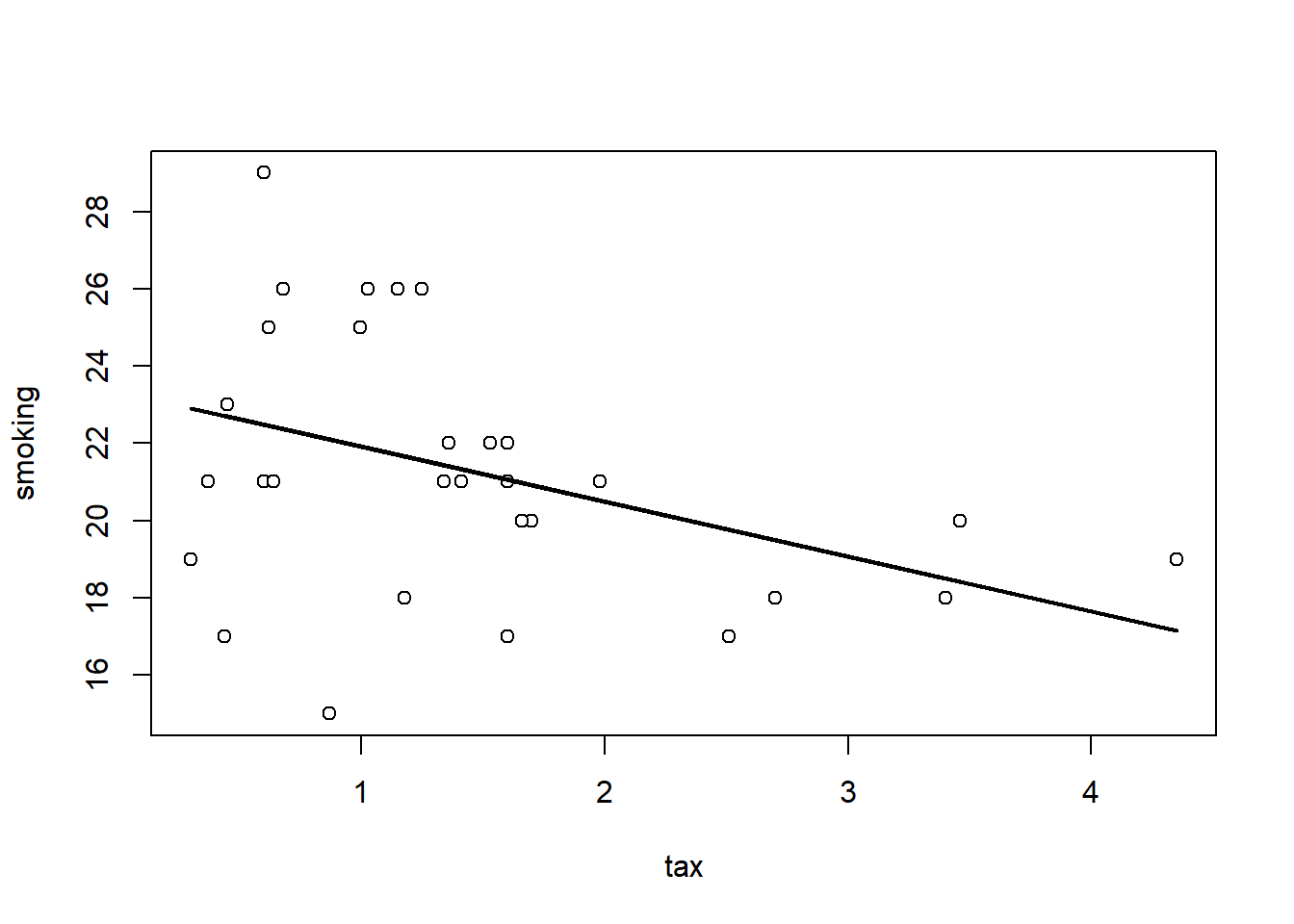
Let’s do that a few times (9 times), and see how the line (the slope) varies each time:
par(mfrow=c(3,3), mar=c(4,4,1,1))
for (i in 1:9) {
  sample_i <- states_data[sample(nrow(states_data), replace=TRUE), ]
  pred_i <- fit(sample_i, "cig_tax12", "smokers12")
  plot(sample_i$cig_tax12, sample_i$smokers12,
       pch=21, bg="white", col="black",
       xlab="tax", ylab="smoking", xlim=c(0,5), ylim=c(5,30))
  lines(sample_i$cig_tax12, pred_i, col="black", lwd=2)
}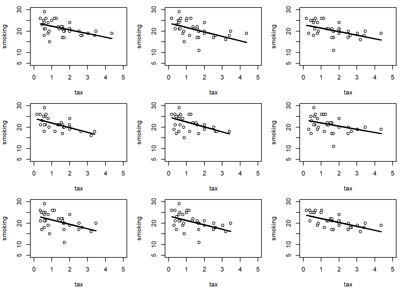
This makes sense: for some samples, the slope is a little flatter than other samples.
We can be more systematic by building a function to bootstrap the slope and store the results. We then take the 95% “middle portion” of these stored slope estimate, and that becomes our confidence interval. At the end of the code, we draw the confidence interval onto a histogram of the sampling distribution.
bootstrap_slope <- function(dframe, x, y, repetitions) {
  slopes <- numeric(repetitions)

  for (i in seq_len(repetitions)) {
    bootstrap_sample <- dframe[sample(nrow(dframe), replace = TRUE), ]
    slopes[i] <- slope(bootstrap_sample, x, y)
  }

  # 95% confidence interval
  left <- quantile(slopes, 0.025)
  right <- quantile(slopes, 0.975)

  # Observed slope
  observed_slope <- slope(dframe, x, y)

  # Plot histogram of bootstrapped slopes
  hist(slopes, col = "lightblue", border = "black", main = "Bootstrap Distribution of Slopes",
       xlab = "Slope Estimates")

  # Plot yellow CI line at the bottom
  lines(c(left, right), c(0, 0), col = "yellow", lwd = 12)

  # Print results
  cat("Slope of regression line:", observed_slope, "\n")
  cat("Approximate 95%-confidence interval for the true slope:\n")
  cat(left, right, "\n")
}
For our running example (2000 bootstrap samples):
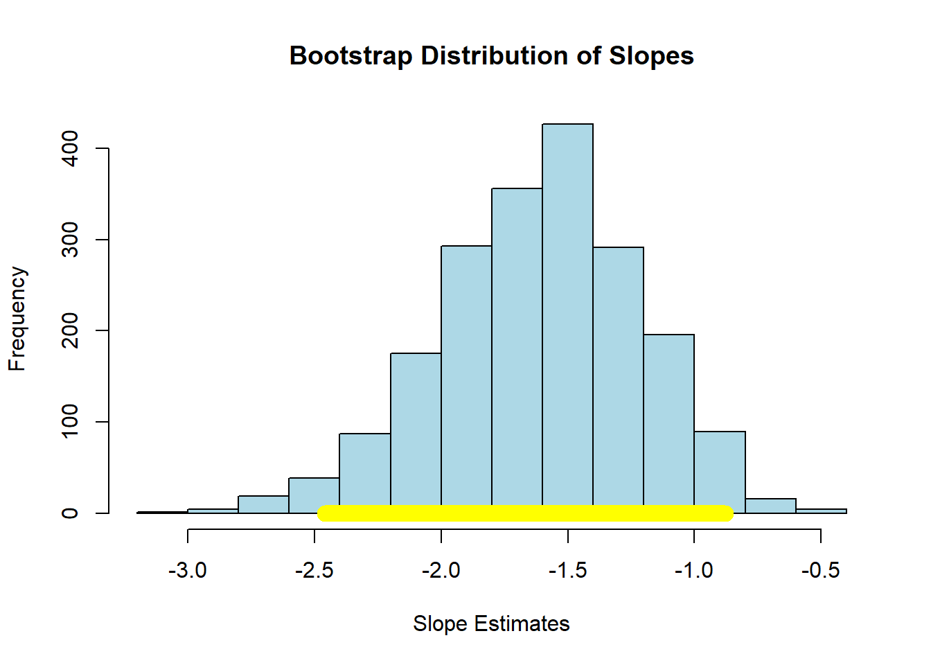
## Slope of regression line: -1.590893
## Approximate 95%-confidence interval for the true slope:
## -2.459281 -0.8782616
Here, the 95% confidence interval is something like \((-2.40, -0.89)\) (your numbers may differ slightly). As usual, we are saying that, if we repeated this process of constructing confidence intervals many times, 95% of those times, we would capture the true value of the parameter. In this case, that parameter is \(\beta\), the value of the slope of the population. And, of course, we do not know whether this particular interval has captured it or not.
We can use the confidence interval for a hypothesis test. Specifically our:
- Null Hypothesis \(H_0\) is that the slope of the true population line is zero. That is, there is no effect of cigarette tax on smoking.
- Alternative Hypothesis \(H_1\) is that the slope is not zero. That is, that there is an effect of cigarette tax on smoking.
As previously we ask: does our confidence interval contain zero? Here, the answer is no: it is everywhere negative. With this, we reject the null hypothesis of no effect. Moreover, because we have the 95% confidence interval, we can say that our regression coefficient on cigarette tax is statistically significantly different to zero (at the 0.05 level).
To see an example of a null result, consider the regression of motor vehicle fatalities per 100,000 population (carfatal) on alcohol consumption in gallons per capita (alcohol):
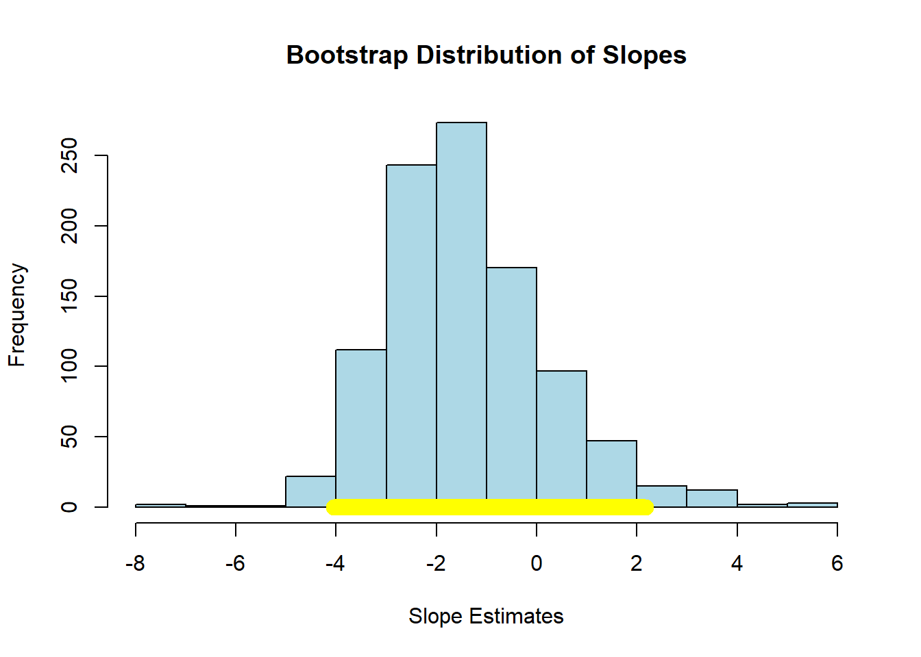
## Slope of regression line: -1.51994
## Approximate 95%-confidence interval for the true slope:
## -4.051257 2.178319
Here the confidence interval includes zero and we fail the reject the null hypothesis of no effect of \(X\) on \(Y\).
4.7.3 Confidence intervals for predictions
As we showed above, it is easy to provide a point prediction for an observation. We simply take the actual \(x\) value and multiply it by the slope estimate and add the intercept estimate. This will give a \(\hat{Y}\) for that observation, which is also called a fitted value. This function does that:
fitted_value <- function(dframe, x, y, given_x) {
  a <- slope(dframe, x, y)
  b <- intercept(dframe, x, y)
  return(a * given_x + b)
}
For example, suppose the tax rate is $5 per pack:
## [1] 15.43441Then we would expect about 15% of the population of the state to smoke. But we would like to know about the uncertainty around this prediction: how does it vary?
To do this, we will build a confidence interval for the prediction. This is sometimes called a predictive confidence interval and is our prediction of the mean response. We are answering the question: “what would expect to be the average value of Y for a unit with these X?”
As often in data science, there is some confusing terminology here. Note that a confidence interval is different to a prediction interval. The latter are used when we are trying to predict the actual future value of \(y\) for a given (set of) x. This is the prediction of a future value, or future observation. For confidence intervals, we are asking how the average value of \(Y\) will vary with \(X\). We won’t belabor the distinction here, except to note that confidence intervals are always narrower than prediction intervals.
The confidence intervals for \(\hat{Y}\) depend on the particular value of \(X\) we care about. Specifically, these intervals are narrowest at the mean value of \(X\). They are widest as we move away from the mean. Basically, this is because the regression line always goes through \(\bar{X},\bar{Y}\) (the average of x and the average of y). If you change the estimate of the slope (i.e. you are uncertain about it) that doesn’t change where the line goes—it still pivots around \(\bar{X},\bar{Y}\). But that means the confidence interval will be narrow near there but wider as you move away from it.
As an aside, being uncertain about the intercept will change where the line goes, but that’s true everywhere, and it’s the slope uncertainty that forces the flaring out at the ends.
In any case, we can use our basic bootstrap procedure to produce thousands of predictions of the average value of \(Y\) for a given value of \(X\), and then plot the sampling distribution and confidence intervals for those predictions. Here is a function to help us:
bootstrap_prediction <- function(dframe, x, y, new_x, repetitions) {
  predictions <- numeric(repetitions)

  for (i in seq_len(repetitions)) {
    bootstrap_sample <- dframe[sample(nrow(dframe), replace = TRUE), ]
    predictions[i] <- fitted_value(bootstrap_sample, x, y, new_x)
  }

  # 95% prediction interval
  left <- quantile(predictions, 0.025)
  right <- quantile(predictions, 0.975)

  # Prediction based on original sample
  original <- fitted_value(dframe, x, y, new_x)

  # Plot histogram of predictions
  hist(predictions, col = "lightblue", border = "black",
       main = paste("Bootstrap Predictions at x =", new_x),
       xlab = paste("Predicted y at x =", new_x))

  # Draw yellow confidence interval line at bottom
  lines(c(left, right), c(0, 0), col = "yellow", lwd = 12)

  # Print results
  cat("Height of regression line at x =", new_x, ":", original, "\n")
  cat("Approximate 95%-confidence interval:\n")
  cat(left, right, "\n")
}
First, let’s set the \(X\) value to the mean of all the \(X\)-values:
meanx <- mean(states_data$cig_tax12)
bootstrap_prediction(states_data, 'cig_tax12', 'smokers12', meanx, 5000) 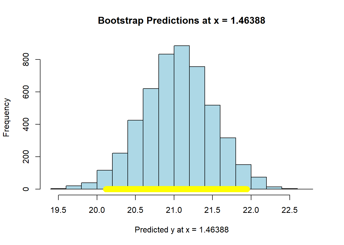
## Height of regression line at x = 1.46388 : 21.06
## Approximate 95%-confidence interval:
## 20.11672 21.94406
Now let’s set the \(X\)-value to the maximum of the data:
maxx = max(states_data$cig_tax12)
bootstrap_prediction(states_data, 'cig_tax12', 'smokers12', maxx, 5000) 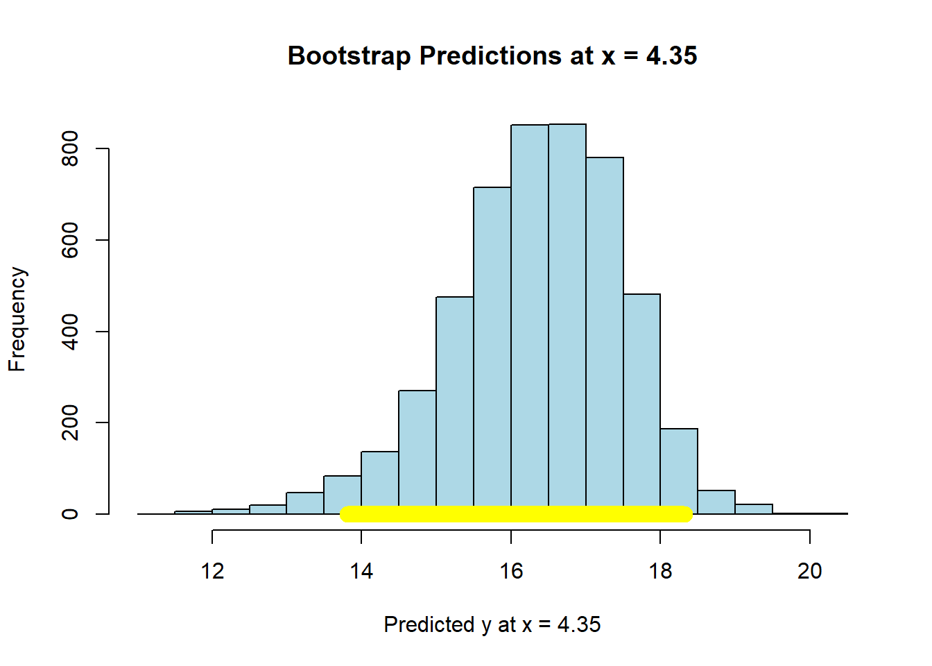
## Height of regression line at x = 4.35 : 16.46849
## Approximate 95%-confidence interval:
## 13.80893 18.3163
Compare the widths of the confidence intervals: with \(X\) near its mean, we have a confidence interval of around \((20.15, 21.92)\); with \(X\) at its maximum, we have a confidence interval of around \((13.93, 18.38)\). So the latter is much larger than the former.
In either case though, we are saying that if we repeated this way of constructing confidence intervals many many times, approximately 95% of the time we expect them to contain the true value of the mean of \(\hat{Y}\) at that level of \(X\).
4.7.3.1 Working with predict
In practice, bootstrapping everything can be a little laborious for some problems. Fortunately, we can use the predict function in R for such cases. First, let’s fit our regression model “as usual”
Then, we will tell predict to give us the 95% confidence interval for the predicted mean response. We will need to tell it what values of \(X\) to consider for this interval. Above, we use the mean of the tax and the maximum of the tax. We can do that again:
Now, we pass this into predict telling it to apply the coefficients from mod, and to give us a confidence interval at the 95% level:
The top and bottom of the interval are stored as lwr and upr. These look essentially identical to our bootstrapped estimates above:
##        fit      lwr      upr
## 1 21.06000 20.14047 21.97953
## 2 16.46849 13.53490 19.40209
For the mean level of \(X\), the interval is ( 20.14 , 21.98 ). For the max level of tax, it is ( 13.53 , 19.4 ).
We can be a bit more general now. We will produce a confidence interval for lots of value of cigarette tax. This requires, first, that we produce a new data frame that is just a list of (plausible) values of cigarette tax:
# Create a grid of values for cig_tax12 to predict over
cig_grid <- data.frame(cig_tax12 = seq(0,
                                       max(states_data$cig_tax12)+2,
                                       length.out = 200))
We then provide a confidence interval for those predictions:
# Get fitted values and 95% confidence interval
preds <- predict(mod, newdata = cig_grid, interval = "confidence", level = 0.95)

# Combine with the grid
plot_data <- cbind(cig_grid, preds)
We plot the result: this is in the original \(X\) v \(Y\) space. Each point is a “real” observation in the data set (a state). The read line is the original regression. And the blue lines are the confidence intervals.
# Plot
plot(states_data$cig_tax12, states_data$smokers12,
     xlim=c(min(cig_grid), max(cig_grid)),
     pch = 16, col = "gray", xlab = "Cigarette Tax",
     ylab = "Smoking rate", main = "95% Confidence Interval for Mean Prediction")

# Add predicted line
lines(plot_data$cig_tax12, plot_data$fit, lwd = 2, col = "red")

# Add confidence band
lines(plot_data$cig_tax12, plot_data$lwr, lty = 2, col = "blue")
lines(plot_data$cig_tax12, plot_data$upr, lty = 2, col = "blue")
grid()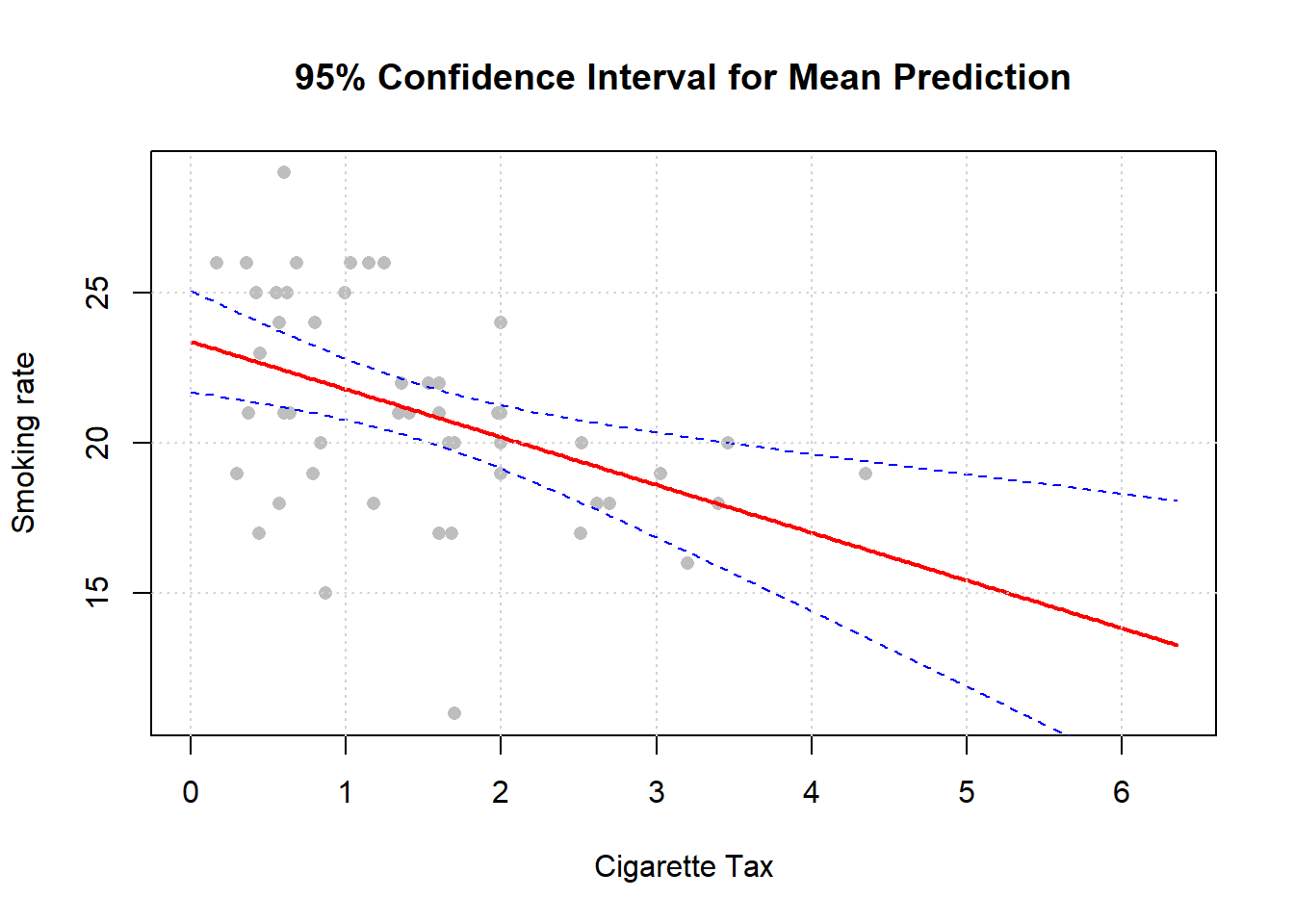
Notice, as we mentioned above, that the confidence intervals are narrowest near the mean of \(X\).