3 Statistics and Hypothesis Testing Part 2
In this chapter we continue our journey through the fundamentals of statistics that will provide the backbone for our work to come. In the previous chapter, we built some intuition around the Law of Large Numbers, hypothesis testing, and simulation, all three of which are essential ingredients in using data to make inferences about the world. Here, we build on this foundation to explore and build further intuition around another cornerstone of inference: uncertainty.
3.1 Percentiles
3.1.1 Recap: Population Parameters, Sample Statistics
Recall that the population is the universe of cases we want to describe. There is some parameter in that population that, from our perspective, is fixed and unknown. What we can do is take large random samples from the population and use the statistics from those samples to estimate the population parameter.
We use the term “estimate”, because we will never know the value of the population parameter for sure. But it is reasonable that we try to say how uncertain we are about our estimate. More crudely, we want to know how much “error” we have around our estimate; intuitively, if we rely on the statistic from the sample we drew, how wrong are we likely to be in terms of understanding of the “true” value the parameter takes in the population?
This all means that we need to answer the following question in as systematic a way as we can:
how different could this estimate have been, if we had drawn a different random sample?
To get the intuition here, remember that as we saw in the previous chapter, different random samples produce different sample statistics (in that case, median wait times). But for a typical problem, we will draw one random sample, one time, and thus have only one statistic. So our problem is to use that one statistic from that one sample—and some tools below—to understand how large or small the population parameter might plausibly be. Before we show how that can be done, in this section we define a new measure that we can calculate from a sample and that will be useful in general.# Percentiles
We define the \(p^{th}\) percentile as the
value of the data such that \(p\)% of the observations fall below that value, and (100-p)% fall above it.
We will give some examples momentarily, but note that some particular percentiles have special names:
- the 50th percentile of the data is the median, which we have already met. It is the “middle value”, and half the observations are above it (in value) and half are below it (in value)
- the 25th percentile of the data is the first or lower quartile. 75% of the observations lie above this value.
- the 75th percentile of the data is the third or upper quartile. 25% of the observations lie above this value.
Just for completeness, note that the 100th percentile of the data is the largest value—there are no observations larger. The particular way that these percentiles are defined and implemented in software varies a little, but this should not make a big difference for large samples.
3.1.1.1 Calculating Percentiles
One standard way to calculate percentiles is as follows.
- Start with a sample of values. Let’s say we have \(n=8\) and they are:
\[ 1,3,9,7,5,3,11,3 \]
- Rank, or sort, the observations from smallest to largest:
\[ 1,3,3,3,5,7,9,11 \]
- Find the \(p\)% of \(n\), which is literally \(\frac{p}{100}\times n\). Call that number \(k\). Now…
- if \(k\) is an integer (a whole number), take the \(k\)th element of the sorted sample. That’s the \(p^{th}\) percentile.
- if \(k\) is not an integer, round it up to the next integer, and take that element of the sorted sample. That’s the \(p^{th}\) percentile.
For our sample, consider calculating the 25th percentile. The relevant value of \(k\) is \(0.25\times 8=2\). That’s an integer, so we take the 2nd element of the ordered sample, which is 3. For the 75th percentile, the relevant value of \(k\) is \(0.75\times 8=6\), so we take the 6th element of the ordered sample, which is 7.
What about, say, the 83rd percentile? Now the relevant value of \(k\) is \(0.83\times 8= 6.64\). We round that to 7 (the next integer), and our 83rd percentile is thus 9.
Percentiles are useful when we want to get a sense of where a given observation is in the distribution of all observations. So, for example, weight percentiles of babies might tell us how healthy a given child is – or how well it is developing – relative to all other children. It does this in a way that the weight itself, e.g. 8 lbs 3 oz, does not automatically convey. Similarly, standardized tests performance is often based on the percentile the student achieves. Thus, we may not care that a student got 59 responses correct out of 122 questions, but we might update quite a bit depending on whether that performance puts the student at the 10th or 99th percentile.
3.1.1.2 Interquartile Range
While percentiles tell us where a given unit is in the distribution, the Interquartile Range (IQR) tells us how the distribution looks as a whole. Specifically, the IQR is the
is the difference between the first and third quartiles in the sample
For our sample above, this is 7-3 = 4. Intuitively, this is telling us about the spread of the ‘middle part’ of the distribution. When it is larger, the distribution is more spread out around its median; when it is smaller, the distribution is less spread out.
3.2 Bootstrapping
3.2.1 How estimates vary
We now know how to generate the median, or in fact any percentile, from a random sample. But, as we said, that is just one incidence statistic from a random sample. We would like to know how this statistic would “behave” (what types of values in would take) in lots of samples. The problem is that we only have the one random sample we took.
In a more traditional statistics class, we would calculate the possible values analytically. That is, we would use mathematics tools to work out the ‘theory’ of how this statistic should behave under various different scenarios. However, in this course, we will approach the problem by simulation. In particular, we will use a special technique called “the bootstrap”, which uses a computer plus our random sample, to tell us what we need to know about variability and uncertainty.
In a sense, bootstrapping is simpler than more traditional methods of calculating the things we need: we follow a computational recipe, and it generally works, even for quite complicated scenarios. In other ways though, it is more involved, insofar as it requires fast and accurate computation—something that has not always been available historically.
3.2.2 The Bootstrap
Previously, we met the idea of a sampling distribution. It is
the probability distribution of the statistic from many random samples. Literally for us, it will be the histogram of all the values that the statistic takes from many random draws from the population.
As the description suggests, if we have the sampling distribution of, say, the 60th percentile, we know how likely we are to observe various estimated values of that 60th percentile in practice. To get the sampling distribution, we merely had to take lots of samples, calculating the statistic of interest each time—and then plotting it.
Our problem is that we cannot do that here: we have one sample of voters or of goods or of incomes or whatever. What we can do is use the bootstrap. This is a
procedure for simulating the sampling distribution of a given statistic.
It does this by making a key assumption that works (surprisingly!) well. It says
treat the sample as if it is the population. So, draw lots of re-samples from the original sample (with replacement), and record the statistic of interest each time. Then study the distribution of those statistics.
To restate things: ideally, we would like to draw many samples from the population. But we cannot, for the usual reasons of time or money. What bootstrapping says is: instead of drawing many samples from the population, draw one sample…and then resample from that sample many times, and build up the sampling distribution from that.
Though not important for understanding how the bootstrap is used, note that the name of the technique is derived from the idea of “pulling yourself up by your bootstraps”—which means, essentially, helping oneself achieve something without external support. Here, we are going to “achieve” the sampling distribution from one sample alone, without having vital “external” knowledge about the population it is drawn from.
3.2.3 Working through an example: bootstrapping the median
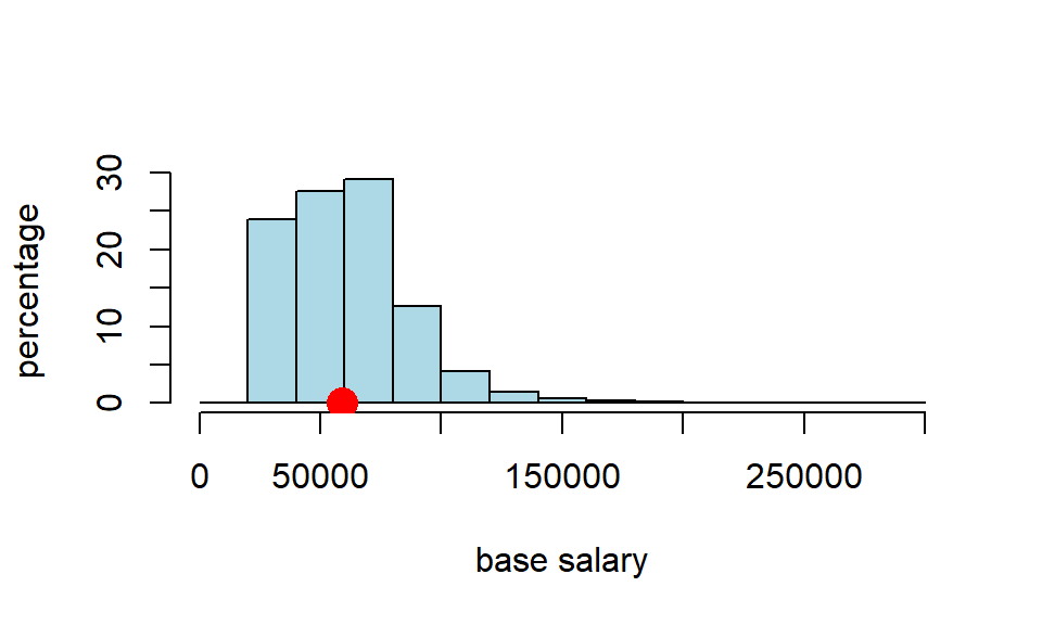
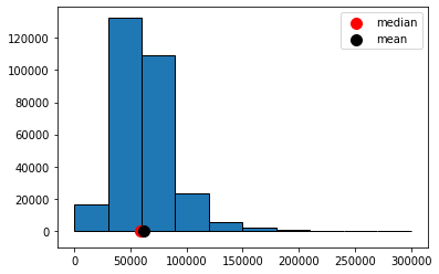
Around 290,000 people work for New York City in various capacities. Let’s call that the “population” (it is stored as nyc_population_salaries.csv) The median salary for that population is \(\$58,850\), as we can see below:
nyc_salary_full_all <- read.csv('data/nyc_population_salaries.csv')
popn_median <- quantile(nyc_salary_full_all$Base.Salary, .5)
 cat("'true' pop med we are trying to capture:",popn_median,"")
## 'true' pop med we are trying to capture: 58850We can plot that distribution and its (true) median:
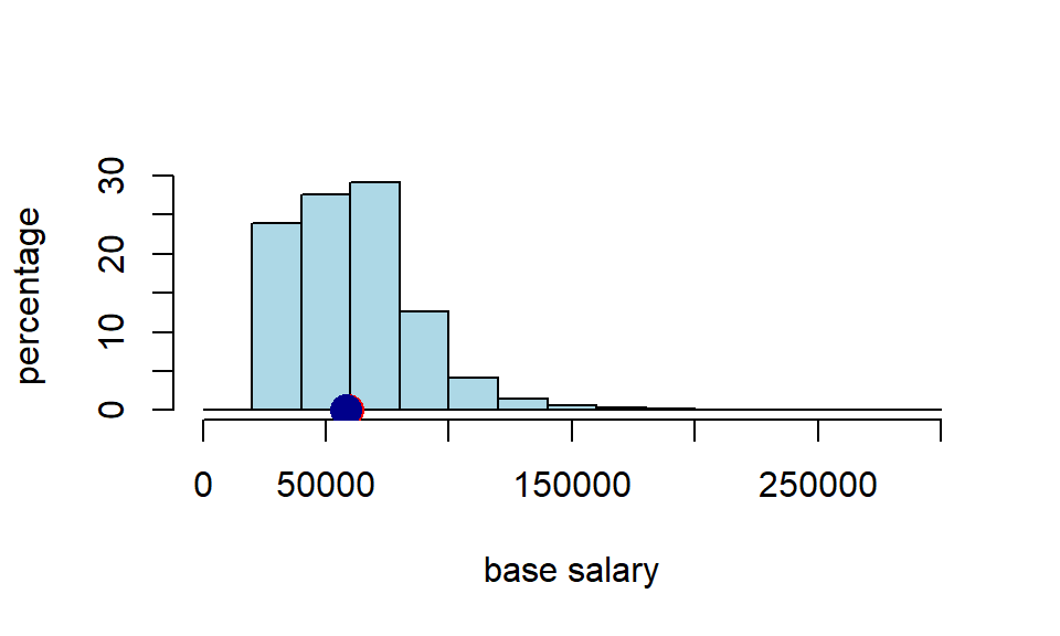
In a typical problem, we won’t have the population. But we will have a sample. Let’s load up our sample (\(n=500\)), and see what its median is.
 nyc_salary_samp <-read.csv('data/nyc_salaries.csv')
cat("median of sample:", quantile(nyc_salary_samp$Base.Salary, .5 ),"")
## median of sample: 57846So the sample median was \(\$57,846\). That’s close to our population median, but not identical to it. Of course, it’s not surprising it does not have an identical median—it is random sample, after all. For completeness, let’s put that on the same plot as above
3.2.3.1 Bootstrap the median
We want to compare our sample with samples we could have taken. We will use the bootstrap to do this, and that means we treat the sample as if it is the population. So, instead of sampling many times (\(n=500\) each time) from the population, we will sample many times (\(n=500\) each time) from our sample. In particular, we will sample with replacement.
Recall, that if we sample with replacement it means that if that observation is (randomly) picked, it is recorded, then returned to whatever we are sampling from so that it can be potentially be picked again. Consequently, the same observation can appear multiple times in the random sample we draw.
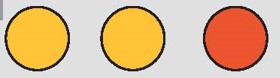
Just as a toy example, suppose we begin with five colored balls as our sample: one green, one red, one blue, one yellow, one white.
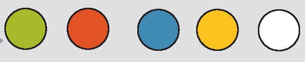
We sample one ball from this group. It is yellow:

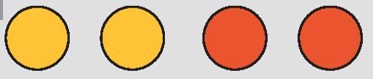
We are sampling with replacement, so we return that yellow ball to the group, and sample again. We picked yellow again. We record that yellow ball and return it; our resample so far consists of two yellow balls.
We sample again, and this time pick a red ball. Our resample so far consists of two yellow balls, and one red.
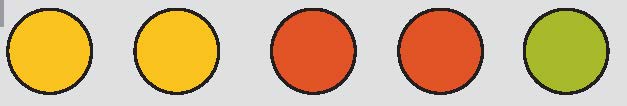
We return that red ball, and pick again. Again, we get a red ball.
We return that red ball, and sample again, which yields a green ball. So here is our the ‘final’ version of our first resample:
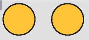
Our second resample ended up with us picking blue, then white, then red, then green, then white again. Here it is:
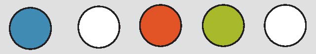
Note that the size of the resample is always the size of the original sample (\(n=5\)), but its composition typically differs because we are sampling with replacement.
For our running NYC example, we are treating the salary sample as if it is the salary population. This means that the same person (and their salary information) can appear multiple times in the random sample we draw from the “population” (actually, our large random sample, nyc_salary_samp). Each time we draw a sample with replacement in this way, we call it a resample because we are sampling again and again from a sample.
3.2.3.2 Why does bootstrapping work?
The idea of bootstrapping is that we can use our (one random) sample to get a sense of how close we anticipate our statistic will be to the (fixed, true but unknown) population parameter. Why does the bootstrap resampling method work for this? The details are quite technical, but some rough intuition may be helpful.
First, in earlier chapters, we talked about the Law of Large Numbers. This was the idea that as the number of observations (actually “trials”) grows larger, things we might calculate from those observations—like the average—get closer and closer to the “true” average of the variable (the “expected value”). More broadly, the LLN is connected to the idea that our large random sample will “look like” our population in terms of its distribution: that is, how the different values ‘stack up’ on the histogram.
Second, we know that if we resample from our large random sample, that resample will look like our (large random) sample, on average. It will differ a little every time, but overall it will look roughly similar.
Third and finally: if
- large random samples from the population resemble the population, and
- large random resamples resemble the sample, then if we put all the resamples together, we will be able to construct something that looks like the population itself. So it will be as if we have access to that population when we calculate things like medians, means, percentiles and so on.
To reiterate, this is a very rough intuition: we will not, in fact, have access to the population at any time. But the bootstrap resamples will allow us to approximate the information we need.
3.2.3.3 The bootstrapped median salary
Let’s start with one resample of our NYC sample salary data. We will calculate its median. Notice the use of replace=True in the function call to tell sample we need to sample with replacement.
a_resample <- nyc_salary_samp[sample(nrow(nyc_salary_samp), replace = TRUE), ]
samp_median <- quantile(a_resample[["Base.Salary"]], probs = 0.5)
print(samp_median)
## 50%
## 55024If you run that single resampling code many times, and record the samp_median(the resample median) every time, you could build up the sampling distribution. But that’s not very efficient, so we will build a function to do it for us.
bootstrap_median <- function(original_sample, label, replications) {
  # original_sample: data frame containing the original sample
  # label: string, name of the column
  # replications: number of bootstrap samples

  just_one_column <- original_sample[[label]]
  medians <- numeric(replications)

  for (i in 1:replications) {
    bootstrap_sample <- sample(just_one_column, replace = TRUE)
    medians[i] <- quantile(bootstrap_sample, probs = 0.5)
  }

  medians
}
This function grabs the relevant column from the original data (via its label), then it draws a resample from that column, and records its median. It does this many times (replications is the number of resamples) and stores those medians in an array (called medians).
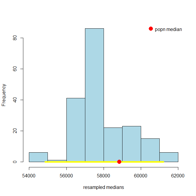
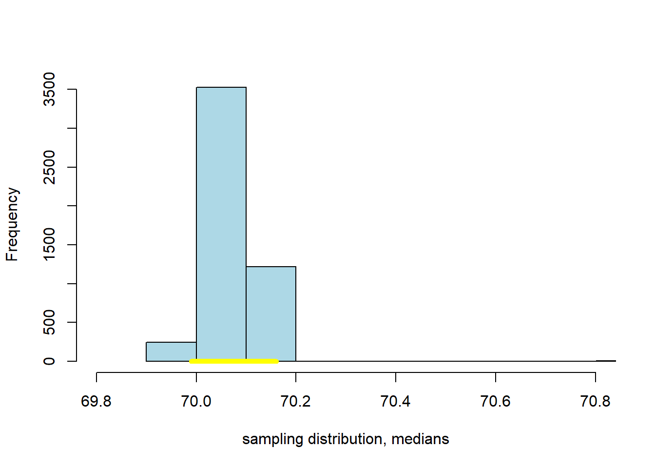
Let’s put the function to work: we will draw 200 resamples, and then look at the histogram of the bootstrap medians. For obvious reasons that histogram is called the bootstrap empirical distribution of the sample medians. Notice that on the histogram we have added the “true” (but usually unknown) population median, just to get a sense of how our bootstrap distribution does at capturing it.
resampled_medians <- bootstrap_median(nyc_salary_samp, "Base.Salary", 200)

hist(resampled_medians, breaks=10, col="lightblue", xlab="resampled medians", main="")
points(popn_median, 0, col="red",cex=3, pch=16)
legend("topright",
       legend = "population median",
       col = "red",
       pch = 16,
       pt.cex = 3,
       bty = "n")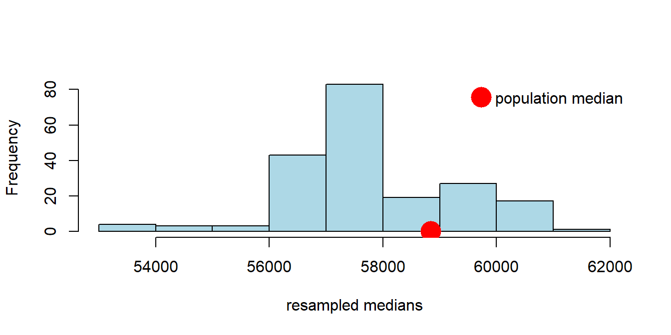
3.2.4 Confidence Intervals
Did we capture the truth? That is, did our bootstrap distribution of the sample statistics (in blue) include our “true” population parameter (the single spot in red)? Just looking at the plot, the answer appears to be “yes”. Now, the population parameter wasn’t quite at the median of our bootstrap distribution, but it wasn’t far off.
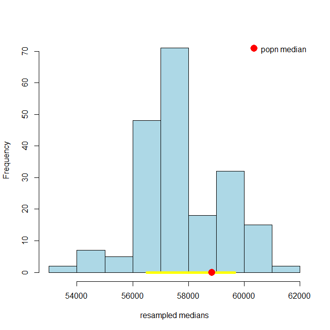
We can be a little more systematic about “far off.” First, let’s think about the “middle” of our sampling distribution. In particular whether the middle 95% of our estimates include the true median or not. We can vary the 95% part momentarily, but for now it seems like a reasonable choice. Obtaining that middle 95% is straightforward, given what we learned above. Specifically, the middle 95% is just everything between the 2.5th percentile and 97.5th percentile of the distribution: because \(97.5-2.5=95\), and we will have the same proportion (2.5%) in each tail.
For reasons that will become clear shortly, we will refer to the 95% as our confidence level. Let’s set that as a variable, and then calculate the upper and lower parts of the distribution we will need. You can work through the math, but ultimately lower will 2.5; upper will be 97.5.
Second, let’s draw on the 95% “interval” of the data that these numbers imply. First, we need the percentiles of our resampled medians that these upper and lower parts of the interval imply. We will call these left and right they are the left and right ends of the interval we want. We are going to calculate these via a call to quantile so we need to divide by 100 in the call (it expects a number between 0 and 1).
Now let’s plot everything. That is, let’s plot the sampling distribution of the median again, put the population median on, and the 95% interval (in yellow). Then we can see if that interval included the true median, or not.
hist(resampled_medians,
     breaks = 10,     col = "lightblue", border = "black", xlab = "resampled medians",
     main = "")

# Yellow line at y = 0
lines(c(left, right), c(0, 0), col = "yellow",  lwd = 5)

# Red point for the population median
points(popn_median, 0, col = "red",   pch = 16, cex = 2)

# Legend
legend("topright", legend = "popn median", col = "red",   pch = 16,   pt.cex = 2,   bty = "n")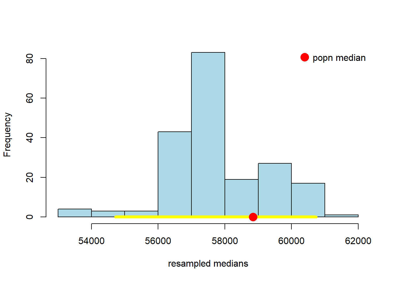
Well, it worked. At least this time: the middle 95% interval of the sampling distribution in this case successfully captured the parameter we wanted (the population median). How often will this work? That is, suppose we pulled a different sample at the start, and did a whole other set of bootstraps—which are random after all in terms of the observations they re-draw—would we expect to capture the true median with that set from that sample? What if we did that again, and again?
We will provide some code to check this elsewhere, but for now, consider running the following simulation:
- we draw 500 observations from the population, and calculate the median (sample) salary
- then, we bootstrap that estimate of the median, using 200 resamples. This produces one 95% interval.
- we repeat steps 1. and 2. a total of 100 times, to produce one hundred 95% intervals.
# make a function that draws 500 obs, calculates the median, and then bootstraps it
draw_samp_boot <- function(nobs=500, nboot=200){
one_sample <- nyc_salary_full_all[sample(nrow(nyc_salary_full_all), nobs, replace=FALSE),]
# note replace = FALSE bec we're simulating idea of taking different initial samples
# The bootstrap itself still uses replace =TRUE

one_sample_median <- quantile(one_sample$Base.Salary, probs=0.5) # that specific sample's median
the_medians <- bootstrap_median(one_sample, "Base.Salary", nboot) # bootstrapping it
list(the_medians,one_sample_median) # record the bs medians, and the sample median
}

# make a function to generate 95% confidence interval for a  bootstrapped sample
make_conf_ends <- function(the_medians, conf = 95) {
  lower <- (100 - conf) / 2
  upper <- 100 - ((100 - conf) / 2)
  left <- quantile(the_medians, probs = lower / 100)
  right <- quantile(the_medians, probs = upper / 100)
  return(c(left, right))
}
Let iterate this many (100) times to get 100 95% intervals
# We'll need a placeholder to take the interval left and right ends
ends <- data.frame(left_end = NA, sample_med = NA, right_end = NA)

for(i in 1:100){
  dsb <- draw_samp_boot(nobs=500, nboot=200)
  sample_med <- dsb[[2]]
  meds <- dsb[[1]]

  conf_ends <- make_conf_ends(meds)
  ends[i, 1] <-conf_ends[1]
  ends[i, 2] <- sample_med
  ends[i, 3] <- conf_ends[2]
}
When we plot the one hundred intervals, sorting them from the lowest sample median to the highest, they look like this:
endso <- ends[order(ends$sample_med, decreasing = FALSE),]
plot(endso$sample_med,
     1:nrow(endso), xlim=c( min(endso[,1])  , max(endso[,3])),
     ylab="", xlab="", col="white")
grid()
for(i in 1:nrow(endso)){
  lines( c( endso[i,1], endso[i,3]), c(i,i), col="yellow", lwd=5)
}
abline(v=popn_median, col="red", lwd=2)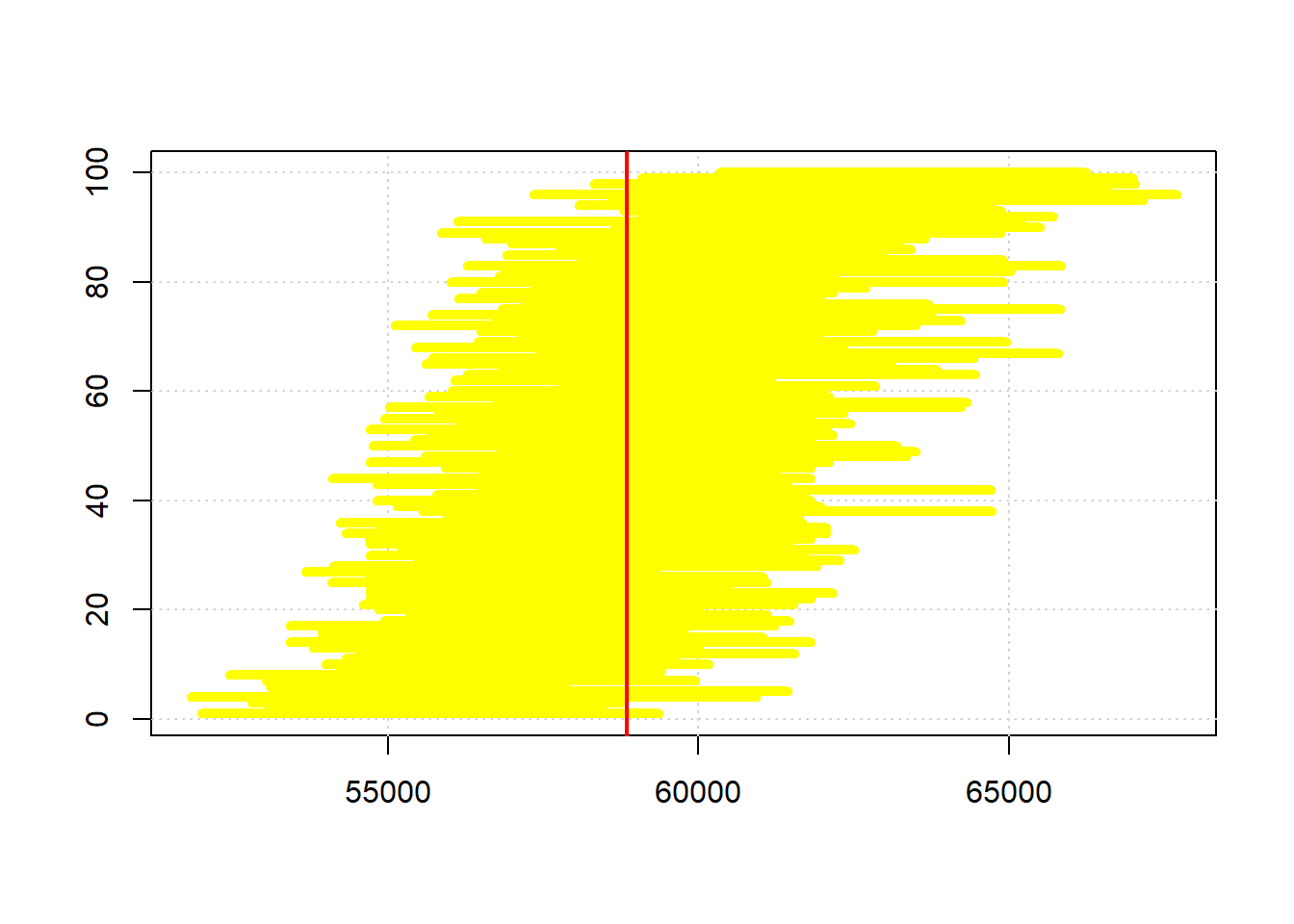
# what proportion of the intervals cover the population median?
inn <- c()
for(i in 1:nrow(endso)){
  btwn <- endso[i,1] <= popn_median & popn_median <= endso[i,3]
  inn <- c(inn, btwn)
}

cat("intervals capture true median",sum(inn)/nrow(endso),"proportion of the time")
## intervals capture true median 0.93 proportion of the timeThe red vertical bar is the population median: it never changes, and is always \(\$58,580\). Our estimate of it does change, because it is based on a different sample every time, and a different set of bootstrap resamples. So that means the intervals (in yellow) are in slightly different places.
To return to our query, how often do the intervals capture the truth? Well, of these 100 intervals, (about) 95 cross with the red vertical line…so that is 95% of the time. Another way to put that is this method, of sampling and bootstrapping, succeeds in capturing the true parameter we care about 95% of the time; it fails around 5% of the time. You can see the intervals that failed at the top and bottom of the plot (it’s not exactly 5% because there is some randomness in our draws).
A natural question here is whether we could do better. That is, could we draw intervals that capture the truth 99% of the time? The answer is yes, but the trade-off is that we would have to use larger intervals. Intuitively, that may not be desirable if we want to tell people that we think the population parameter is between two numbers: we would prefer those numbers to be close together (a narrow interval) rather than farther apart (a wider interval). In the limit, we could always say something like “the population median is (for sure) somewhere between \(-\infty\) and \(+\infty\)”, but it’s hard to think of cases where that is informative.
3.2.5 Confidence Levels
The bootstrap procedure gave us an interval of estimates from our sample. Not just one (point) estimate of the median, but a whole set. That interval is implicitly taking into account variability that comes from random sampling: it is doing this via the idea that we can treat the sample as if it is the population. So, it is as if we are drawing many samples from the population, which is what we wanted to do initially. For the 95% interval, we say we are “95% confident” that it will capture the truth. And the “truth” is just the actual population parameter value we were interested in.
The interval that captures the truth 95% of the time is called the 95% confidence interval. This formulation is very general: the interval that captures the truth 99% of the time is called the 99% confidence interval. And the interval that captures the truth 69.45% of the time is called the 69.45% confidence interval etc etc.
Let’s take a look at the 95% confidence interval relative to the 99% one. You can just run the code above, changing conf to 99. It will come out something like this:
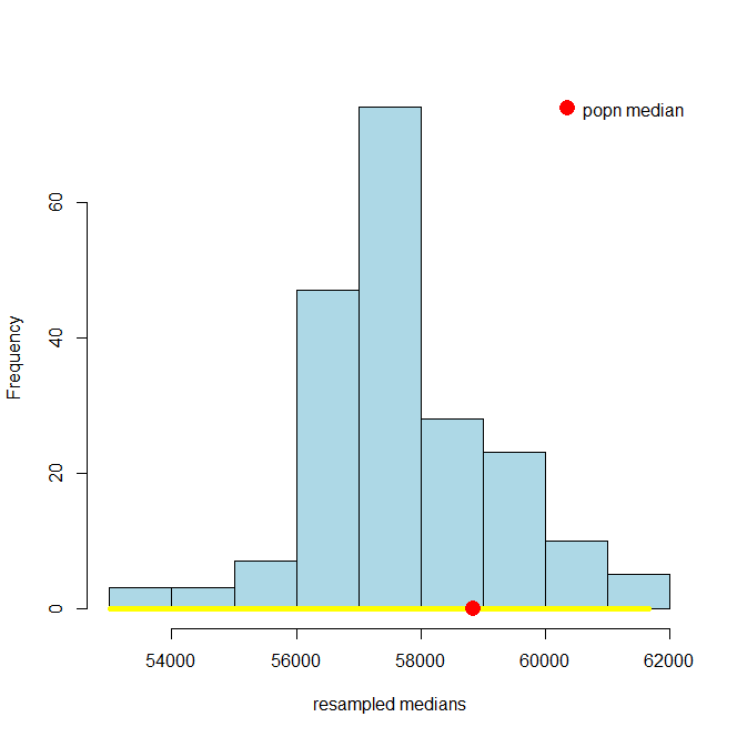
and, just as a reminder, here’s the 95% one:
It is immediately obvious that the 99% confidence interval is wider. What about the 69.45% confidence interval? Here it is:
And here is the 10.4% one:
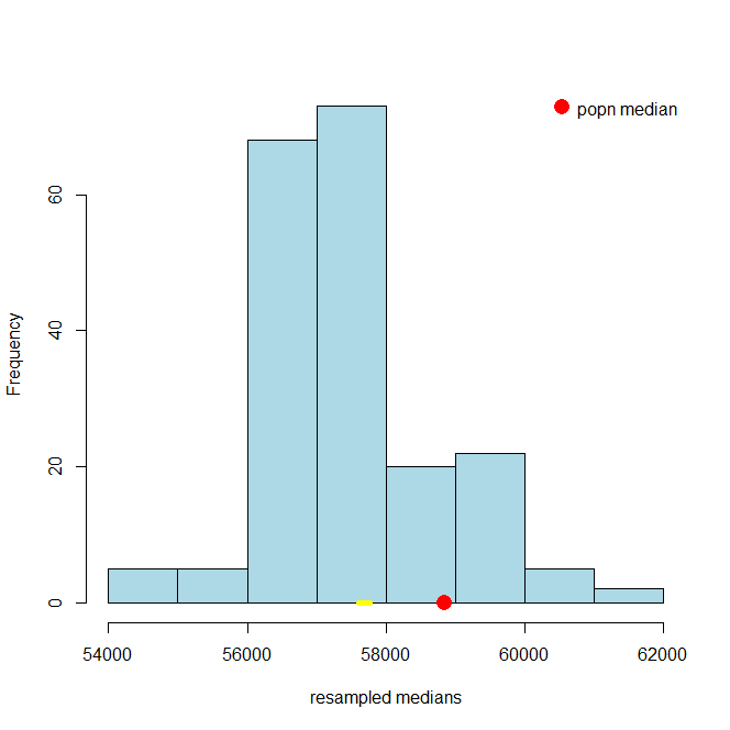
These look much narrower, which makes sense because we are less confident we will capture the truth. In fact, in the case of the 10.3% one, it looks like we missed the true value altogether.
3.2.5.1 (Mis)understanding Confidence Intervals
Confidence intervals are often misunderstood, so we will try to correct some common misconceptions here. First and foremost, in our examples above, we put the “true” population parameter on the histograms to see if the confidence intervals. But in a real example, we will never know the population parameter value. We will try to estimate it, and confidence intervals are a tool for that, but we will never know if we are correct or not (for sure).
Here are four more important facts expressed as true/false statements:
- A given 95% confidence interval contains 95% of a variable’s values
This is false. The interval we constructed for the salary variable does not contain 95% of the salary values. It is an interval specifically with respect to the median of that variable in the population.
- A given 95% confidence interval captures the true value of the parameter with probability 0.95.
This is false, but is an extremely common misconception. Take a look at the figure above where we showed the 95% confidence interval in yellow and the population parameter value in red. That interval either captured the true value of the parameter, or it did not: it didn’t capture it with some probability. That is, the red dot was in the yellow, or it wasn’t (it was, in this case). Now look at the 10.3% confidence interval. It did not capture the true value. It is false to say that it captured it with probability 0.103. In fact, with probability \(=1\) the true value was not in the interval (probability \(=0\) it was in it).
What we can say is that if we repeat the process of forming confidence intervals many many times, 95% of those times we will capture the true parameter value. But this is a different statement to saying a particular interval e.g. \((\$57105,\$58105)\) captures the truth with some probability.
- A given 95% confidence interval captures the true value of the parameter or it does not.
This is true for the exact reason we gave just above. A given confidence interval captures the truth, or it does not. But in a given problem, we will never know whether it did or not.
- A given 95% confidence depends on the random sample it was created from.
This is true and speaks to the fact that the confidence interval is random while the population and its parameters are fixed.
3.3 Hypothesis tests with confidence intervals
One of the most important uses of confidence intervals is for hypothesis testing. In particular, we might want to test a hypothesis that the mean, median or some other summary value of a variable is equal to a particular value (or not). To see how this might work, consider the OKCupid data set. OKCupid is a social networking site where people provide details about themselves and their lives in an effort to find dates. Specifically, we have the details on a random sample of 1112 men from the site, and we will be interested in their average (median) height.
Let’s get the data and look at the sample distribution (this is not the sampling distribution!) of heights. We will put the median height on in red, and mean height in black.
okc <- read.csv('data/okcupid_data_men.csv')
heights <- okc$height
hist(heights, breaks=10, xlim=c(55,85), col="lightblue")
abline(v=quantile(heights, 0.5), col="red", lty=2, lwd=2)
abline(v=mean(heights), col="black", lty=3)
legend("topright", legend=c("median","mean"), col=c("red", "black"),
lty=c(2,3))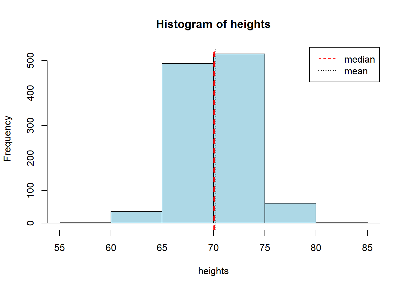
## median: 70.07 inches## mean: 70.25131 inchesThe median man in our sample is just over 70 inches (5’10”, 178cm) tall. Notice that now, in contrast to our NYC salary example, we do not have the population median. Let’s repeat our bootstrapping procedure from above to construct a sampling distribution and a 95% confidence interval. We will start with the same core function, that resamples (bootstraps) rows to build up a set of medians.
bootstrap_median <- function(original_sample, label, replications) {
  # original_sample: data frame containing the original sample
  # label: string, name of the column
  # replications: number of bootstrap samples

  just_one_column <- original_sample[[label]]
  medians <- numeric(replications)

  for (i in 1:replications) {
    bootstrap_sample <- sample(just_one_column, replace = TRUE)
    medians[i] <- quantile(bootstrap_sample, probs = 0.5)
  }

  medians
}
Then we will need a function to take those bootstrapped medians, and return the 95% confidence interval from them.
make_conf_ends <- function(the_medians, conf = 95) {
  lower <- (100 - conf) / 2
  upper <- 100 - ((100 - conf) / 2)
  left <- quantile(the_medians, probs = lower / 100)
  right <- quantile(the_medians, probs = upper / 100)
  return(c(left, right, conf))
}
Now we will call the functions: first the core bootstrapping part (5000 replications), and then the part that makes the interval. Finally we print what we need.
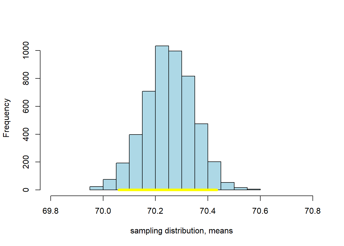
 bbs <- bootstrap_median(okc, "height", 5000)
 intervals <- make_conf_ends(bbs,conf=95)
cat("The",intervals[3],"% CI is (" ,intervals[1],  ","  ,intervals[2], ")"  )
## The 95 % CI is ( 69.99 , 70.16 )This confidence interval should be something like \((69.99 \mbox{ inches}, 70.16 \mbox{ inches} )\). Actually, there is nothing unique about bootstrapping that applies only to the median—as we will now see.
3.3.1 Bootstrapping the Mean
We can bootstrap the mean too. If you don’t know what that average is, we will return to it momentarily. Our point here is just to show that we can apply our methods in more or less the same way as we have done for the median. That said, one thing to note is that the median is robust relative to the mean, which means that the median is not very responsive to outliers (very big or very small values in the tails of the sample). The consequence above was that the median did not vary much as we resampled. We expect the mean to vary more.
We will set up the code in almost exactly the same way as before, except we will take the mean not the median. So:
bootstrap_mean <- function(original_sample, label, replications) {
  # original_sample: data frame containing the original sample
  # label: string, name of the column
  # replications: number of bootstrap samples

  just_one_column <- original_sample[[label]]
  means <- numeric(replications)

  for (i in 1:replications) {
    bootstrap_sample <- sample(just_one_column, replace = TRUE)
    means[i] <- mean(bootstrap_sample)
  }

  means
}

bms <- bootstrap_mean(okc, "height", 5000)
intervalsm <- make_conf_ends(bms,conf=95)
cat("The",intervalsm[3],"% CI is (" ,intervalsm[1],  ","  ,intervalsm[2], ")"  )
## The 95 % CI is ( 70.05969 , 70.4335 )This 95% confidence interval should be something like \((70.06 \mbox{ inches}, 70.43 \mbox{ inches} )\), which is a little wider than the one for the median. We can compare the bootstrapped sampling distribution for the median and mean, respectively, to see this difference. Here’s the sampling distribution for the median:
Here’s the one for the mean:
3.3.2 Bootstrapping Proportions
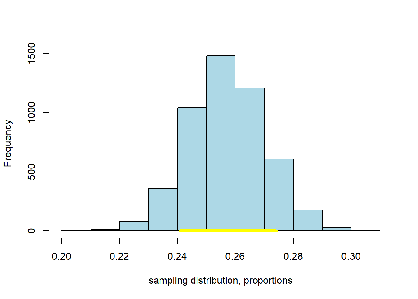
As suggested above, we can bootstrap all sorts of summaries and features of our data. As a final example here we will use the bootstrap to provide a confidence interval on the proportion of men in our sample who describe their body_type as athletic. We won’t belabor things too much; just note that we can run our code in a way almost identical to the above, but for a proportion. This is simply
\[ \frac{\mbox{number of units in the resample responding a particular way}}{\mbox{number of units in the resample}} \]
where the particular response of interest is athletic. Just to show that we can ask for any confidence level of interest, we will specify the 80% here.
bootstrap_proportion <- function(original_sample, label, replications, val) {
  # original_sample: data frame containing the original sample
  # label: string, name of the column
  # replications: number of bootstrap samples

  just_one_column <- original_sample[[label]]
  proportions <- numeric(replications)

  for (i in 1:replications) {
    bootstrap_sample <- sample(just_one_column, replace = TRUE)
    proportions[i] <- length(which(bootstrap_sample==val))/length(bootstrap_sample)
  }

 proportions
}

bmp <- bootstrap_proportion(okc, "body_type", 5000, val= "athletic")
intervalsp <- make_conf_ends(bmp, conf=80)
cat("The",intervalsp[3],"% CI is (" ,intervalsp[1],  ","  ,intervalsp[2], ")"  )
## The 80 % CI is ( 0.2410072 , 0.2742806 )Again, we can plot the result:
3.3.3 Testing Hypotheses with Confidence Intervals
We have established that
The \(p\%\) confidence interval gives us a set of numbers: if we follow our procedure many, many times, \(p\) times out of 100 the interval will capture the true, population value of the parameter we care about.
This useful if we just need an (interval) estimate of the population parameter. But it confidence intervals allow us to do more than that. They also allow us to test hypotheses in a way similar to our efforts with \(p\)-values earlier.
Recall that the mean height of the men from the dating site was \(70.25\) inches. Via the CDC website we can look up the US population figure: it is \(69\) inches for men.
Let’s set up a hypothesis test:
- our null hypothesis is that the men on OKCupid do not differ, on average, from the US population as a whole. Any difference we saw is just due to random sampling error.
- our alternative hypothesis it that the men on OKCupid do differ.
We need to ask whether 69 inches is a ‘plausible’ value of the average height of an OKCupid man. If it is plausible, then we fail to reject the null. If it is implausible, we reject the null and claim there is a statistically significant difference.
The particular way we will do this is via the confidence interval. If the 95% confidence interval of the mean includes 69, we deem 69 a plausible average value, and we fail to reject the null. In this case, the 95% confidence interval was \((70.06 \mbox{ inches}, 70.44 \mbox{ inches} )\). This does not include 69, and we can therefore reject the null hypothesis. In fact, we can reject the null at the 5% level. And this is completely general:
the \(p\)-percent confidence interval corresponds to \(100-p\) level of a test.
By extension then: if we have a 99% confidence interval, we can reject the null at the 1% level if it doesn’t contain the claimed value. For our OKCupid men’s heights, the 99% confidence interval on the mean is \((70.01 \mbox{inches}, 70.49 \mbox{inches})\) so, again, we reject the null of no difference (this time at the 0.01 level).
One final observation here is that using confidence intervals in this way is equivalent to doing a two-tailed test: our alternative hypothesis in this case was of a “difference”, not a direction.
3.3.4 Working with Bootstraps
In this part of the chapter, we have relied on bootstrap sampling to form confidence intervals. In general, this method works well, but it is worth just noting some caveats about performance for when you come to use it in your own studies.
First, bootstrapping works well when the sample you have is large and random. Exactly how large is debatable, but we need the logic of the Law of Large Numbers to make sure our sample isn’t too far, on average, from the nature of our population.
Second, bootstrapping can be expensive. Here we did, say, 5000 replications. This was fast enough, but generally as the number of replications increases our simulated estimate of the quantity of interest (here, the confidence interval) becomes more accurate. In certain problems where it is very important to get the interval correct—say in medical dosing problems—we might want to run 10000 or 10000 resamples. That number of simulations could be time consuming, depending on the problem at hand.
Third, bootstrapping works best when the “true” sampling distribution is approximately normally distributed. We will cover the normal distribution later in this chapter, but the point is that it should be roughly symmetric and single peaked.
Fourth, and related, bootstrapping works well when we are trying to characterize the behavior of “central” statistics that are near the middle of the distribution—like medians, or means. It can fail to resample properly when what we are trying to provide a confidence interval for is an extreme value, like the minimum or maximum. This is basically because, in a given sample, it may not be able to find enough of these very large (or very small values) to build up a distribution from.
3.4 Working with the mean
The mean is a vital measure of central tendency in data science, and we will now review its definition and properties. By definition the mean is
the sum of all the observations for that variable in the sample divided by the total number of observations
For a given sample, we sometimes refer to the mean as “xbar” and write it \(\bar{x}\). In line with the definition above we can write:
\[ \bar{x} = \frac{1}{n}\sum^{i=n}_{i=1} x_i \]
Taking the components in turn we have: - \(x_i\) is the \(i\)th observation (so, just a number in the sample) - \(\sum\) tells us to sum these observations from the first (\(i=1\)) to the last (\(i=n\)) element in the sample - \(\frac{1}{n}\) that we multiply what we get by one divided by the sample size, which is equivalent to dividing by the sample size.
Thus, if our sample of values is
\[ 1, 3, 3, 3, 5, 5, 7 \]
The mean is
\[ \bar{x} = \frac{1+3+3+3+5+5+7}{7}=3.86. \]
3.4.1 Properties of the Mean
Notice that the mean need not appear in the sample: for example, in our sample above 3.86 is not one of the elements. Indeed, the mean need not be an integer, even if all elements of our sample are integers (consider, for example, the mean number of children in US families).
Second, the mean acts as a smoother. What we mean by this is that it takes values throughout the distribution, and pushes together around the middle. It does this by dividing out by the sample size.
Finally, the mean is weighted sum. What we mean by this is that we add up all the various values in the sample but we weight the more common ones more heavily than the less common ones. So, for example, we can rewrite our calculation above as
\[ \bar{x} = (1\times \frac{1}{7}) + (3\times\frac{3}{7}) + (5 \times \frac{2}{7}) + (7\times\frac{1}{7})=3.86 \]
The number 3 occurs three times in our sample, so it is weighted \(\frac{3}{7}\), whereas the number 5 only appears twice, so it receives a weight \(\frac{2}{7}\). The fact that the mean is a type of weighted sum will be important later when we consider how the Central Limit Theorem applies to it.
3.4.2 The mean versus the median
We have already mentioned that the mean is less robust than the median. By definition, of course, the median is in the “middle” of the sample distribution. But the mean need not be. To see these two things, consider the following example of a set of salaries in thousands of dollars per week:
\[ 1,3,3,3,5,7,7,9,11 \]
The median of these numbers is 5 (so, $5000 dollars a week). The mean is 5.44. These are fairly similar. Now suppose the largest earner is replaced with an outlier: someone with a very high salary. Then we have:
\[ 1,3,3,3,5,7,7,9,1100 \]
and the mean moves to 126.44. That is, it is “pulled” by the outlier well away from the middle of the distribution: 126.44 is larger than all the values, bar one. Meanwhile, the median does not move: it continues to be 5 and is “robust” to outliers in that sense.
3.4.3 Skew
In the example above, when the mean moved much higher than the median, it pulls the distribution of the sample out to the right (towards bigger numbers). We say that if
- the histogram has one tail
- and the mean is far larger (to the right) of the median
The distribution has a positive or right skew. Salaries and house prices are classic examples of things with a positive skew. Take a look at the distribution of NYC salaries below. The mean of this data is around \(\$62000\) dollars, while the median is around \(\$59000\) (as we saw above). We can see the “right” tail of the distribution is pulled out away from the mass of the rest of the distribution, in a way that is not true on the lower end of the salary scale.
When the histogram has one tail, and the mean is far smaller (to the left) of the median, we say the distribution has a negative or left skew. Something like the length of pregnancies in humans has a negative skew: some babies are born earlier (premature), but everyone is born by nine months. The nine months acts as an upper bound, and this brings the mean down below the median.
3.4.4 Symmetry
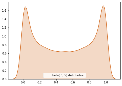
We will say that a distribution is symmetric if its median and mean are the same. An obvious example, which we will return to below, is the normal distribution. For the normal, the mean, median and mode are all equal, and it is unimodal (there is one peak).
But symmetry can describe non-single peaked distributions too, like the beta. Here is an example:
3.4.5 Variability: the “Standard Deviation”
We have spent some time on averages, including the mean and the median. But we often want to also measure the dispersion or spread of data too. One way to do this was the Interquartile Range, which told us how large the “middle” of the distribution was.
Another popular measure is the standard deviation which tells us
on average, how far away are the data points from the sample mean?
It is mathematically defined as:
\[ \mbox{SD} = \sqrt \frac{\sum(x-\bar{x})^2}{n} \]
where:
- \(x\) is each data point
- \(\bar{x}\) is the mean of the sample
- \(n\) is the sample size
The operation to calculate the standard deviation is simple:
- subtract the mean from each value of the data: \(x-\bar{x}\)
- square the outcome of this subtraction: \((x-\bar{x})^2\)
- add all these squared values together: \(\sum (x-\bar{x})^2\)
- divide this sum by \(n\): \(\frac{\sum (x-\bar{x})^2}{n}\)
- take the square root of this number: \(\sqrt \frac{\sum(x-\bar{x})^2}{n}\)
Python can calculate this very quickly using functions like np.std() in numpy. In some textbooks, you will see a very slightly different formula:
\[ \mbox{SD} = \sqrt \frac{\sum(x-\bar{x})^2}{n-1} \]
This differs to the previous formula in that the denominator is \(n-1\), rather than \(n\). The purpose is to fix a bias that occurs in small samples. The use of \(n-1\) is known as Bessel’s Correction. When the sample size is large, the difference between \(n\) and \(n-1\) is small, and thus the difference that Bessel’s Correction makes is small. Some software implements Bessel’s Correction automatically by default, but this is not true of np.std()—though you can add that correction if you need it.
3.4.6 Comparing Variability
A larger standard deviation means the values are more spread out around the mean. A smaller one means the values are more tightly packed around the mean. Obviously, the mean will differ, depending on the data. To see this, let’s return to our OKCupid sample of men, and draw a histogram of their heights, while reporting the standard deviation of those heights.
 okc <- read.csv('data/okcupid_data_men.csv')
 heights <- okc$height
 hist(heights, freq=FALSE, xlim=c(55,85), col="lightblue")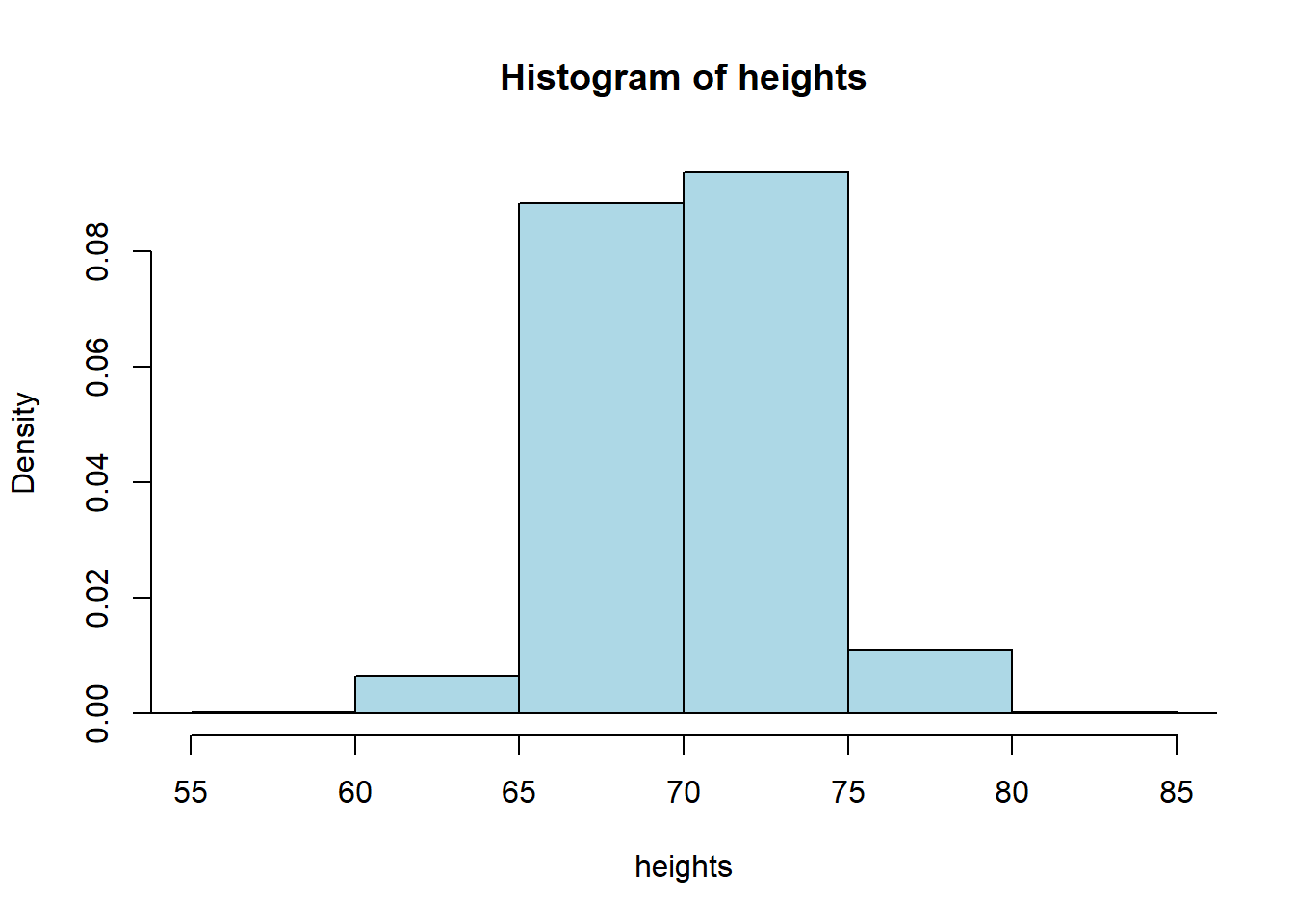
## men's height SD = 3.147948Alright, so the standard deviation of the men’s heights is 3.15 (inches). What about the women? Let’s load up the women’s data:
 okcw <- read.csv('data/okcupid_data_women.csv')
 heightsw <- okcw$height
 hist(heightsw, freq=FALSE, xlim=c(55,85), col="lightblue")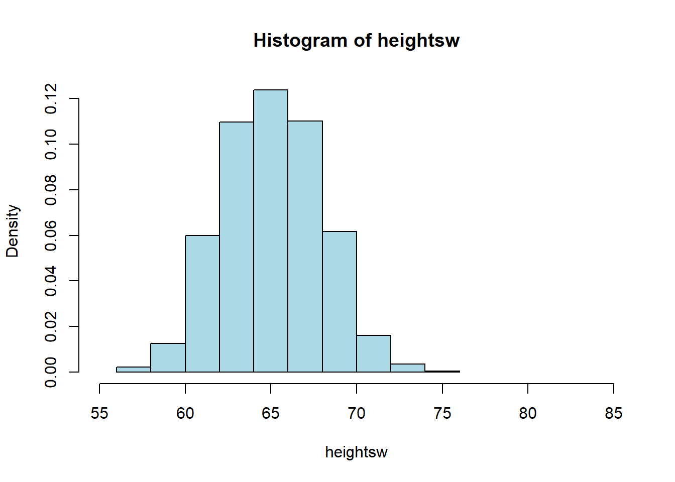
## women's height SD = 2.838381Their standard deviation is lower: 2.84 inches. This makes sense, when we look at the spread of height values in comparing the men to the women: the men’s distribution is a bit “fatter.”
Notice that, as expected, the women’s mean height is lower (they are shorter on average). So the correct interpretation is that the women’s heights are more tightly packed around a lower mean.
3.4.7 Standard Deviation and Variance
Above we said that the men’s height standard deviation was 3.14 inches. The units are deliberate: we use inches because the standard deviation is in whatever units the original measurement was in. We are saying that, on average, the men’s heights are 3.14 inches away from the mean man’s height.
Intimately related to the standard deviation is another measure of spread: the variance. Literally it is
the square of the standard deviation.
Given the mathematical structure we gave earlier, this means the variance is
\[ \mbox{var} = \frac{\sum(x-\bar{x})^2}{n} \]
note the absence of a square root sign. We will not spend too much time on the definition of the variance and its importance, except to say that it represents a particularly important quantity that describes the shape of the distribution under study. In terms of intuition, note that—as with the standard deviation—a larger variance implies a larger spread, while a smaller one implies a narrower one.
Finally, note that the variance in measured in units-squared. In our running heights example then, the variance of the men’s heights is \(3.14^2\) or 11.15 “inches squared”.
3.5 Normal distribution
The mean and the variance (the standard deviation squared) are important for characterizing the normal distribution. This is one of the most important distributions in statistics, in part because it is empirically common—a lot of things are normally distributed in nature. But it is also important for the related reason that we have learned a lot about it. That knowledge of the normal facilitates a great deal of statistical reasoning, in terms of assumptions we make and inference we draw.
First, notice that the normal goes by many other names: it is sometimes referred to as a Gaussian distribution (named after Gauss). It is sometimes referred to as the “bell curve”, because it looks like a bell—though this is imprecise and may lead to confusion (a lot of distributions look like a bell).
Second, as noted above, the normal distribution is characterized by its mean and variance (equivalently, its standard deviation). It is unimodal (has one mode) and that mode is equal to its median, which is equal to its mean. So it is symmetric.
The mean tells us the “location” of the normal in terms of its base on the \(x\)-axis. The standard deviation tells us how spread out it is around that mean. In statistics, when describing the normal, we often use the Greek letter “mu” (\(\mu\)) to stand in for the mean; and we use “sigma” (\(\sigma\)) for the standard deviation. We write “sigma squared” (\(\sigma^2\)) for the variance.
Though you don’t need to know this for the course, here is the formula for the normal distribution. See if you can see the mean and standard deviation in it:
\[ f(x) = \frac{1}{\sigma\sqrt{2\pi}} \exp\left( -\frac{1}{2}\left(\frac{x-\mu}{\sigma}\right)^{\!2}\,\right) \]
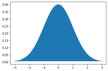
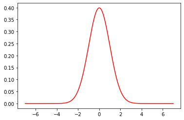
As an example of a normal distribution, consider one with mean \(\mu =0\) and variance \(\sigma^2=1\). This looks as follows:
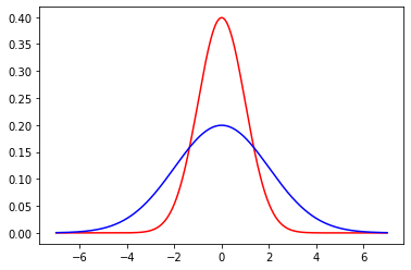
Now, let’s add (in blue) a normal distribution with the same mean, but a large standard deviation (\(\sigma=2\)). Note how it is centered at the same place as the previous normal, but more “spread out”, in line with its larger variance.
Finally, we will add (in green) another normal, with a standard deviation of 2, but with a mean of 2. Note how it shifts up the \(x\)-axis, but looks otherwise similar to the blue one.
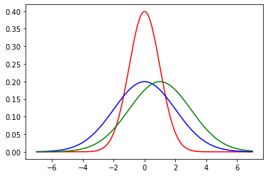
For convenience, a particular normal is sometimes written as \(\mathcal{N}(\mu,\sigma^2)\) or \(\mathcal{N}(\mu,\sigma)\) depending on whether you are giving the variance or standard deviation. So, for example, our green distribution might be rendered as \(\mathcal{N}(2,4)\) (in the variance case) or \(\mathcal{N}(2,2)\) (in the standard deviation case).
As we hinted above, many many things are normally distributed in nature, like human heights or birth weights.
3.5.1 Features of the normal: the “empirical rule”
The symmetry of the normal distribution, along with some other important features, leads to the Empirical Rule. This rule states that if a variable is normally distributed…
- approximately 68% of the observations will be between one standard deviation above and below the mean…
- approximately 95% of the observations will be between two standard deviations above and below the mean…
- approximately 99% of the observations will be between three standard deviations above and below the mean.
This rule is shown graphically below:

To understand the Empirical Rule, notice that the mean (\(\mu\)) and standard deviation (\(\sigma\)) are just numbers. They take particular values, and so writing \(\mu+2\sigma\) literally means “the value of the mean plus the value of two times the value of the standard deviation”.
To give an example, suppose we have women’s heights, which we believe to be normally distributed. The mean of those heights is \(\mu=65\) inches. The standard deviation is \(\sigma=3.5\) inches. What does the Empirical Rule say?
It says: > - approximately 68% of the observations will be between one standard deviation above and below the mean…
Well, one standard deviation above the mean is \(65+3.5=68.5\) (we just add one standard deviation value to the mean value); one standard deviation below the mean is \(65-3.5=61.5\) (we just subtract one standard deviation value from the mean value). So: approximately 68% of all women have heights between 61.5 and 68.5 inches. Next:
- approximately 95% of the observations will be between two standard deviations above and below the mean…
Well, two standard deviations above the mean is \(65+(2\times 3.5)= 72\) (we just add two standard deviations to the mean value); two standard deviations below the mean is \(65-(2\times 3.5)= 58\) (we just subtract two standard deviations from the mean value). So: approximately 95% of all women have heights between 58 and 72 inches. Next:
- approximately 99% of the observations will be between three standard deviations above and below the mean.
Well, three standard deviations above the mean is \(65+(3\times 3.5)= 75.5\) (we just add three standard deviations to the mean value); three standard deviations below the mean is \(65-(3\times 3.5)= 54.4\) (we just subtract three standard deviations from the mean value). So: approximately 99% of all women have heights between 54.4 and 75.5 inches.
In a sense, it is not surprising that almost all women’s heights are between 4 foot 6 and a half inches and almost six foot, four inches. But this is nonetheless quite informative about how a variable is distributed, how likely we are to see a case above or below a certain point, and so on.
3.5.2 \(Z\)-Scores
We can make the idea of the Empirical Rule more general. Rather than focusing on “whole numbers” of standard deviations (so, 1 or 2 or 3), we can give every observation a score in terms of where it lies relative to the mean of the normal distribution from which it was drawn.
We will define the \(Z\)-Score of an observation as
the value of the observation minus the mean of the distribution, divided by the standard deviation of the distribution.
That is:
\[ Z= \frac{X-\mu}{\sigma} \]
where: - \(X\) is the value of the observation (the specific height, or weight, or income or whatever) - \(\mu\) is the value of the mean of the normal distribution from which it is drawn - \(\sigma\) is the value of the standard deviation of the normal distribution from which it is drawn
The intuition is that, but converting the observation to a \(Z\)-Score, we are putting it in terms of “standard deviations away from the mean”. If the \(Z\)-Score is positive the observation is above the mean; if the \(Z\)-Score is negative the observation is below the mean.
3.5.2.1 Men’s weights as \(Z\)-Scores
Suppose that the mean weight of a man in the US is 191 pounds ($=\(191 lbs). Suppose the standard deviation of weights is 43 pounds (\)=$43 lbs). Consider three observations (people) and their weights:
176 lbs. Then: \(Z=\frac{176-191}{43} = -0.34\)
302 lbs. Then: \(Z=\frac{302-191}{43} = 2.58\)
80 lbs. Then: \(Z=\frac{80-191}{43}= -2.58\)
Notice that the second (302 lbs) and third (80 lbs) men were equally far from the mean, but above and below it respectively—in both cases, they are 2.58 standard deviations away.
3.5.3 Standard Normal
When we subtract the mean and divide by the standard deviation, we are standardizing our distribution. Whatever normal distribution we start with, whatever its mean and variance, we will end up with a normal distribution that has: - mean equal to zero (\(\mu=0\)) - standard deviation (and variance) equal to one (\(\sigma=\sigma^2=1\))
This distribution is called the standard normal, and is written as \(\mathcal{N}(0,1)\). Note that there is no ambiguity as to whether the ‘1’ is for the variance or the standard deviation, because there are the same in this special case.
The standard normal look as we would expect (it is centered at zero) and, in fact, we met it already above:
To reiterate: the distribution of \(Z\)-Scores, sometimes called the \(Z\)-distribution, is standard normal.
3.5.4 The \(Z\)-distribution and probabilities
Converting observations to \(Z\)-scores allows us to calculate probabilities of seeing units of different values. To get the intuition, recall when we showed that, based on \(Z\)-score, 99% of all women were between 54.4 and 75.5 inches. This immediately suggests that the proportion of women taller than 75.5 inches is very small. Another way to put this is that the probability that a woman randomly drawn from the population is taller than 75.5 inches is very small.
To make this more formal, consider the following question:
- what proportion of women are taller than 5 feet 9 inches?
This is the same as asking what proportion of women have heights in excess of 69 inches, which itself is the same as asking what the probability of a random woman being over 69 inches tall.
In \(Z\)-score terms, 69 inches is
\[ Z = \frac{65-69}{3.5} = 1.14 \]
So we want to know the probability of observing \(Z>1.14\) for a random woman in the population.
To understand this problem graphically, consider the following figure:
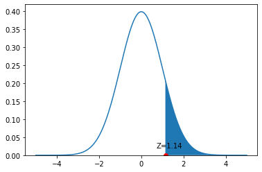
We have an observation with \(Z=1.14\). That’s a little above the mean, as we see on the figure. We want to know what proportion of the distribution is larger than this value. This is equivalent to asking about the size of the blue colored area is: from the \(Z=1.14\) point out to infinity.
To calculate this, we can ask R “for a standard normal distribution, what is the size of the area to the right of \(Z=1.14\)?” In practice, we do this by asking a more roundabout question: “what is the size of the total distribution minus the area that begins 1.14 standard deviations below the mean?” To do this, we need a function pnorm:
The “1” here captures the fact that all distributions sum to one (the probability of observing all the possible heights must be one in total). We subtract the 1.14 to tell us how much of the distribution remains once we remove those folks below that height.
This comes out to a probability of around 0.127; equivalently, that 12.7% of women are taller than 5’9”.
Let’s consider a different problem. Suppose we want to know what proportion of women are under 5’3”. This is equivalent to asking what proportion of women have a \(Z\)-Score less than \(\frac{63-65}{3.5}=-0.57\). And that is equivalent to asking what proportion of the height distribution is shaded blue in this figure:
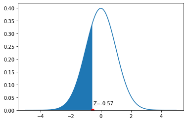
Now, we can simply ask for:
## [1] 0.2843388This works, because pnrom is set up to tell us what proportion of the distribution is below the argument we gave it (a \(Z=-0.57\)). And it is around 0.28: the probability of a random women having a height less than or equal to 5’3” is 0.28. It immediately follows the proportion of women taller than 5’3” is 1-0.28=0.72. That is the entire area to the right of the blue color.
Finally, suppose we want to know the proportion of observations between two values. Let’s say, the proportion of women between 5’4” and 5’8”. We need the proportion of the normal between a \(Z\)-Score of \(\frac{64-65}{3.5}=-0.28\) and \(\frac{68-65}{3.5}=0.86\). On the density, this is the blue area pictured:
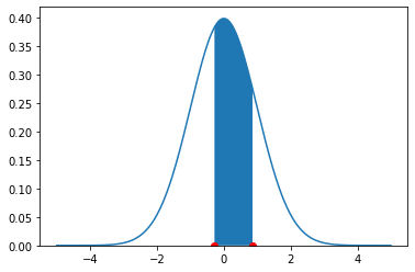
There are several different ways to proceed here. Perhaps the simplest is to request the area above the higher number (so, \(>0.86\)), then request the area below the lower number (so, \(< -0.28\)) and then subtract both areas from 1. Hence:
## [1] 0.4153667Or around 41.4%. This implies that a random draw will select a woman between 5’4” and 5’8” with probability 0.415.
3.6 Central Limit Theorem
Recall that in earlier chapters we discussed the sampling distribution of a statistic. We said it was the distribution (the histogram) of how all the values a statistic might take if we drew many many samples from a population. Subsequently, we used the bootstrap as a method to obtain the sampling distribution when we only had one (large, random) sample. Now, we turn to the case of the mean and ask what its sampling distribution looks like.
As we will see, the sampling distribution of the sample mean has very special properties and characteristics. In particular, under certain mild circumstances, it is normally distributed, no matter how the underling variable was distributed. This is a surprising but important result, and is due to the Central Limit Theorem which we will discuss in more detail below.
3.6.1 A non-Normal Population: Horse Prices
We begin with a data set on a population that is certainly not normally distributed. In particular, the prices of horses for sale online (via a specific website). As we can see, prices start as low as zero but can go very high: it’s a right skewed distribution, with a mean considerably higher than its median.
 horses <- read.csv('data/horse_data.csv')
hist(horses$price, breaks=40, col="lightblue", main="")
points(mean(horses$price), 0 ,  col='red', cex=2, pch=16)
points(median(horses$price), 0 ,  col='blue', cex=2, pch=16)
legend("topright", pch=c(16,16), col=c("red","blue"), legend=c("mean", "median"))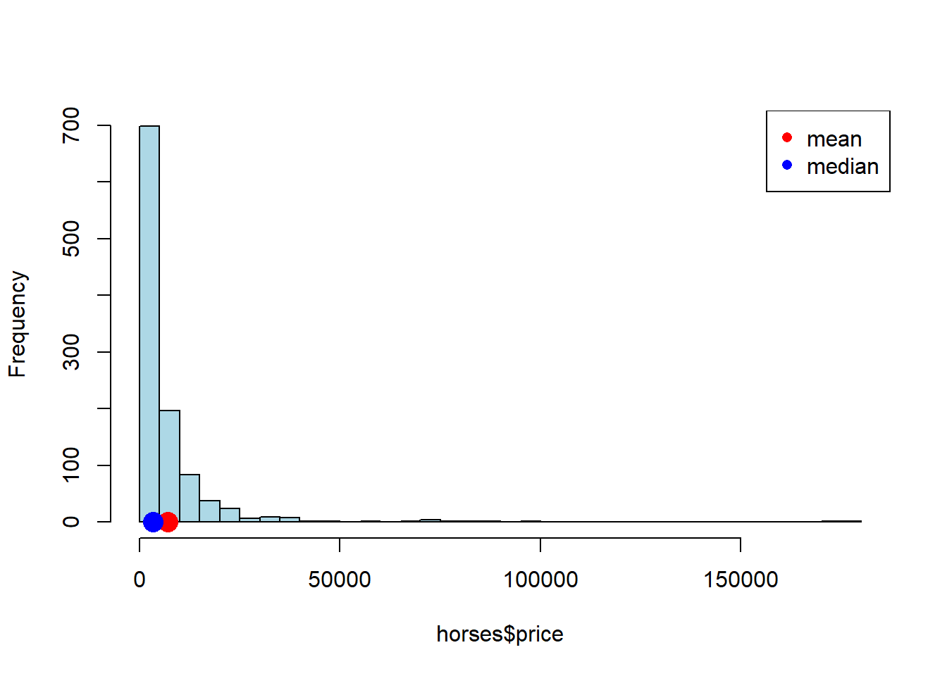
3.6.2 Sampling Distribution of Mean Price
Let’s build a sampling distribution of the mean price. We will need a sample size \(n\), to draw from the population and then we will build up a sampling distribution. In particular, we will sample many (say, 10000) times from the population (each sample of size \(=n\)). Because we will want to vary the sample size, let’s write a single function to do this.
simulate_sample_mean <- function(data, label, sample_size, repetitions) {
  means <- numeric(repetitions)

  for (i in seq_len(repetitions)) {
    new_sample <- sample(data[[label]], size = sample_size, replace = TRUE)
    means[i] <- mean(new_sample)
  }

  # Plot histogram of sample means
  hist(means,
       breaks = 20,
       col = "lightblue",
       border = "black",
       xlab = "Sample Means",
       main = paste("Sample Size", sample_size),
       xlim = c(2000, 12000))

  # Print summary statistics
  cat("Sample size:", sample_size, "\n")
  cat("Population mean:", mean(data[[label]]), "\n")
  cat("Average of sample means:", mean(means), "\n")
  cat("Population SD:", sd(data[[label]]), "\n")
  cat("SD of sample means:", sd(means), "\n")
}
The simulate_sample_mean function first sets up a vector called means to store its results. Then, for each one of the repetitions, it draws a sample of a pre-specified size of prices from the population data. It takes the mean of that sample and records it every time.
Subsequently, it will plot those means, giving the sampling distribution. It will then report the sample size, the population mean (the parameter we are trying to estimate), the average of the sample means (which will be relevant later), the population standard deviation and the standard deviation of the sampling distribution (the standard deviation of the sample means).
Let’s start with \(n=100\).
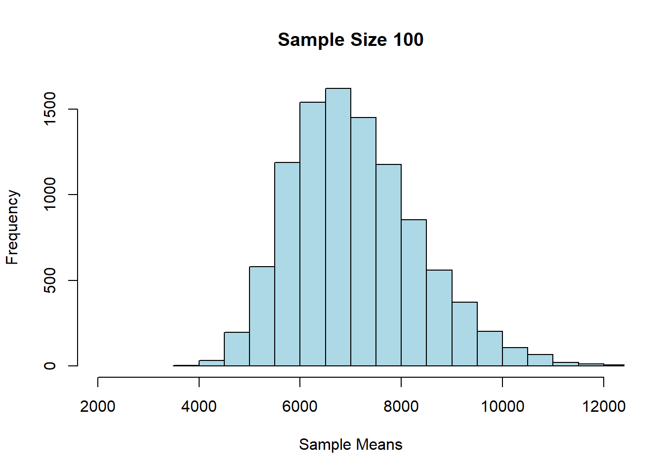
## Sample size: 100
## Population mean: 7084.903
## Average of sample means: 7091.656
## Population SD: 12696.5
## SD of sample means: 1269.093
Alright, let’s try \(n=200\) each time:
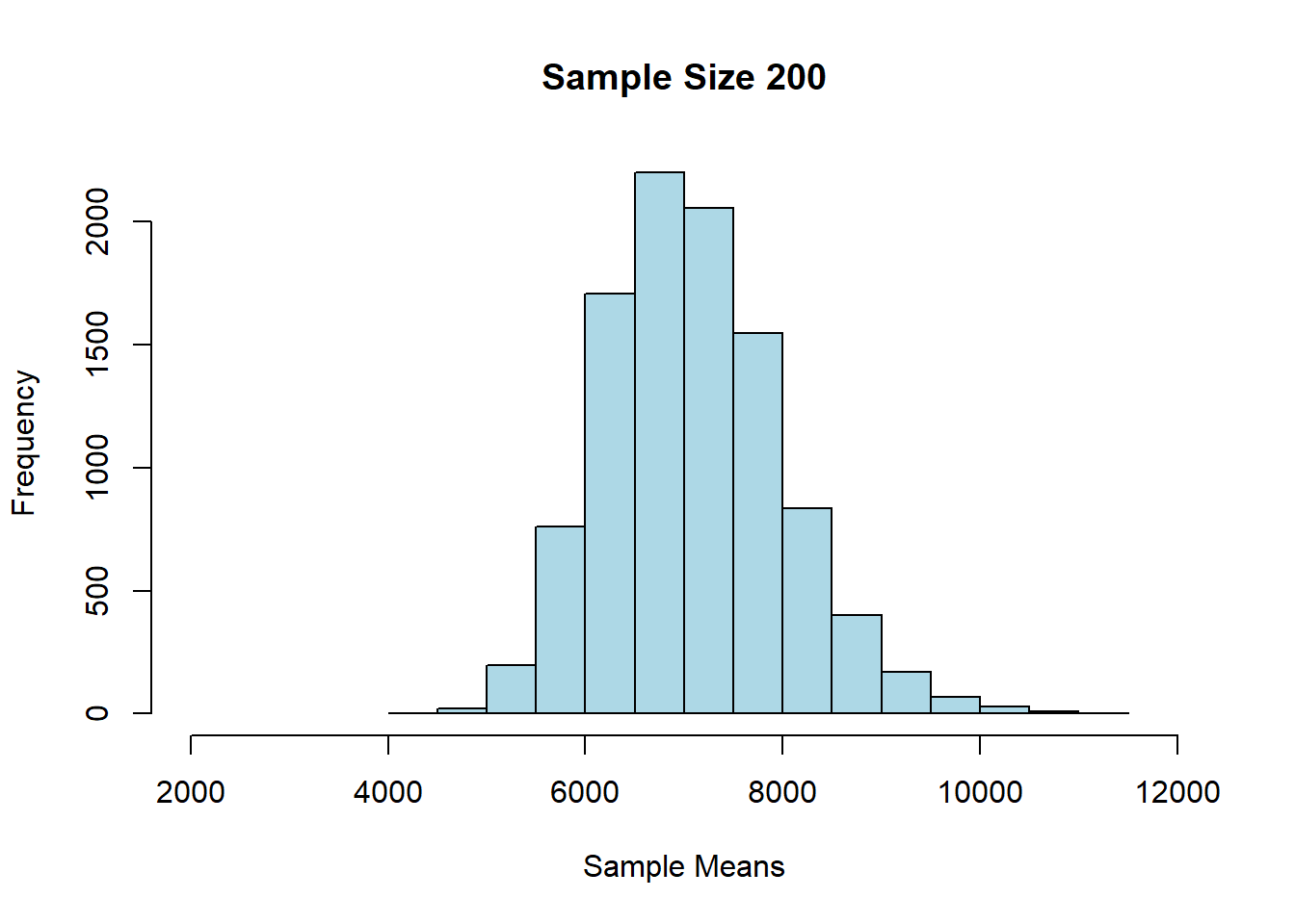
## Sample size: 200
## Population mean: 7084.903
## Average of sample means: 7093.452
## Population SD: 12696.5
## SD of sample means: 895.2337
And finally, \(n=1000\):
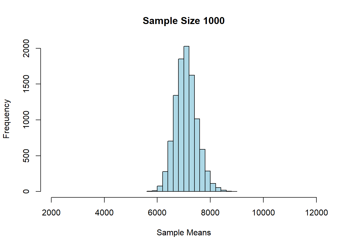
## Sample size: 1000
## Population mean: 7084.903
## Average of sample means: 7087.357
## Population SD: 12696.5
## SD of sample means: 405.3154
3.6.3 Findings: Central Limit Theorem
First, we notice that as \(n\) gets larger, the mean of the sampling distribution gets closer and closer to the mean of the population distribution. This makes sense, insofar as we know large samples will generally lead to better estimates of the parameter.
We also see that the sampling distributions are approximately normal: they are symmetric, and unimodal around their means. This is perhaps surprising, given that the underlying prices were not normally distributed. In fact, this is a very general result called the Central Limit Theorem. It says that
if we generate a reasonably large number of samples, from any population, for large enough sample sizes, the sampling distribution of the mean is normally distributed.
We will leave it a little vague as to how many samples one needs, and how large they need to be, but certainly once our sample size is above 30, we should see the result take hold.
The other thing we notice about the sampling distribution is that its mean is equal to the population mean. So, the CLT implies that the average of the sampling distribution will be where the population mean is. That will typically be very useful given we won’t have the population mean, but will have the sampling distribution mean (say, via the bootstrap).
Finally, notice that as the sample sizes got larger, the standard deviation of the sampling distributions got smaller: it started out about 1300 (\(n=100\)), then fell to about 900 (\(n=200\)), and then to about 400 (\(n=1000\)). A smaller standard deviation is good, because it implies that our estimate is on average closer to the truth (the population mean). Again, this makes sense given what we know about larger samples.
But what is the exact relationship between the size of the underlying sample (\(n\)) and the standard deviation of the resulting sampling distribution?
3.6.4 Standard Error
To understand the relationship, note first a particular piece of terminology: we use the term standard error to mean
the standard deviation of the sampling distribution of the sample mean
When it is “large” the sampling distribution is spread out; when it is small, the sampling distribution is “narrow”. In particular, there is a non-linear relationship between \(n\) and the standard error. It looks something like this:
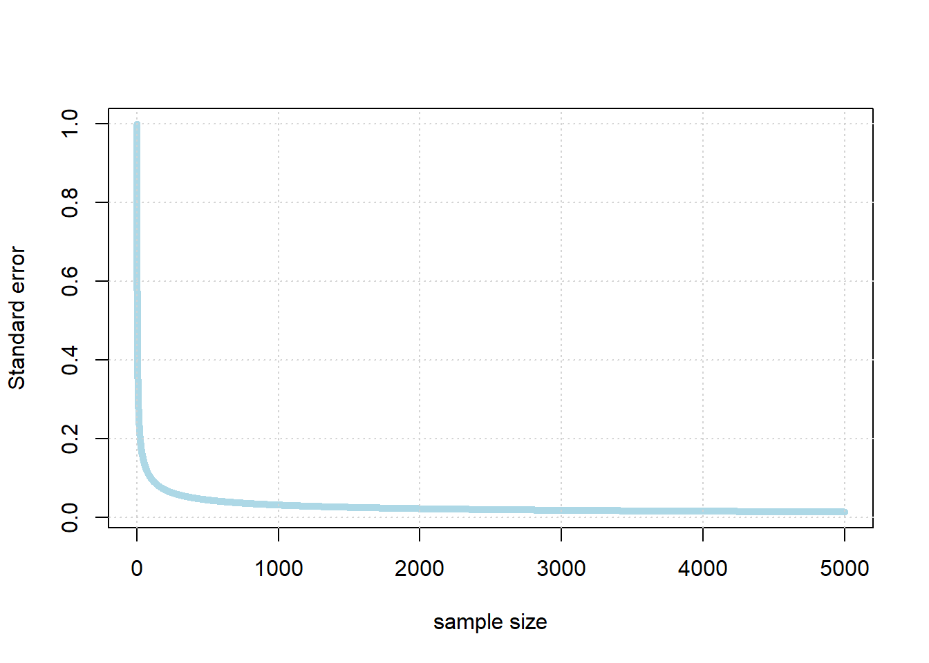
So, the standard error falls very quickly at first as the sample gets larger. But eventually, it begins to flatten off: it still continues to fall every time the sample increases, but the effect is not linear. For example, if we multiple the sample by ten, we will not be able to decrease the standard error by ten.
In fact, the standard error is increasing in the square root of the sample size. So, if you want to decrease your standard error by 10 times what it currently is, you need to increase your sample size by 100 times what it currently is (!)
In practical data science, this is good and bad news. On the one hand, the bad news is that, while getting a larger sample leads to more accurate estimates, at a certain point it is very hard to get much better estimates. That is, unless one has extraordinary resources to produce much larger samples. On the other hand though, it is good news insofar as once you have a “fairly large” sample for an estimation problem, it does not help much to increase it.
So what is “fairly large”? It depends on the problem, but for many public opinion surveys, having a sample of around 1000-2000 people is enough to estimate the percentage of the population who support a given position (e.g. proportion voting Republican, proportion voting Democrat, proportion who are pro-Choice, proportion who are pro-gun restrictions etc) quite well. In particular, it is enough to get the confidence interval for a proportion estimated to be within \(\pm 3\) or \(\pm 4\) of the true percentage of people that support that position in the population. Indeed, the harder problem is typically not getting enough respondents, but rather making sure they are “randomly” sampled correctly.