5 Prediction 2
We begin this chapter with classification problems. That is, situations in which we want to place observations into categories. If we are successful at this, we can predict what category future or incoming observations should be placed in, given what we know about those observations (their \(X\) variables). To keep things simple, our categories will be binary in nature (i.e. there are two categories), but classification is much more general than that. We will begin with some real examples of such problems.
5.1 Classification Examples
5.1.1 Example 1: credit card fraud
Banks and other financial institutions monitor the use (and abuse) of credit cards. They want to know if a particular transaction is
- “usual” (\(Y=0\))
- “fraudulent” (\(Y=1\))
Here, the type of transaction is the outcome or dependent variable (\(Y\)) and take one of two values: \(0\) or \(1\). Rather than being the numbers themselves, these are discrete categories. The categories are mutually exclusive meaning that a transaction cannot be in both categories, and they are jointly exclusive meaning that there are no other categories.
The value – the category – of \(Y\) is predicted by a set of \(X\) variables. These variables come from the credit card owner’s personal purchase history (e.g. the location they usually buy things, the types of items they regularly purchase etc). There may also be \(X\) variables that come from other credit card holder’s purchase histories. Indeed, other customers will be a key source of information about fraudulent transactions insofar as a given customer may never have reported a previous transaction as fraudulent but other customers will have done. So, for example, transactions that are very large relative to a customer’s usual amounts (say \(\$2000\) in a single purchase, where the average is more like \(\$6\)), and for items that are known to be commonly purchased with stolen credit cards (like bottles of hard liquor that can be relatively easily resold for cash) will be flagged as fraudulent.
Ultimately, the goal is to use past relationship between \(X\) and \(Y\) to predict the future class of transactions. Of course, it may be somewhat helpful to know that a previous purchase should not be billed to the customer; but the immediate goal is to decline fraudulent purchases as they happen—and potentially act on that information by e.g. alerting law enforcement. With this in mind, ambiguous cases, i.e. cases where we cannot easily assign the correct category, take on special importance. Suppose, for example, the purchase was of alcohol, but not very expensive alcohol, yet far from the bank customer’s home. Should that be classified as legitimate or fraudulent? Making a mistake either way is obviously costly: someone gets away from stealing from the bank, or we end up calling the police on our customer. Such boundary cases are very difficult.
5.1.2 Example 2: dating websites
Many websites attempt to “recommend” people or services or goods to other people. In a sense, matchmaking sites are not that different. We want our customers to find a match (\(Y=1\)), rather than a miss (\(Y=0\)). On a dating website, we will typically have a lot of \(X\) variables to use for that assessment: age, preferences, sexual orientation, location and so on. The other thing we have for (at least some) users is past successful and failed matches: we might know when they contacted a potential date (and when they didn’t), or indeed when customers like them (similar \(X\)s) stopped looking all together – perhaps because they are now in relationships.
But as with the credit card fraud example, mistakes are far from costless. Customers of a dating site presumably get bored of the service if they don’t receive good matches. And it’s worth thinking about whether we would generally prefer we match them with “too many” people such that many are ultimately unsuitable, or “too few”, such that they the people with whom they do match are likely to be a better fit, but they come along too rarely to sustain a reasonable dating life. In this sense, the problem is not that different from recommending movies or books.
5.1.3 Classification and Prediction
As should be clear from these examples, prediction in such problems is about classification. We want to use the relationships between the variables in our data to predict the likely class outcome (category) of a new observation:
- Should we regard this transaction as fraudulent (or not)?
- Is this person a good match (or not)?
- Will this movie appeal to the user (or not)?
The general structure of the problem is that we will have a past relationship between \(X\) and \(Y\). In “deployment” – that is, what we want to use the model for – we will observe the \(X\)s for some new observation (not in our current data set) and try to predict its class. A common tool for this procedure is machine learning. For us this will describe
a set of techniques that use data in some “automated” way to improve performance on some task.
We say “automated” to convey the idea that the computer will not need explicit instructions about how to combine inputs, but will learn this relationship by observing previous decisions. We will impose certain types of rules and constraints on the problem at hand, but there is a notion that it is a somewhat “hands off” process relative to other statistical approaches.
In what follows, we will specifically look at supervised machine learning, which means that the model has access to both explicit inputs and explicit outputs, which are typically coded by us, originally. For example, we have decided that a particular type of transaction is a case of a “fraudulent” one and we pass that in to the learning process for the computer.
We will get to the building blocks momentarily, but just be aware that while this is an exciting and fast-moving area – or perhaps precisely because of this – there is a lot of unhelpful “hype” around machine learning. In fact, machine learning can be done with very simple techniques, including the linear model, as we shall see.
5.1.4 Building blocks of (supervised) machine learning
Machine learning uses some new concept and new terminology and it is helpful to get familiar with it:
- The units (the transaction, the website customer etc) about which we wish to make predictions are the observations or instances.
- Those observations have attributes, sometimes called features or covariates. These are the \(X\) variables that will help us predict \(Y\).
- The \(Y\) are classes. For a given instance, we want to predict the class it should be in (using its features). This could be binary (e.g., “match”/“no match”) or something more elaborate (e.g. a predicted star rating that a consumer will give a product we advertise to them).
- For obvious reasons, we sometimes call a machine learning model of this kind a classifier.
We will have historical data on the relationship between \(X\) and \(Y\). We call this the training data or training set. It is:
a set of observations for which we already know \(X\) and \(Y\) from which we want to machine to learn the way that \(X\) and \(Y\) are related.
This will enable us to predict the appropriate category for new observations. All things equal, we prefer that our classifier gets more predictions correct, but a model does not need to be 100% accurate to be extremely helpful in practice. To assess the accuracy of our classifier, we will use test data or a test set. This is:
a set of observations for which we already know \(X\) and \(Y\) and for which we want the machine to produce predictions, such that we can assess how well it does on data it has never “seen before” (i.e. that was not in its training set).
The test set will help us mimic the process of “new” data arriving when we try to deploy our model.
5.2 k-Nearest Neighbors
5.2.1 Chronic Kidney Disease
We are interested in predicting whether patients will develop Chronic Kidney Disease (CKD). We have historical data for a set of patients in terms of their attributes (their \(X\)s, which are mostly blood related) and in terms of their binary outcomes (their \(Y\))—they either developed CKD (\(Y=1\)) or they did not (\(Y=0\)).
We do not the exact relationship between the \(X\)s and the \(Y\)s, and we will use (basic) machine learning to explore it. The goal is to allow us to look at a “new” patient – in terms of their \(X\) variables – and make a good prediction as to whether they will develop CKD or not.
5.2.2 The CKD Data
Let us load the data and take a look.
You can look at the data directly via e.g. head(ckd). But this is quite wide. Clearly we have many variables available to us:
##  [1] "Age"
##  [2] "Blood.Pressure"
##  [3] "Specific.Gravity"
##  [4] "Albumin"
##  [5] "Sugar"
##  [6] "Red.Blood.Cells"
##  [7] "Pus.Cell"
##  [8] "Pus.Cell.clumps"
##  [9] "Bacteria"
## [10] "Blood.Glucose.Random"
## [11] "Blood.Urea"
## [12] "Serum.Creatinine"
## [13] "Sodium"
## [14] "Potassium"
## [15] "Hemoglobin"
## [16] "Packed.Cell.Volume"
## [17] "White.Blood.Cell.Count"
## [18] "Red.Blood.Cell.Count"
## [19] "Hypertension"
## [20] "Diabetes.Mellitus"
## [21] "Coronary.Artery.Disease"
## [22] "Appetite"
## [23] "Pedal.Edema"
## [24] "Anemia"
## [25] "Class"
The final one here is Class taking the value 1 if the patient had CKD and 0 otherwise. We will be making use of a few of the variables, including Blood Glucose Random. This is annoying to type out every time, so we will just rename it (in place) as Glucose.
The other variables of interest to us are Hemoglobin and White Blood Cell Count.
5.2.2.1 Standardization
Before we start building a classifier, note that it is typical in machine learning problems like the one we are about tackle to standardize our variables prior to using them for prediction. The basic reason for this is to avoid the scale on which a variable is measured affecting its importance in classification. To understand this point, note that our technique below will ask how “far” one observation is from another. If we don’t standardize the variables, the ones that happen to have averages that are bigger (raw) numbers (e.g. the patient’s height in inches) will overwhelm those measured with smaller (raw) numbers (e.g. the patient’s number of previous surgeries). Yet presumably it is patients relative positions on these things that are most useful for predicting outcomes.
Of course, we have met a standardizing function before:
And we will just, for now, apply it to a small number of variables:
mydata <- data.frame(Class=ckd$Class, Hemoglobin=NA, Glucose=NA, White.Blood.Cell.Count=NA)
mydata$Class <- ckd$Class
mydata$Hemoglobin <- standard_units(ckd$Hemoglobin)
mydata$Glucose <- standard_units(ckd$Glucose)
mydata$White.Blood.Cell.Count <- standard_units(ckd$White.Blood.Cell.Count)

std_data <- mydata
5.2.2.2 Inspecting the data
To get the lay of the land, and a basic overview of the problem, let’s plot the data. In particular, let’s plot patients in two dimensions: Hemoglobin on the \(x\)-axis, Glucose on the \(y\)-axis and the color the points (the patients) by their CKD class.
First, we will rename the Class variable to be a more intuitive status variable:
std_status <- std_data
std_status$status <- std_data$Class
std_status$status[which(std_data$Class==1)] <- "CKD"
std_status$status[which(std_data$Class==0)] <- "CKD free"
Next, let’s plot the data:
cols <- std_status$status
cols[which(std_status$status=="CKD")] <- "darkblue"
cols[which(std_status$status=="CKD free")] <- "gold"

plot(std_status$Hemoglobin, std_status$Glucose, col=cols,
     ylab="Glucose", xlab="Hemoglobin", pch=16, cex=1.1)
grid()
legend("topright", legend=c('CKD','CKD free'),
       col=c("darkblue", "gold"), pch=16, cex=1.1)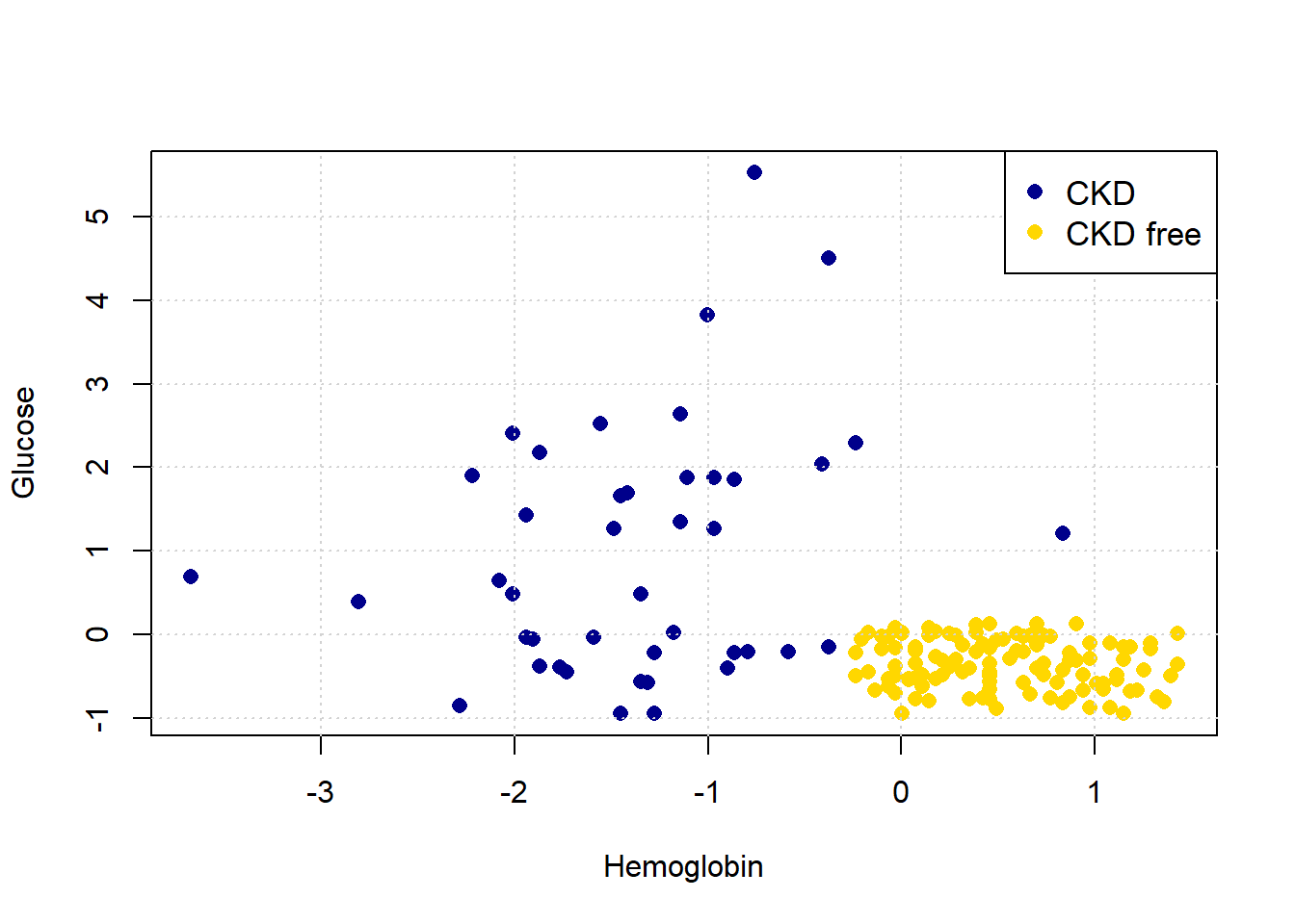
Looking at the plot, it seems that those with “high” Hemoglobin and “low” Glucose are CKD free. Meanwhile, other combinations of those variables seem to be associated with getting CKD.
5.2.3 Nearest Neighbor classification
When a new patient arrives, we need a predicted class for her. What is a good way to do this? A simple idea is to ask which current patients she is like, and see what happened to that current patient. And then just use that class as the prediction for the new patient.
More formally:
- look at the new patient’s attributes (Hemoglobin, Glucose)
- look up the current patient who has the most similar values on these attributes
- whatever the CKD status of that current patient, assign the same status to the new patient.
We will give more specifics imminently, but this basic design is called nearest neighbor classification.
5.2.3.1 Useful functions
Before we get into the theoretical details of how this might work, we will define a series of functions to help us do it in practice. We will explain them in more detail below, but for now we first provide a brief description of each function followed by the actual functions.
distancecalculates the Euclidean distance between two points (these could be rows of data).all_distancescalculates the distance between a row and all other rows in the data.table_with_distancesreturns the training data, but with a column showing the distance from each row of that data to some example we are interested in.closestreturns the top-k (so the k closest) rows to our data point of interest.majoritydoes a majority vote among the top-k closest rows to give us a prediction; in this case, the prediction will be either zero or one.classifyuses the function above to tell us the classification of a given example (an instance).
distance <- function(point1, point2) {
  # The Euclidean distance between two numeric vectors
  sqrt(sum((point1 - point2)^2))
}
all_distances <- function(training, point) {
# Remove the 'Class' column
attributes <- training[ , !(names(training) %in% "Class")]
# Compute distances row-wise
distance_from_point <- function(row) {
distance(point, as.numeric(row))
}
apply(attributes, 1, distance_from_point)
}table_with_distances <- function(training, point) {
# Make a copy of the training data
train_set_copy <- training
# Compute distances
ad <- all_distances(train_set_copy, point)
# Add Distance column
train_set_copy$Distance <- ad
return(train_set_copy)
}closest <- function(training, point, k) {
# Compute distances and attach to training data
with_dists <- table_with_distances(training, point)
# Sort by distance
sorted_by_distance <- with_dists[order(with_dists$Distance), ]
# Take the top k rows
topk <- head(sorted_by_distance, k)
return(topk)
}5.2.3.2 Plotting the new patient
The intuition here is straightforward. Consider a new patient (in red) on our original plot above: her name is Alice, and her variable values are 0 for Hemoglobin and 1.5 for Glucose. Thus:
Let’s put her on the plot:
plot(std_status$Hemoglobin, std_status$Glucose, col=cols,
ylab="Glucose", xlab="Hemoglobin", pch=16, cex=1.1)
grid()
legend("topright", legend=c('CKD','CKD free'),
col=c("darkblue", "gold"), pch=16, cex=1.1)
points(alice[1], alice[2], col="red", cex=1.3, pch=16)
She appears to be closest to the blue cluster of points, but we can make this more explicit by drawing a line between her and the nearest current point in the data.
show_closest <- function(point) {
# Drop 'White Blood Cell Count' from std_data
HemoGl <- std_data[ , !(names(std_data) %in% "White.Blood.Cell.Count")]
# Get the closest point
t <- closest(HemoGl, point, 1)
x_closest <- t[1, "Hemoglobin"]
y_closest <- t[1, "Glucose"]
# Map class to colors
point_colors <- ifelse(std_status$status == "CKD free", "gold", "darkblue")
# Plot base data
plot(std_status$Hemoglobin, std_status$Glucose,
col = point_colors, cex=1.1,
pch = 21, bg = point_colors,
xlab = "Hemoglobin", ylab = "Glucose",
main = "Closest Point to New Observation")
# Add the red test point
points(point[1], point[2], col = "red", bg = "red", pch = 21, cex = 2)
# Draw dotted line to nearest neighbor
lines(c(point[1], x_closest), c(point[2], y_closest),
col = "black", lty = "dotted", lwd = 2)
grid()
}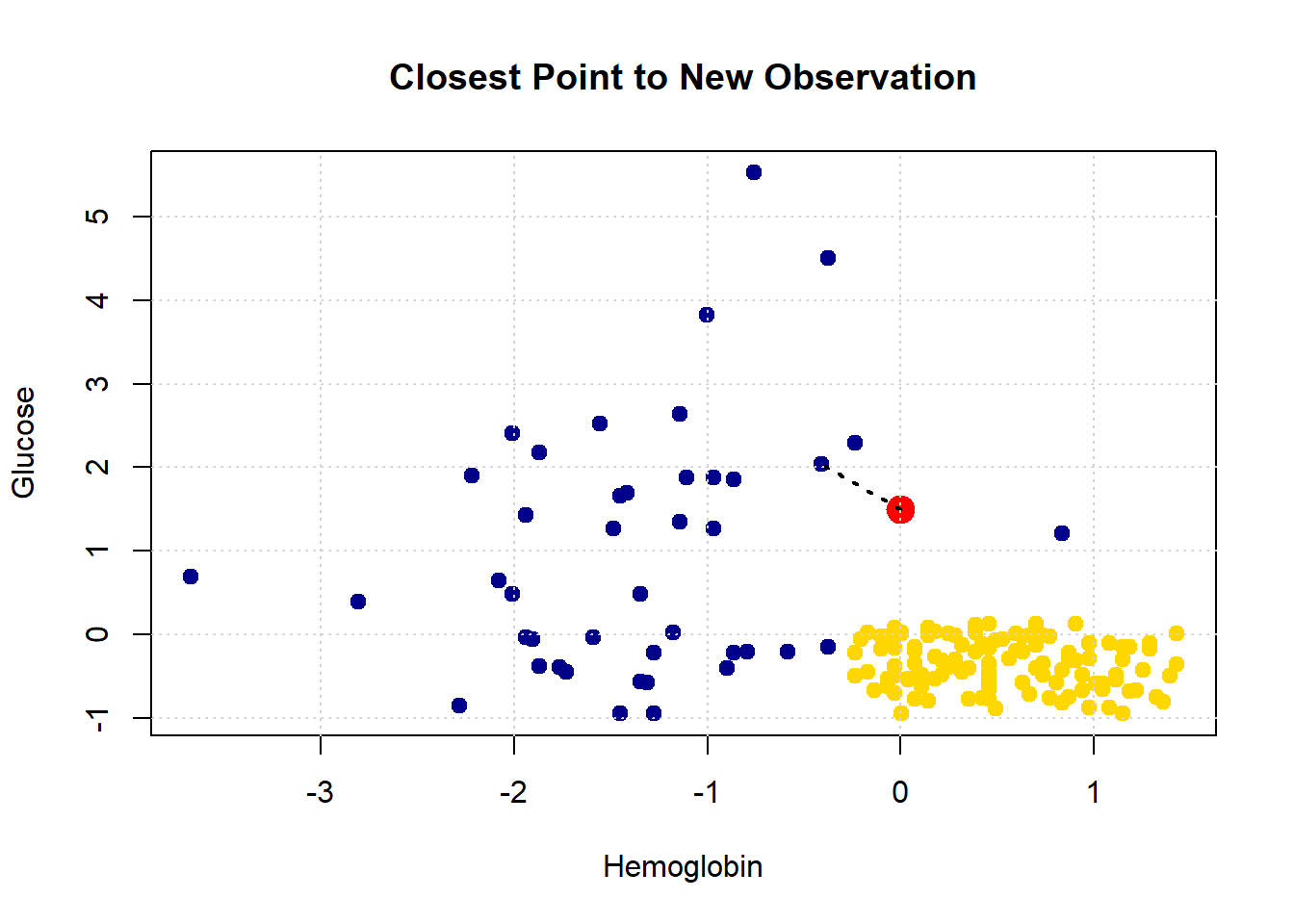
Let’s consider another patient, Bob:
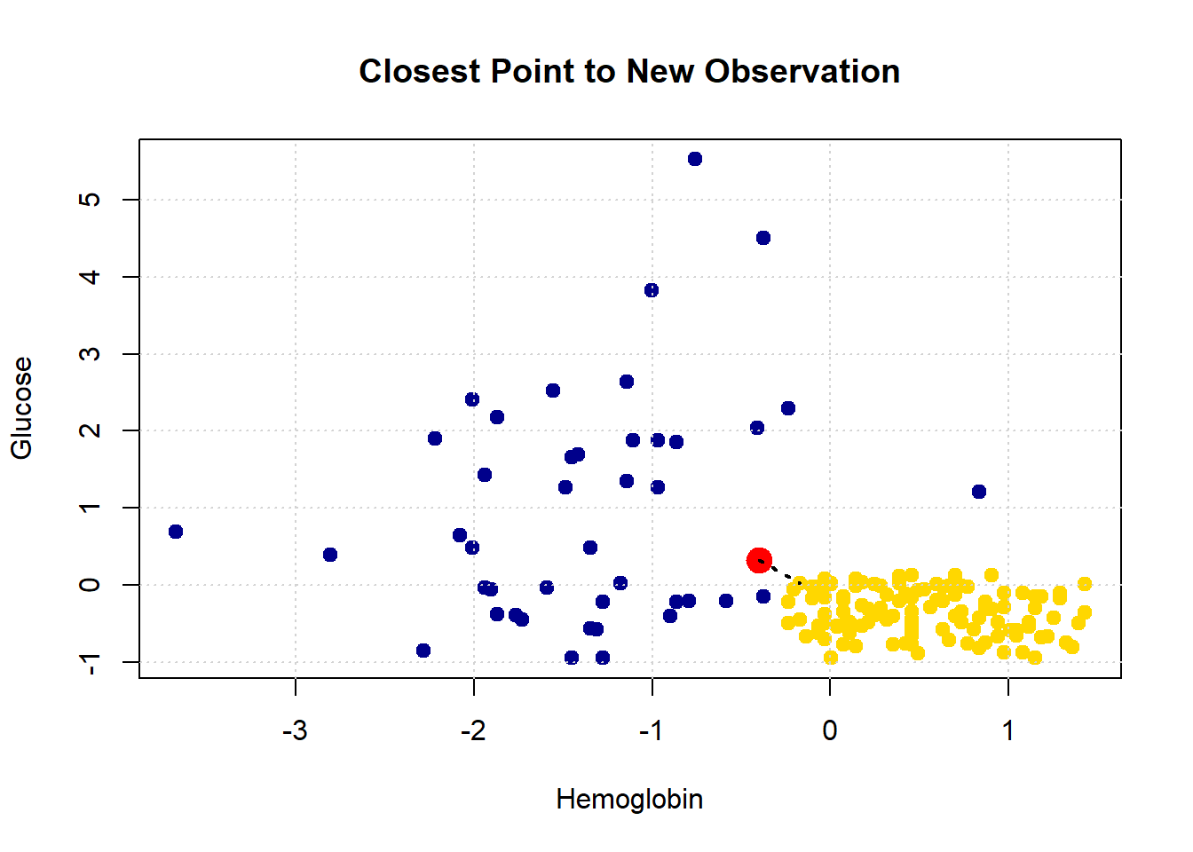
His nearest neighbor has CKD, so that is our prediction for Bob.
5.2.4 Decision boundary
These examples demonstrate a simple point: given any combination of attributes, we can provide a prediction. We just look up which current patient is closest to our new patient, and that’s it. If we did this for every point in the two dimensional space, we would obtain a decision boundary. This is
a line that separates the attribute space into two parts, where each part corresponds to our model predicting a given class as an outcome.
We will work in two dimensional attribute space for now, and we will have a two class problem, but the idea is more general than that. For example, one can draw a decision (hyper)plane in three dimensions, and one can place instances in multiple classes.
One reason we draw this boundary is so we can see what regions of the space correspond to what predicted classes. This is immediately informative about how our classifier works in practice, and also about the underlying nature of the relationship between the attributes and outcomes. To see how this works, imagine filling the filling to space with lots of new patients—one for “every” combination of the features in small steps along the axes.
x_array <- c()
y_array <- c()
for (x in seq(-2, 2.1, by = 0.1)) {
for (y in seq(-2, 2.1, by = 0.1)) {
x_array <- c(x_array, x)
y_array <- c(y_array, y)
}
}
grid_data <- data.frame(
Hemoglobin = x_array,
Glucose = y_array
)
test_grid <- grid_dataHere, test_grid is just a bunch of pretend or invented instances with various combinations of attributes. We will slightly restrict the space of though attributes here (from -2 to 2 on both variables), but that is just for visualization purposes. Let’s plot these pretend instances in red, and then put the “real” data on in its usual colors.
plot(test_grid$Hemoglobin, test_grid$Glucose,
col = rgb(1, 0, 0, alpha = 0.4), # semi-transparent red
pch = 16, # filled circles
cex = 0.7, # size ~ s=30
xlab = "Hemoglobin", ylab = "Glucose",
xlim = c(-2, 2), ylim = c(-2, 2))
# Overlay: standard status points colored by class
point_colors <- ifelse(std_status$status == "CKD free", "gold", "blue")
points(std_status$Hemoglobin, std_status$Glucose,
col = "black", bg = point_colors, pch = 21)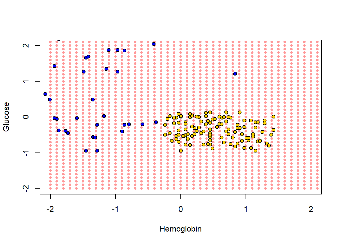
To reiterate, every one of the red points has a nearest neighbor (which is either yellow or blue). Let’s find that nearest neighbor for every point. The function we need is this one:
classify_grid <- function(training, test, k) {
cout <- numeric(0)
for (i in seq_len(nrow(test))) {
point <- as.numeric(test[i, ])
class_result <- classify(training, point, k)
cout <- c(cout, class_result)
}
return(cout)
}This function applies classify() to the \(i^{th}\) element (the \(i^{th}\) patient) in the object called test. It does this based on the information that classify() gets from the training set.
5.2.4.1 Aside: explaining the functions
But what is classify()? It’s one of the functions we defined above. It was:
classify <- function(training, p, k) {
topkclasses <- closest(training, p, k)
return(majority(topkclasses))
}This took the majority (vote) of an object called topkclasses which was the outcome of a function called closest().
So what does majority() do? We defined it as:
majority <- function(topkclasses) {
ones <- topkclasses[topkclasses$Class == 1, ]
zeros <- topkclasses[topkclasses$Class == 0, ]
if (nrow(ones) > nrow(zeros)) {
return(1)
} else {
return(0)
}
}This is saying, essentially, count how many instances for which Class==1 and Class==0 (these are CKD categories) we have in the data set topkclasses. Take a majority vote: if you have more ones than zero, the function should return 1 overall. Otherwise, return 0 as the overall classification.
Well, topkclasses comes from applying the closest() function; so what is closest? It was defined as:
closest <- function(training, point, k) {
# Compute distances and attach to training data
with_dists <- table_with_distances(training, point)
# Sort by distance
sorted_by_distance <- with_dists[order(with_dists$Distance), ]
# Take the top k rows
topk <- head(sorted_by_distance, k)
return(topk)Essentially this sorts some data: it takes a table_of_distances, and then sorts them from shortest to longest. Finally it returns the \(k\) observations that are the closest (i.e. the observations for which the distances are the smallest).
This closest() function relies on table_with_distances—what does that do? It is defined as:
table_with_distances <- function(training, point) {
# Make a copy of the training data
train_set_copy <- training
# Compute distances
ad <- all_distances(train_set_copy, point)
# Add Distance column
train_set_copy$Distance <- ad
return(train_set_copy)
}This takes training and then calculates all_distances between that data and some particular point (an instance in the data). It then puts that set of distances into a copy of training as a variable called Distance. Clearly this function relies on understanding what all_distances() does.
Well, all_distances() is defined as:
all_distances <- function(training, point) {
  # Remove the 'Class' column
  attributes <- training[ , !(names(training) %in% "Class")]

  # Compute distances row-wise
  distance_from_point <- function(row) {
    distance(point, as.numeric(row))
  }

  apply(attributes, 1, distance_from_point)
}First it makes an object called attributes from the training data frame. This is just the training data frame without the Class column. Then it uses apply to repeatedly execute a function called distance_from_point across the columns of attributes. So, it is executing that function on every row of attributes, and then returning whatever that produces. What’s in the function that’s being applied? Well it’s distance().
Finally then, what does distance() do? This function is defined as
distance <- function(point1, point2) {
  # The Euclidean distance between two numeric vectors
  sqrt(sum((point1 - point2)^2))
}
It takes two sets of attributes corresponding to two instances (point1 and point2) and returns the (Euclidean) distance between them. We will discuss that distance calculation in more detail below. For now, let’s summarize what these functions do together: collectively, they:
- calculate the distance between a set of
trainingdata and a new instance (a new patient). If there are 100 instances in the training data, we would calculate 100 distances from the new patient. - put all those distances in a table, and sorts them from shortest (nearest the new patient) to largest (furthest from the new patient)
- take the \(k\) shortest distances and does a majority vote: whichever class is more prevalent is the predicted class of our new patient.
5.2.5 Back to the decision boundary
For each of the red points, let’s just find its nearest neighbor, and use that as the predicted class for each point. Note that we don’t need the White Blood Cell count variable for now, so we will drop it. Executing the next function takes a little while, because it is doing the classification operation we described above.
The content of cc is just a bunch of predictions (one for each of the red dots). That becomes the Class variable of test_grid, and this next code just adds a status variable that corresponds with the way we’ve been using that variable for our main data set (i.e. is CKD if Class is one; it is CKD free if Class is zero).
# Add the predicted class
test_grid$Class <- cc

# Assign labels based on Class value
test_grid$status <- NA  # initialize the column
test_grid$status[test_grid$Class == 1] <- "CKD"
test_grid$status[test_grid$Class == 0] <- "CKD free"
We have what we need for the plot. We first put on the test_grid set, but using a (slightly washed out) version of the colors we used above. We will also put the actual points on the figure.
# Map status to colors (assumes 'colors' is a named vector like: c("CKD" = "gold", "CKD free" = "blue"))
grid_colors <- test_grid$status
grid_colors[which(test_grid$status=="CKD")] <- "darkblue"
grid_colors[which(test_grid$status=="CKD free")] <- "gold"

status_colors <- std_status$status
status_colors[which(std_status$status=="CKD")] <- "darkblue"
status_colors[which(std_status$status=="CKD free")] <- "gold"

# Plot background classified grid points (semi-transparent)
plot(test_grid$Hemoglobin, test_grid$Glucose,
     col = adjustcolor(grid_colors, alpha.f = 0.4),
     pch = 16, cex = 0.7,
     xlab = "Hemoglobin", ylab = "Glucose",
     xlim = c(-2, 2), ylim = c(-2, 2))

# Overlay original labeled data points with black borders
points(std_status$Hemoglobin, std_status$Glucose,
       col = "black", bg = status_colors,
       pch = 21, cex=1.2)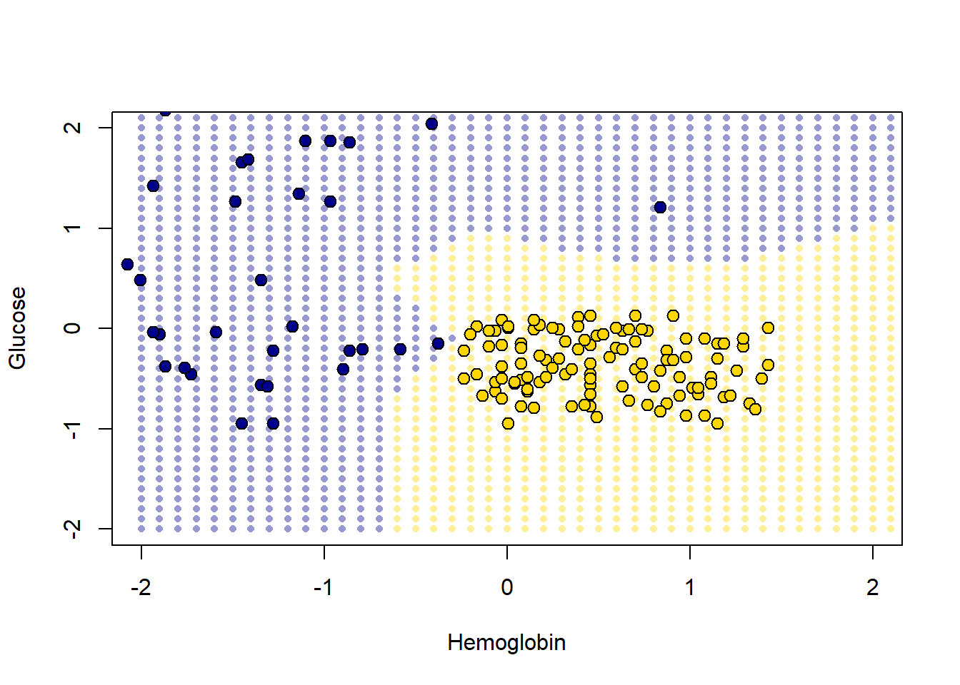
The decision boundary here is very clear: it snakes round the yellow points from bottom left up to top right. Where the color changes, our prediction changes for a patient. As we read from left to right on the \(x\)-axis, for a given \(y\)-axis value, the color mostly only changes once: we go blue to yellow, and then we stay yellow (though this is not true around 0.75 on vertical Glucose axes).
5.2.5.1 A tougher example
Here is a tougher example: let’s use White Blood Cell Count instead of Hemoglobin.
point_colors <- status_colors

# Plot
plot(std_status[["White.Blood.Cell.Count"]], std_status$Glucose,
     col = "black", bg = point_colors,
     pch = 21,
     xlab = "White Blood Cell Count", ylab = "Glucose")


# Add grid
grid()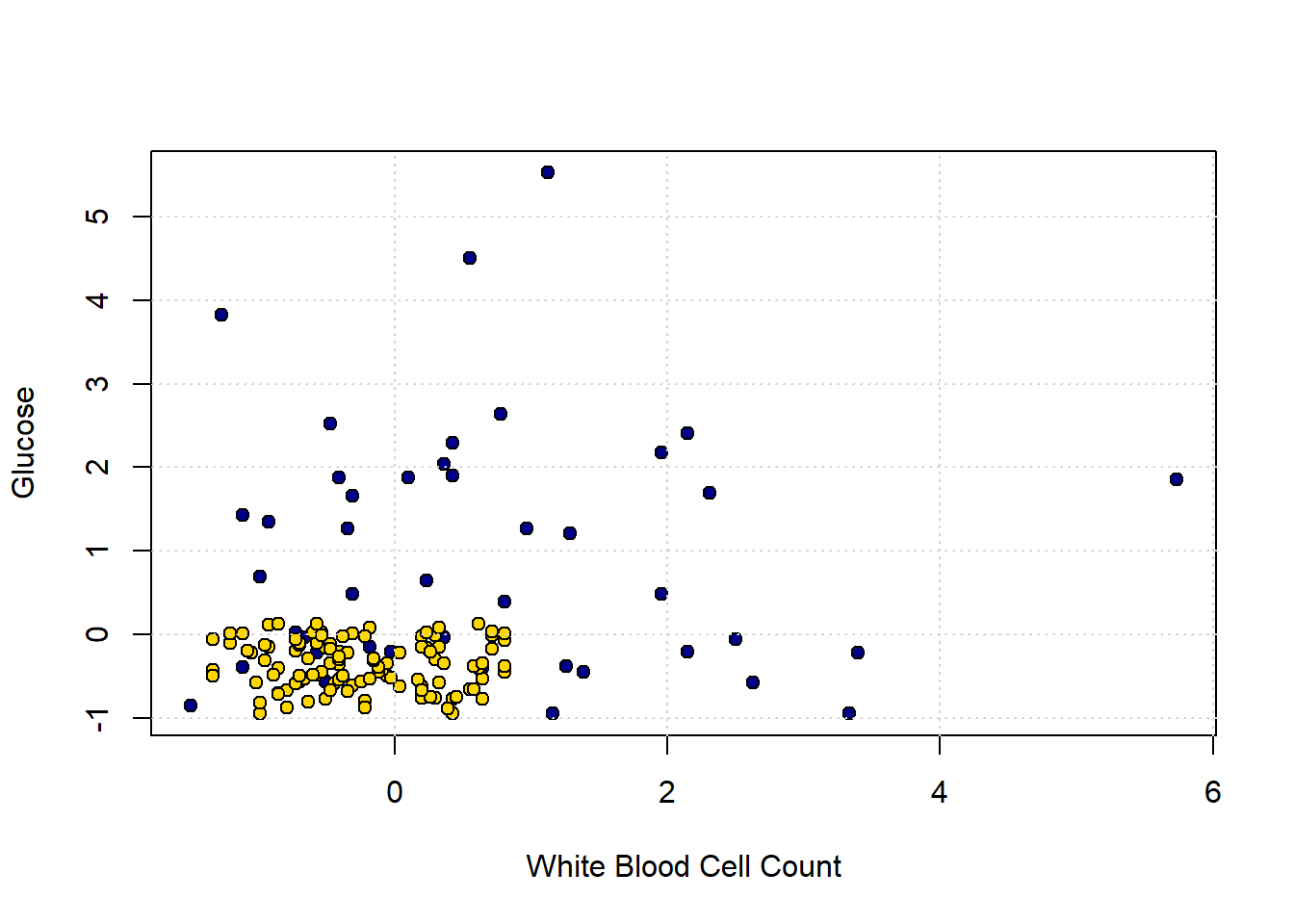
In the bottom left of the plot, we can clearly see some blue dots (CKD) among the yellow ones (CKD free). To see the issue in starker relief, let’s enlarge the “problem” area and place a new patient (in red):
plot(std_status[["White.Blood.Cell.Count"]], std_status$Glucose,
     col = "black", bg = point_colors,
     pch = 21,
     xlab = "White Blood Cell Count", ylab = "Glucose",
     xlim=c(-1,1.5), ylim=c (-1,1))

new_patient = c(-0.02,-0.26)
points(new_patient[1], new_patient[2], cex=2,
            col="red", pch=16)

# Add grid
grid()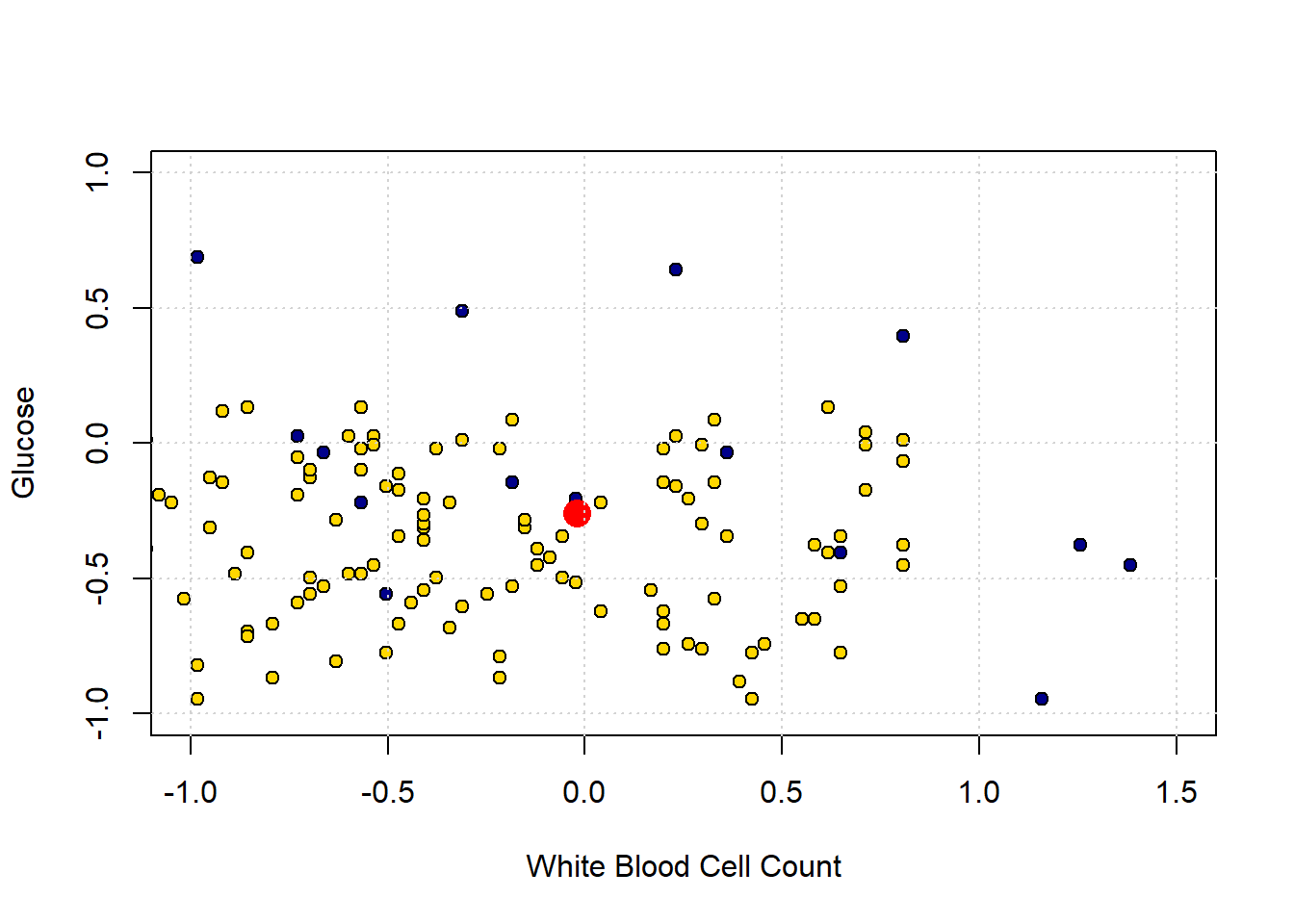
The “problem” here is that our new patient (in red) is closest to a blue point, and thus we predict CKD for them. But they are in a space where, generally speaking, CKD is rare. So our prediction is “unlucky” in some sense. Our main point is that using only a single nearest neighbor may be misleading.
5.2.6 k-Nearest Neighbors
To reiterate: the (single) nearest point here was blue (meaning CKD), but that was potentially misleading, because there were many more yellow points (meaning CKD free).
What we might do instead is look at the \(k\) nearest neighbors, where \(k=3\) or some other odd number. We then take a vote of those \(k\) nearest neighbors, and whichever is the majority class is our prediction. This method is called k Nearest Neighbors or kNN.
Looking back at our problem case, the patient’s three nearest neighbors are two CKD-free patients (yellow), and one with CKD (blue). The majority vote is CKD-free, and that becomes our prediction.
Generally speaking we like to use a \(k\) that is odd and relatively small. \(k\) must be odd to ensure our votes doesn’t lead to ties – and thus an ambiguous prediction. And we prefer \(k\) to be small to avoid “smoothing” too much. To see the problem, suppose we picked \(k=n\): that is, we just the number of nearest neighbors equal to the size of our data. This means that every new patient’s predicted outcome is just a majority vote of all the current data points. But this will not change, no matter where the new patient is in terms of attributes. And that does not seem like a helpful classifier.
5.3 Evaluating kNN
Before we get going with the core material, we need a set of functions from our previous efforts and the data. When “knitting” we just use include=FALSE in the R code chunks.
5.3.1 Evaluating the Classifier: Training/Test splits
If our classifier works, it should be able to correctly classify our current patients: it should put the ones who have CKD into the CKD category, and those that do not have it into the CKD-free category.
But there is a problem here. The current patients are, collectively, our training set. We already know their statuses for sure, and we don’t need predictions for them. We need predictions for new patients who our model has not yet met. And we don’t have an obvious source for those new patients (by definition, they haven’t come in yet).
Well why not just assess the accuracy of our classifier on the data we do have, i.e. the training set? Technically, this is because we will end up “over-fitting.” This means, essentially, that we end up modeling random error in our data and believing—falsely—we have captured something important and systematic about the relationship between \(X\) and \(Y\). This will be a big problem when we try to predict new patients: we will not actually have understood the true systematic relationship between \(X\) and \(Y\) and will make mistakes for our incoming instances.
You can get some intuition for this problem by thinking about the original nearest neighbor classifier we used. We said that we could just look for the single current patient closest to a new patient (in terms of attributes), and then their status becomes our prediction for the new patient. What happens if we apply that simple rule to our current data. Well, every single instance is its own nearest neighbor. That is, each instance is zero distance from itself, so our prediction for that observation is just whatever we currently know its status to be. But if this is true, our model is perfectly accurate, even though it has not predicted anything we didn’t already know and hasn’t used any systematic information about the relationship between \(X\) and \(Y\) at all.
In general, we cannot use the training data to test our classifier. So we need to find a way to mimic the idea of “new” data which we are trying to predict.
5.3.2 Generating A Test Set
Our plan is make these “new” patients from our current data. We will do this by splitting our data into two parts: one set where we fit the same model as above (the \(kNN\)) and the other set which we will use as the source of “new” patients. Importantly, though our model will not yet have seen these “new” patients, we will know their correct outcome class. And we will know this, because we know it for all our data.
More formally, we will proceed as follows:
- Generate a random sample from our original data to form our training set. Here, we will sample half the observations, without replacement. Our classifier will use this set to learn the relationship between \(X\) and \(Y\).
- Generate a random sample from our original data to form our test set. This will be the other half of the observations, and we will see how well our classifier does. That is, the test set assesses the performance of our model.
- Use this test set to make inferences about the rest of the population (hopefully our test set is similar to them)—i.e. our “new” patients
A couple of notes about this process are in order. First, we sample without replacement because we want to make sure we don’t have the same observations in the training and test set. This could lead to the same sorts of problems (like over-fitting) that we mentioned with not having a test set at all. Second, the 50:50 split is mostly for demonstration. In real problems, analysts use all sorts of splits, with 80:20 (train: test) being a popular one.
5.3.3 Training/Test Split: An Example
Let’s return to our ‘tough’ problem above. We had a data set that looked like this:
plot(std_status[["White.Blood.Cell.Count"]], std_status[["Glucose"]],
     col = "black",
     pch = 21, bg = ifelse(std_status$status == "CKD free", "gold", "blue"),
     xlab = "White Blood Cell Count", ylab = "Glucose")
grid()
legend("topright", legend = c("CKD", "No CKD"),
       fill = c("gold", "blue"), border = "black")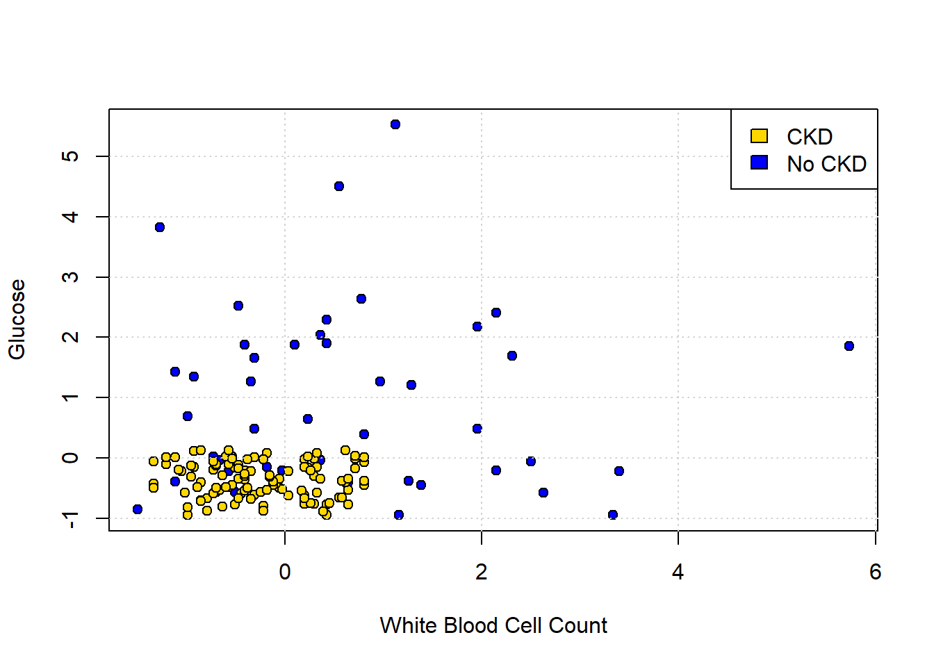
We can make a training and test set as follows:
set.seed(3)
shuffled_ckd <- std_status[sample(nrow(std_status)), ]

training <- shuffled_ckd[1:79, ]
testing <- shuffled_ckd[80:158, ]
The first line tells R to randomly sample the entire data set. This is equivalent to shuffling it randomly. The set.seed(3) just tells R to do exactly the same random draw for everyone using the code. Then the training set is formed by taking the first 79 observations of the shuffled data set; the testing set is formed by taking what is left (there are 158 observations total). This operation is obviously equivalent to just randomly creating a training and test set from the data.
We can plot our training data (on a slightly restricted axes, just for presentation):
training_colors <- training$status
training_colors[which(training$status=="CKD")] <- "darkblue"
training_colors[which(training$status=="CKD free")] <- "gold"


# Scatter plot
plot(training$White.Blood.Cell.Count, training$Glucose,
     col = "black", bg = training_colors,
     pch = 21,
     xlab = "White Blood Cell Count", ylab = "Glucose",
     main = "Training",
     xlim = c(-2, 6), ylim = c(-2, 6))

# Add grid
grid()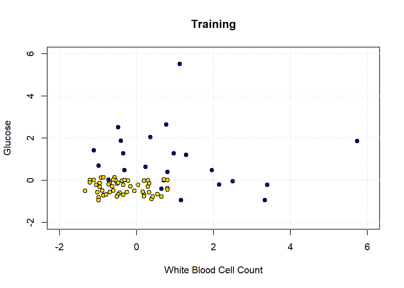
Obviously, there is only half as much data as before. Let’s now make our decision boundary. In a real problem, we would not have to do this part first—we could just go ahead and try to predict the test set points—but the visualization is instructive. As above, we start with a data point for every part of the space:
test_grid2 <- expand.grid(
  Glucose = seq(-2, 6.1, by = 0.25),
  White.Blood.Cell.Count = seq(-2, 6.1, by = 0.25)
)
Now we classify all these points, dropping Hemoglobin from the data first (because we don’t need it).
# Drop 'Hemoglobin' and 'status' columns
training_subset <- training[ , !(names(training) %in% c("Hemoglobin", "status"))]

# Classify points in test_grid2 using k=1
c2 <- classify_grid(training_subset, test_grid2, 1)

# Add predicted class and status labels
test_grid2$Class <- c2
test_grid2$status <- NA
test_grid2$status[test_grid2$Class == 1] <- "CKD"
test_grid2$status[test_grid2$Class == 0] <- "CKD free"

# Map colors to status
grid_colors2 <- test_grid2$status
grid_colors2[which(test_grid2$status=="CKD")] <- "darkblue"
grid_colors2[which(test_grid2$status=="CKD free")] <- "gold"

# Plot decision boundary
plot(test_grid2[["White.Blood.Cell.Count"]], test_grid2$Glucose,
     col = adjustcolor(grid_colors2, alpha.f = 0.4),
     pch = 16, cex = 0.7,
     xlab = "White Blood Cell Count", ylab = "Glucose",
     main = "Decision Boundary from Training Set",
     xlim = c(-2, 6), ylim = c(-2, 6))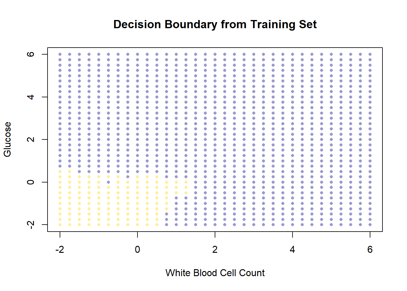
So, this is the decision boundary that we learned from the training set. It is what our model predicts for any given point in the space. Let’s draw this again, but put our test set onto the plot: remember, we know the actual outcomes for those points, but they weren’t not involved in fitting the model.
test_colors <- testing$status
test_colors[which(testing$status=="CKD")] <- "darkblue"
test_colors[which(testing$status=="CKD free")] <-   "gold"

# Plot decision boundary grid (background)
plot(test_grid2[["White.Blood.Cell.Count"]], test_grid2$Glucose,
     col = adjustcolor(grid_colors2, alpha.f = 0.4),
     pch = 16, cex = 0.7,
     xlab = "White Blood Cell Count", ylab = "Glucose",
     main = "Test set",
     xlim = c(-2, 6), ylim = c(-2, 6))

# Overlay test set points with black edges
points(testing[["White.Blood.Cell.Count"]], testing$Glucose,
       col = "black", bg = test_colors,
       pch = 21, cex = 0.9)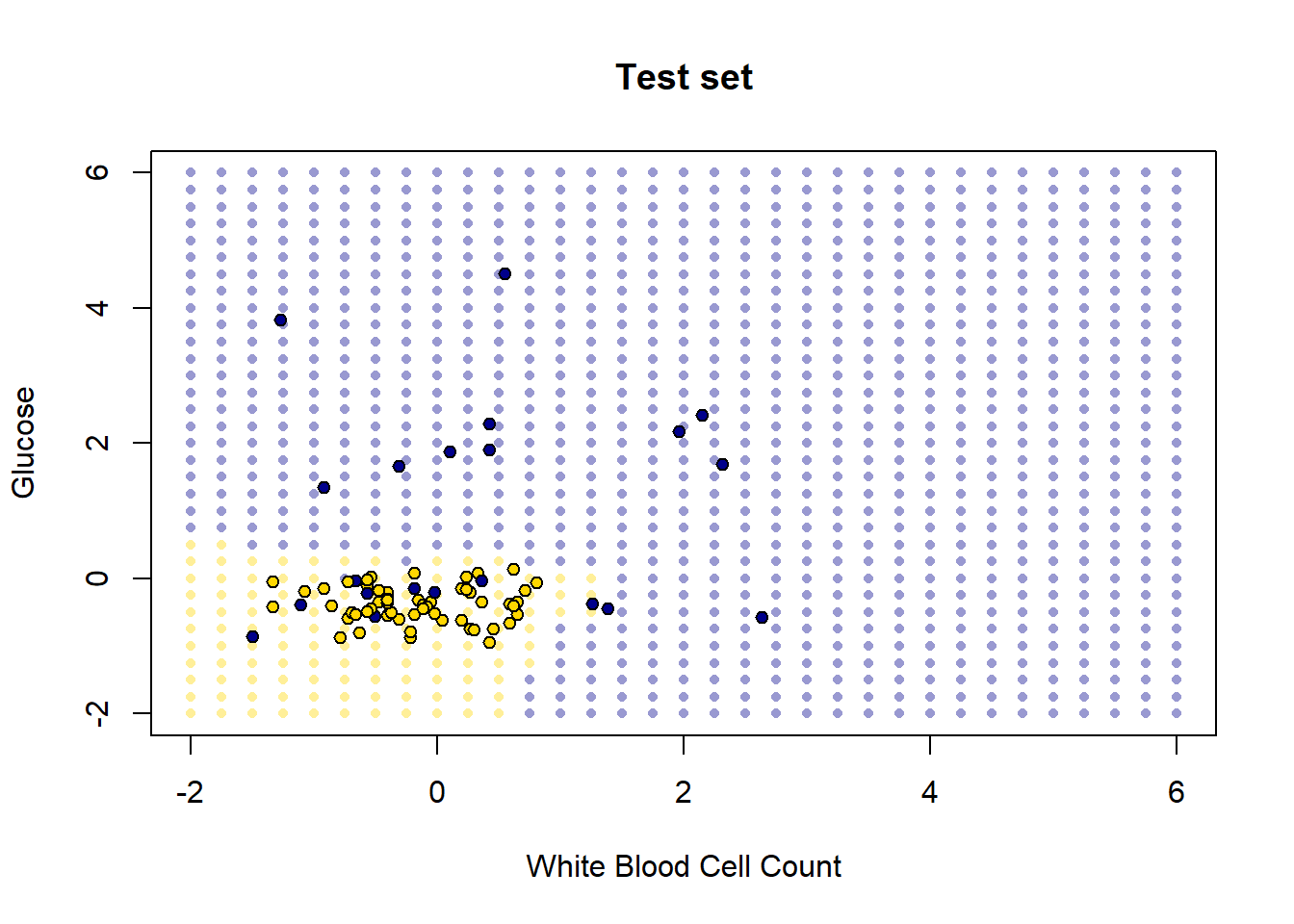
How did we do? Well it looks like the blue points are mostly in the blue area, and the yellow points are mostly in the yellow area. But there are a few mistakes: a few mis-classifications have occurred, in the sense that our model predicts that some points in the lower left should be yellow (CKD free) but those observations (from the test set) actually were blue (had CKD).
These examples make the basic intuition of \(kNN\) classification obvious. But, of course, it’s time consuming to plot the decision boundary every time – we just want a prediction. Moreover, in a real problem we would usually have more than two dimensions (two attributes). The good news is that \(kNN\) can deal with these requirements without issue.
5.4 Making \(kNN\) more general
Our examples above were perhaps not very realistic: we often have more than two attributes, and need to know how to deal with them. We will need the scatterplot3d library for this code, so install it and load it:
5.4.1 Distance
We will extend \(kNN\) below, but first note that at its core is a measure of distance. In particular Euclidean Distance, \(D\), which is just the “straight line” distance between two points. It is defined as
\[ D = \sqrt{(x_0-x_1)^2 + (y_0-y_1)^2} \]
Here, \(x_0, y_0\) is our first point, and \(x_1, y_1\) is our second point. The dimensions \(x\) and \(y\) correspond to two attributes which we were using to plot the data above. To see the logic of this distance measure, we can simulate a couple of points:
point_1 <- c(1, 3)
point_2 <- c(4, 2)

plot(NA, xlim=c(0,5), ylim=c(0,5), xlab="", ylab="", type="n")
points(point_1[1], point_1[2], col="red", pch=21, bg="red", cex=2)
points(point_2[1], point_2[2], col="blue", pch=21, bg="blue", cex=2)

lines(c(1, 1), c(0, 3), lty=2, col="red")
lines(c(0, 1), c(3, 3), lty=2, col="red")
lines(c(4, 4), c(0, 2), lty=2, col="blue")
lines(c(0, 4), c(2, 2), lty=2, col="blue")

arrows(1, 3, 4, 2, length=0.1, angle=20, col="black", lwd=2)
text(2.5, 2.8, "D", cex=1.5)
grid()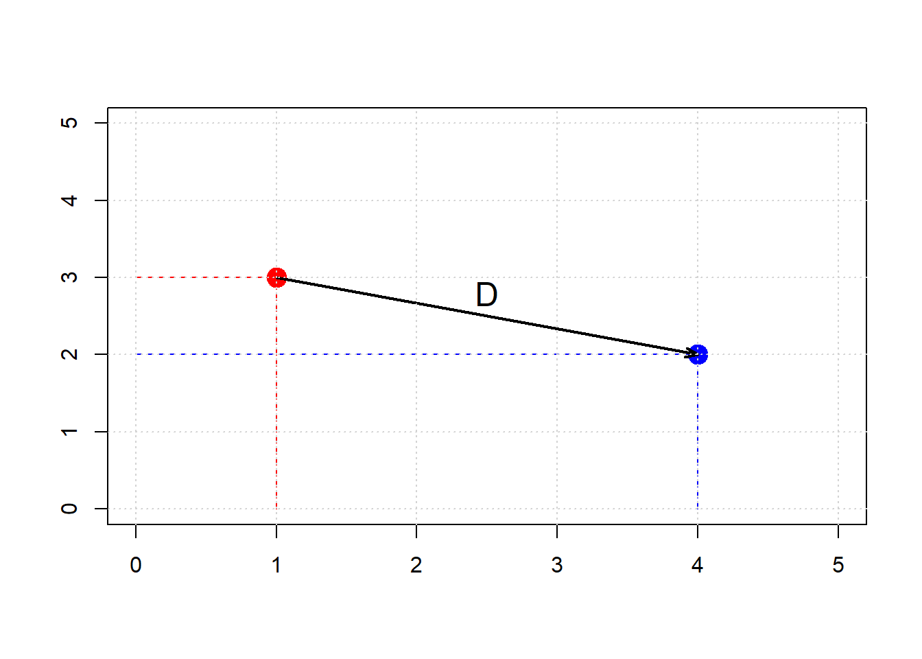
Clearly, \(D\) is the hypotenuse of a right triangle. As such, we know its \(\mbox{length}^2\) must be the sum of the squares of the other two sides. So:
\[ (x_0-x_1)^2 + (y_0-y_1)^2 \]
And specifically:
\[ (4-1)^2 + (3-2)^2 = 9 + 1 =10 \]
If \(D^2 = 10\), then \(D=\sqrt{10}\) or around 3.16. We can “confirm” this by returning to the function we built earlier:
distance <- function(point1, point2) {
  # The Euclidean distance between two numeric vectors
  sqrt(sum((point1 - point2)^2))
}
and calling
## [1] 3.162278As we will see below, this also works when the points have more than two dimensions. But first, let’s return to our running example, and look at what this understanding of distance for \(kNN\) implies.
5.4.2 5-Nearest Neighbors
We return to our problem of classifying a new patient in Hemoglobin/Glucose attribute space:
We define a new function distance_from_new_patient that is as its name suggests: it calculates the distance of the new patient’s attributes from the attributes of a given row in the table of observations. We will apply this function, such that we get the distance of our patient from every row in the data. Then, we add those distances as a new variable to our (original) data.
distance_from_new_patient <- function(row) {
  distance(new_patient, as.numeric(row))
}

# Apply row-wise using apply()
distances <- apply(ckd_attributes, 1, distance_from_new_patient)

# Copy the std_status data frame and add distances
std_status_w_distances <- std_status
std_status_w_distances[["Dist_New_Pat"]] <- distances
If we sort these observations by the distances we calculated, we have an order data set from closest to furthest from our new patient:
We can obtain the \(k\) nearest neighbors by simply requesting the first \(k\) rows of this sorted data. For the 5 nearest neighbors, we do:
##     Class  Hemoglobin    Glucose
## 15      1  0.83708795 1.21124778
## 36      1 -0.96708691 1.27284326
## 85      0 -0.03030381 0.08713031
## 153     0  0.14317454 0.08713031
## 7       1 -0.41195619 2.04278673
##     White.Blood.Cell.Count   status
## 15               1.2869219      CKD
## 36              -0.3440968      CKD
## 85              -0.1841930 CKD free
## 153              0.3274992 CKD free
## 7                0.3594799      CKD
##     Dist_New_Pat
## 15     0.8444479
## 36     0.9824113
## 85     1.0133229
## 153    1.0229389
## 7      1.0288609
Looking down the Class column, the majority vote is for CKD. To visualize the result, we can draw a circle around our new patient such that its radius is the distance to the 5th furthest observation. This circle will incorporate the first five \(NN\)s, and no more.
# make the plot square
par(pty = "s")

# Plot background points
plot(std_status$Hemoglobin, std_status$Glucose,
     col = "black", bg =  ifelse(std_status$status == "CKD free", "gold", "blue"),
     pch = 21, cex = 1.2,
     xlab = "Hemoglobin", ylab = "Glucose",
     xlim = c(-2, 2.5), ylim = c(-2, 2.5),
     main = ""   )

grid()

# Add new patient (red dot)
points(new_patient[1], new_patient[2],
       col = "black", bg = "red", pch = 21, cex = 1.4)

# Draw radius to 5th nearest neighbor
radius <- patient_5_nn[5, "Dist_New_Pat"] + 0.014

# Circle points
theta <- seq(0, 2 * pi, length.out = 201)
circle_x <- radius * cos(theta) + new_patient[1]
circle_y <- radius * sin(theta) + new_patient[2]

lines(circle_x, circle_y, col = "green", lwd = 2.5, lty = "dashed")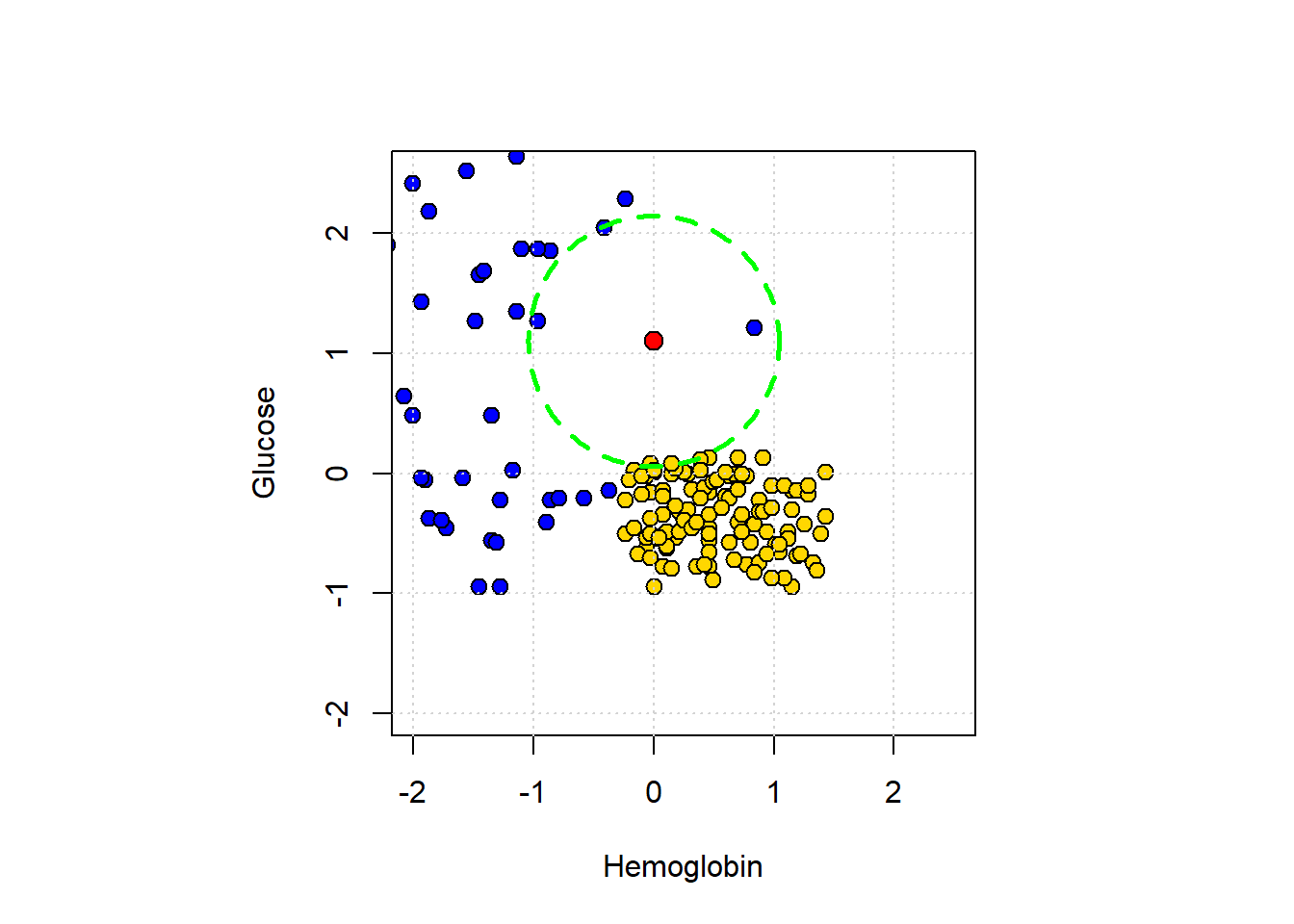
5.4.3 Multiple attributes
A nice feature of Euclidean distance is that it can, in principle, incorporate any number of attributes. That is, if \(m\) is the number of attributes, \(m\) can be 2, 100, 2000, 100000 etc. The formula becomes:
\[ D(\mathbf{p},\mathbf{q}) = \sqrt{ (p_0-q_0)^2 + (p_1-q_1)^2+ \ldots +(p_m - q_m)^2 } \]
Here \(\mathbf{p}\) is the first row of data (point); \(\mathbf{q}\) is the second row of data (point). That is, \(\mathbf{p}\) is an observation with \(m\) attributes \(\mathbf{p}=p_0,p_1\ldots p_m\). And \(\mathbf{q}\) is also an observation with \(m\) attributes \(\mathbf{q}=q_0,q_1\ldots q_m\).
To show why moving beyond two attributes is (often) helpful, consider a problem of trying to categorize bank notes into Counterfeit or Real based on two features: WaveletSkew and Entropy (don’t worry about what these features mean!). We’ll read in the data, and color code it: blue if counterfeit, and yellow if real.
# Load the data
banknotes <- read.csv("data/banknote.csv", stringsAsFactors = FALSE)

# Map class to status labels
banknotes$status <- ifelse(banknotes$Class == 1, "Counterfeit", "real")

# Map class to colors
colors_bank <- c("0" = "gold", "1" = "blue")  # character keys for R indexing
point_colors <- colors_bank[as.character(banknotes$Class)]

# Scatter plot
plot(banknotes$WaveletSkew, banknotes$Entropy,
     col = "black", bg = point_colors,
     pch = 21, cex = 1.2,
     xlab = "Wavelet Skew", ylab = "Entropy",
     main = "Banknote Classification")

grid()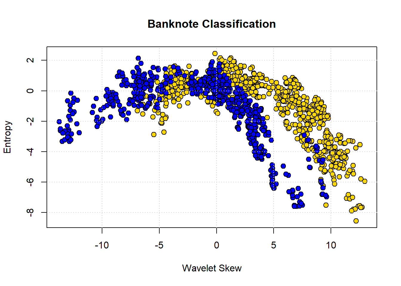
The boundary here is not obvious: it looks like notes with high Skew and low Entropy are real, but there is a lot of overlap. Let’s add some different variables—Wavelet Variance and Wavelet Kurtosis—to our original Wavelet Skew.
library(scatterplot3d)

# Map class to colors
colors_bank <- c("0" = "gold", "1" = "blue")
point_colors <- colors_bank[as.character(banknotes$Class)]

# 3D scatter plot
scatterplot3d(banknotes$WaveletVar,
              banknotes$WaveletSkew,
              banknotes$WaveletCurt,
              color = "black",      # edge color
              bg = point_colors,    # fill color
              pch = 21,
              cex.symbols = 1.2,
              xlab = "Var",
              ylab = "Skew",
              zlab = "Curt")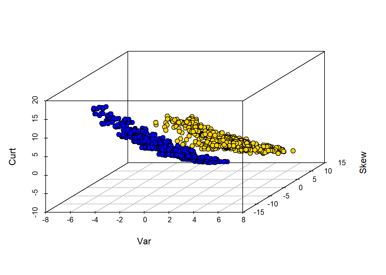
Clearly, WaveletVar does a good job of dividing the categories, and that will help with classification.
5.4.4 Building a \(kNN\) classifier
To reiterate, for a given application, the \(kNN\) algorithm is very simple. We begin with a data set where we already know the classes of the observations. We are handed a new data point, which is just a vector (a set) of attributes. We then need to:
- find the closest \(k\) neighbors of that new observation
- obtain the classes of those \(k\) neighbors and do a majority vote
- take that majority class as the prediction of our new point.
To see this in action, we will use data on wine. In particular, we will have a binary outcome class and a total of 13 attributes to help predict this class. In our initial data set, we will have 178 observations.
For us, the class of interest is the Cultivar which is currently 1,2 or 3. We will change the name of this variable to Class and recode it to binary: if Cultivar is 1, the class is 1, but otherwise zero. We will put this information back into the original data.
# Extract the Cultivar column
wine_class <- wine$Cultivar

# Replace 2 and 3 with 0
wc <- ifelse(wine_class %in% c(2, 3), 0, wine_class)

# Rename 'Cultivar' to 'Class'
names(wine)[names(wine) == "Cultivar"] <- "Class"

# Update the column with recoded values
wine$Class <- wc

# Show the first few rows
head(wine)
## Class Alcohol Malic.acid Ash
## 1 1 14.23 1.71 2.43
## 2 1 13.20 1.78 2.14
## 3 1 13.16 2.36 2.67
## 4 1 14.37 1.95 2.50
## 5 1 13.24 2.59 2.87
## 6 1 14.20 1.76 2.45
## Alcalinity.of.ash Magnesium Total.phenols
## 1 15.6 127 2.80
## 2 11.2 100 2.65
## 3 18.6 101 2.80
## 4 16.8 113 3.85
## 5 21.0 118 2.80
## 6 15.2 112 3.27
## Flavanoids Nonflavanoid.phenols
## 1 3.06 0.28
## 2 2.76 0.26
## 3 3.24 0.30
## 4 3.49 0.24
## 5 2.69 0.39
## 6 3.39 0.34
## Proanthocyanins Color.intensity Hue
## 1 2.29 5.64 1.04
## 2 1.28 4.38 1.05
## 3 2.81 5.68 1.03
## 4 2.18 7.80 0.86
## 5 1.82 4.32 1.04
## 6 1.97 6.75 1.05
## OD280.OD315.of.diluted.wines Proline
## 1 3.92 1065
## 2 3.40 1050
## 3 3.17 1185
## 4 3.45 1480
## 5 2.93 735
## 6 2.85 1450We can ask about distances between observations using the functions we defined above, and dropping the Class variable to make sure we are only checking distances between attributes:
# Drop the 'Class' column
wine_attributes <- wine[ , !(names(wine) %in% "Class")]

distance(as.numeric(wine_attributes[1, ]), as.numeric(wine_attributes[178, ]))
## [1] 506.0594Suppose now we have a new wine and want to classify it. To see how this might work, we will first suppose that the new wine is simply the first entry in our data. Let’s get the \(5NN\) prediction for that “new” wine:
# Drop the 'Class' column and extract the first row as a numeric vector
new_wine <- as.numeric(wine[1, !(names(wine) %in% "Class")])

# Classify the new wine using k-NN with k = 5
classify(wine, new_wine, 5)
## [1] 1Note that all classify does is take a majority vote of the classes of the nearest neighbors. What about classifying a “really” new wine? Well, a wine is just some attributes (from our perspective) so let’s create one and make it into a data frame:
new_observation <- data.frame(
  Alcohol = 14.23,
  Malic.acid = 4.0,
  Ash = 2.70,
  Alcalinity.of.ash = 25,
  Magnesium = 96,
  Total.phenols = 2.00,
  Flavanoids = 0.78,
  Nonflavanoid.phenols = 0.55,
  Proanthocyanins = 1.35,
  Color.intensity = 9.6,
  Hue = 0.65,
  OD280_OD315.of.diluted.wines = 1.4,
  Proline = 560
)
Now, let’s classify it (note that we classify expects a row, so that’s how we pass it in). Here we use \(13NN\):
# Extract the first (and only) row of new_ob as a numeric vector
new_ob_vec <- as.numeric(new_observation[1, ])

# Classify using k = 13
classify(wine, new_ob_vec, 13)
## [1] 05.4.5 Training and testing
As before, we will want to divide our data into a training and test set so we can mimic the idea of “new” observations arriving. We can set this up as before, by shuffling the data and then doing a 50:50 split.
set.seed(23)
shuffled_wine <- wine[sample(nrow(wine)), ]

training_set <- shuffled_wine[1:89, ]
test_set <- shuffled_wine[90:178, ]
Note that we use a particular set.seed just to ensure everyone gets the same answer. Remember that our goal is predict the class of the observations in the test set that we “hold out” (thus sometimes called the “holdout set”). We do this given the \(X\)s in the test set and the relationship between \(X\) and \(Y\) that our machine (\(kNN\)) learned from the training set.
5.4.6 Assessing performance
In some cases, we will correctly predict the test set observation class, and in some cases we won’t (that is, we make an incorrect prediction). To see this, let’s do a \(5NN\) model and predict the class of every observation in the test set. First, we need to restrict ourselves to the test set attributes:
Next, we need a function that can take a row of test set attributes and classify it with respect to its nearest neighbors in the training set. We apply that function by row to the test set.
# Define classification wrapper for a single row
classify_testrow <- function(row) {
  classify(training_set, as.numeric(row), 5)
}

# Apply to each row of test_attributes
predict_out <- apply(test_attributes, 1, classify_testrow)
Here, predict_out is simply the outcome of the majority vote of the nearest neighbors for every row of the test set. It is our set of predictions. We want to compare it to the ‘true’ class for those test set observations that the learner has not seen. So let’s get that quantity:
Let’s put these “model predictions” and “actual class” outcomes together in a table, so we can compare them:
# Create a data frame of predictions
table_compare <- data.frame(`model prediction` = predict_out)

# Add the actual class
table_compare$actual <- actual_class

# View the first few rows
print(head(table_compare))
## model.prediction actual
## 160 0 0
## 19 1 1
## 174 0 0
## 152 0 0
## 143 0 0
## 40 0 15.4.6.1 Accuracy
Straightaway, we see at least one case where the prediction was incorrect (it did not match the true class). We want to be more systematic, which in this case means asking: “what proportion of the model predictions were correct?.” This is called the Accuracy of the model and is
\(\mbox{accuracy} = \frac{\mbox{number of correct predictions}}{\mbox{total number of predictions}}\)
The numerator is the number of times our model prediction matched the actual class of the observations in the test set. That is, when our model predicted 1 and the actual class was 1 or when our model predicted 0 and the actual class was 0. The denominator is the number of predictions we made: this is just the size of the test set for us, because we made a prediction for every member of that set (which was 50% of the data, or 79).
We can implement this idea in R with a few simple functions. Our method will be to essentially compare the two columns in the table above (table_compare) and see how often they are similar. We do this mechanically by subtracting one from the other. If the model prediction and the actual class are the same for an observation, the subtraction will result in a zero (it will be \(1-1\) or \(0-0\)) at that point in the resulting array. If they do not match it will result in something other than zero (it will be \(1-0\) or \(0-1\)).
This reduces the problem to simply counting the number of zeros in the array that arises from the subtraction. So we need a function for that, and a function to apply that idea to the subtraction:
# Count the number of zeros in a numeric vector
count_zero <- function(array) {
  sum(array == 0)
}

# Count the number of equal elements in two vectors
count_equal <- function(array1, array2) {
  count_zero(array1 - array2)
}
Finally, we need a function to pull everything together. Here it is:
evaluate_accuracy <- function(training, test, k) {
  # Drop 'Class' column from test set
  test_attributes <- test[ , !(names(test) %in% "Class")]

  # Define a row-wise classifier
  classify_testrow <- function(row) {
    classify(training, as.numeric(row), k)
  }

  # Apply classification to each row of test data
  cs <- apply(test_attributes, 1, classify_testrow)

  # Compare predictions to actual labels
  correct <- sum(cs == test[["Class"]])
  total <- nrow(test)

  cat(correct, "correct predictions out of", total, "total predictions\n")

  return(correct / total)
}
This function does several things. First, it drops the Class variable from the test set—leaving just the attributes. Then, it defines a function that classifies each row of the test set attributes, and applies that function by row. Finally, it prints out the number of times the model prediction and the actual class match, and the total number of predictions it made (which allows for the user to calibrate accuracy). The return value of the function is this accuracy. Note that this is a “one stop shop” insofar as it does the \(kNN\) internally and so needs to know the \(k\) we want (here we set to 5).
We can apply it to our problem:
## 82 correct predictions out of 89 total predictions## [1] 0.9213483And the answer is an accuracy of around 0.92.
5.4.6.2 Comparing to a majority-class baseline
Is 0.92 good or bad? It’s hard to say without knowing what to compare it to. One common heuristic in machine learning is to compare the performance of the model to the “best guess” an ignorant machine or user would make. And that “best guess” is just whatever the majority class of the training set. That is, if you know what most of the training set is in terms of class, this is a crude but not unreasonable estimate of what every new observation will be.
To understand the logic, notice that the whole point here is that we are making a prediction without any reference to \(X\). That is, we are asking what our best guess would be if we didn’t build a model at all. Surely we expect our machine learner to do better than that. This might not be as extreme as it sounds: suppose we are interested in a very rare disease like Creutzfeldt-Jakob, which affects around one in a million people. Our best, and quite reasonable, guess is that the new (random) patient we see in a doctor’s office does not have it.
For our wine example, our majority class baseline is 0, because in the training set there were 57 zeros and 32 ones. We can look this up via a table:
##
##  0  1
## 57 32
What if we now predict 0 for every observation in the test set? To see, let’s first get the count of zeros in the test set:
##
##  0  1
## 62 27
There were 62, and we would get every one correct. We would get 27 wrong. More formally we can calculate the accuracy as:
npredictions <- nrow(test_set)
modal_guess_accuracy <- sum(test_set$Class==0) / npredictions
modal_guess_accuracy
## [1] 0.6966292This is simply calculating the number of correct predictions (the number of true zeros in the test set) divided by the number of predictions (the size of the test set). Thus the accuracy is 0.697. This implies our \(kNN\) model improves over this majority class “best guess”.
5.4.7 Aside: using class
Our efforts above used handwritten functions, mostly for pedagogical purposes: we want you to see how the methods work from ‘scratch’. But there are many packages in R that will do the implementation for you. class is one such package. To introduce it to you, and to make it clear that (ultimately) it is reproducing what we did above, here is some equivalent code:
This imports the relevant package. We next create the model, giving it the key piece of information regarding the number of nearest neighbors to use:
labels_to_predict <- training_set$Class
training_data <- training_set[,-1]
test_data <- test_set[,-1]

pred <- knn(train = training_data, test = test_data, cl = labels_to_predict, k = 5)
Here, pred is our prediction for a 5NN model of the test set labels. Then we can compare the predicted class of our observations to the actual class of the observations. We are asking how often the predicted label is equal to the (true) test set label, divded by the size of the test set:
## [1] 0.9213483This is as expected – and identical to our answer above.
5.5 Predicting Continuous Outcomes
Until now, we have been interested in predicting categories for observations. But it will often be the case that we want to predict continuous numerical outcomes like incomes, prices or temperatures. We can use the tools we have already learned about—linear regression and \(kNN\)—to do this.
5.5.1 Multiple regression
Previously, we discussed regression in the context of fitting models of this type:
\[ Y = a + bX \] where \(Y\) was the outcome, \(a\) was our intercept or constant, and \(b\) was our slope coefficient. In that case, we had one predictor or \(X\) variable. We extend that now to multiple predictors:
\[ Y = a +b_1X_1 + b_2X_2 + \ldots + b_kX_k \]
Here, \(X_1\) is our first variable, \(X_2\) is a second, all the way through to \(X_k\) (our \(k\)th variable). Notice that each variable has its own slope coefficient: its own \(b\). Note also terminology: we sometimes refer to the \(X\) variables as the “right hand side”, because they are on the on right hand side of the equals sign. We sometimes refer to the dependent variable, the \(Y\) variable, as the left hand side (for obvious related reasons).
To see how multiple (linear) regression works, we will try to predict house prices in a well-known data set.
5.5.2 Predicting house prices
Our data is from Ames, Iowa. Each observation in the data set is a property for which we have a sales price. It is this sales price that we wish to predict. We will base that prediction on the \(X\) variables available to us, which are extensive. They include the size of the first floor, the size of basement, the size of the garage area, the year the house was built and so on. It seems reasonable to believe we would want to include many (or all) of these variables in our predictions, and multiple regression with allow for that.
Let’s pull in the data. Our interest will be in one family homes (1Fam) that are in normal condition, so we will restrict the data to those. In addition, we will restrict our models to a subset of all the predictors available, mostly just to simplify the presentation.
all_sales <- read.csv("data/house.csv", stringsAsFactors = FALSE)
fam_sales <- subset(all_sales, Bldg.Type == "1Fam")
norm_fam <- subset(fam_sales, Sale.Condition == "Normal")

sales <- norm_fam[, c("SalePrice", "X1st.Flr.SF", "X2nd.Flr.SF",
                      "Total.Bsmt.SF", "Garage.Area", "Wood.Deck.SF",
                      "Open.Porch.SF", "Lot.Area",
                      "Year.Built", "Yr.Sold")]
We can take a quick look at the data; here we sort from cheapest to most expensive, and take the ‘top’ 4:
## SalePrice X1st.Flr.SF X2nd.Flr.SF
## 2844 35000 498 0
## 1902 39300 334 0
## 1556 40000 649 668
## 709 45000 612 0
## Total.Bsmt.SF Garage.Area Wood.Deck.SF
## 2844 498 216 0
## 1902 0 0 0
## 1556 649 250 0
## 709 0 308 0
## Open.Porch.SF Lot.Area Year.Built
## 2844 0 8088 1922
## 1902 0 5000 1946
## 1556 54 8500 1920
## 709 0 5925 1940
## Yr.Sold
## 2844 2006
## 1902 2007
## 1556 2008
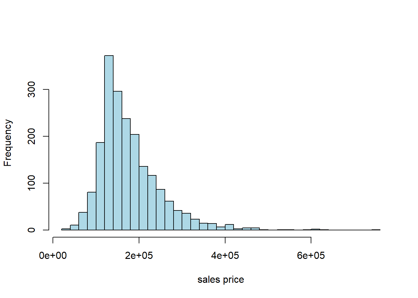
## 709 2009Typically, prices of properties are right skewed: the mean property is much more expensive than the median one. That seems to be the case here, too:
5.5.3 Working with the data: training/test split
As usual with prediction problems, we will split the data, and learn the relationship between \(X\) and \(Y\) in the training set. We will then see how well we predict the outcomes in the test set. In particular, we will:
- split the data evenly and randomly into training and test set
- fit a multiple linear regression to the training set that models \(Y\) in the training set as a function of the \(X\)s in the training set
- Use the model results from the training set (for us, the estimated coefficients) to predict the \(Y\) in the test set (based on the \(X\)s in the test set)
- Compare our predictions (the fitted values) with the actual sales prices in the test set to get a sense of how well our model performs
As previously, we form the training set by sampling without replacement from the data. Then, anything we do not use in training goes to the test set. We do this telling R to drop the observations assigned to train from the original data set and make the residual data the test set. We will set a seed again, just to ensure everyone gets the same results.
set.seed(5)
train_indices <- sample(1:nrow(sales), size = 0.5 * nrow(sales), replace = FALSE)
train <- sales[train_indices, ]
test  <- sales[-train_indices, ]

cat(nrow(train), "training and", nrow(test), "test instances.\n")
## 1001 training and 1001 test instances.5.5.4 Working with multiple regression
Previously, when we conducting a linear regression—e.g. regressing the percentage of a state’s population that smokes on the cigarette tax—we had one \(Y\) variable and one \(X\) variable. Perhaps somewhat confusingly, this set up is called a bivariate regression. We interpreted a given slope coefficient (the \(b\) or \(\hat{\beta}\)) as
the (average) effect on \(Y\) of a one unit change in \(X\)
Now we have a multiple regression which involves one \(Y\) (still), but many \(X\)s. As a side-note, this is not a “multivariate” regression, which describes something else. In any case, a given estimated \(b\) tells us
the (average) effect on \(Y\) of a one unit change in that \(X\), holding the other variables constant
Implicitly, this is allowing us to compare like with like: when we talk of the effect of, say, size of the first floor on the sales price (\(Y\)), it is as if we are comparing houses which have the same size second floor, the same size garage and so on. We are then asking “what would happen to these similar houses (in terms of their price, on average) if we altered this one factor?”
5.5.5 Working with R
As always, there are many ways to estimate a given model. We will use the workhorse lm function.
5.5.5.1 The constant term
One thing to be aware of is that not all methods or all users fit an intercept term (also called the constant) by default. That is, instead of fitting this model:
\[ Y = a +b_1X_1 + b_2X_2 + \ldots + b_kX_k \]
They fit:
\[ Y = b_1X_1 + b_2X_2 + \ldots + b_kX_k \]
where the \(b\)s adjust for the fact that there is no \(a\) coefficient.
For a prediction problem like ours below, it won’t make a lot of difference practically. Still, it’s worth thinking through the theory here. One argument for not including an intercept is that, for your particular problem, when all the \(X\)s are zero, you expect the outcome to be zero. That is perhaps plausible in the case of house prices (though it’s hard to think sensibly about a house with zero floor space). It is probably not plausible in the case of the smoking example we did.
In any case, lm() adds a constant by default, and we will do so in what follows below. We suggest you always do that, unless explicitly instructed otherwise.
5.5.6 Fitting to the training data
Recall we fit the regression to the training data (the training \(X\) and \(Y\)), learn the \(b\) coefficients there, and see how well it predicts the test set.
training_model <- lm(SalePrice ~ X1st.Flr.SF + X2nd.Flr.SF + Total.Bsmt.SF +
               Garage.Area + Wood.Deck.SF + Open.Porch.SF +
               Lot.Area + Year.Built + Yr.Sold, data= train)
This is pretty similar to how we used lm for a single \(X\) variable, except now we just use the + syntax to string them out on the right. The order doesn’t matter. SalePrice is what we are trying to predict. A constant (the intercept) is automatically included unless we specify lm(y~0+x), that is we add a 0 term on the right hand side of the regression.
We now request the summary:
##
## Call:
## lm(formula = SalePrice ~ X1st.Flr.SF + X2nd.Flr.SF + Total.Bsmt.SF +
##     Garage.Area + Wood.Deck.SF + Open.Porch.SF + Lot.Area + Year.Built +
##     Yr.Sold, data = train)
##
## Residuals:
##     Min      1Q  Median      3Q     Max
## -132053  -17835   -2238   15606  253117
##
## Coefficients:
##                 Estimate Std. Error t value
## (Intercept)   -9.964e+05  1.567e+06  -0.636
## X1st.Flr.SF    7.785e+01  5.264e+00  14.788
## X2nd.Flr.SF    7.271e+01  2.722e+00  26.715
## Total.Bsmt.SF  4.338e+01  4.562e+00   9.509
## Garage.Area    5.222e+01  6.550e+00   7.974
## Wood.Deck.SF   4.946e+01  8.265e+00   5.984
## Open.Porch.SF  3.899e+01  1.640e+01   2.378
## Lot.Area       1.138e+00  2.087e-01   5.452
## Year.Built     4.540e+02  4.010e+01  11.321
## Yr.Sold        4.028e+01  7.802e+02   0.052
##               Pr(>|t|)
## (Intercept)     0.5251
## X1st.Flr.SF    < 2e-16 ***
## X2nd.Flr.SF    < 2e-16 ***
## Total.Bsmt.SF  < 2e-16 ***
## Garage.Area   4.23e-15 ***
## Wood.Deck.SF  3.04e-09 ***
## Open.Porch.SF   0.0176 *
## Lot.Area      6.29e-08 ***
## Year.Built     < 2e-16 ***
## Yr.Sold         0.9588
## ---
## Signif. codes:
## 0 '***' 0.001 '**' 0.01 '*' 0.05 '.' 0.1 ' ' 1
##
## Residual standard error: 31620 on 991 degrees of freedom
## Multiple R-squared:  0.8198, Adjusted R-squared:  0.8182
## F-statistic: 501.1 on 9 and 991 DF,  p-value: < 2.2e-16
Each element of Coefficients in the table is a coefficient. These are the slope estimates. So, for example, the \(b\) on Garage.Area is 5.222e+01 (that means 5.222 \(\times 10^1\), which is 52.22). This tells us that, holding all other variables constant, a one square foot increase in the garage area of a house is expected to increase the sale price by $52.22 (on average).
The Pr(>|t|) gives the \(p\)-value for each coefficient. And we see there is also (bottom left) the \(R\)-squared (Multiple R-squared) should we want it.
But to reiterate, we are not particularly interested in interpreting the coefficients here: they are helpful to the extent they aid prediction.
5.5.7 Making Predictions with Multiple Regression
With bivariate regressions, if you gave me an \(X\) value, I could immediately predict a \(Y\) (\(\hat{Y}\)) value by just plugging that \(X\) value into the equation, and multiplying by the \(b\) estimate and adding the \(a\) estimate to that product.
The story with multiple regression is very similar. Now though we produce
\[ \hat{Y} = a+b_1x_1+b_2x_2+\ldots+b_kx_k \]
That is, we predict a \(Y\)-value for the observation by taking the observation’s value on \(x_1\) (X1st.Flr.SF) and multiplying that by our \(b_1\) estimate (79.57) and adding it to the observation’s value on \(x_2\) (X2nd.Flr.SF) and multiplying that by our \(b_2\) estimate (74.76) and so on through all the variables down to the observation’s Yr.sold multiplied by that coefficient (369.80). Finally we add the constant to this.
We want to take this prediction machinery to the test set. We use the model from the training set (the coefficients) and multiple them by the \(X\) values in the test set. Thus we will obtain a predicted \(Y\) (a \(\hat{Y}\)) for every observation in the test set.
But we also have the actual values of the \(Y\) in the test set. If we have done a good job of modeling, our predicted \(Y\)s should be similar to the true Ys in the test set.
We now use the model we fit to the training set (called training_model) to make predictions based on that model but with the “new” data (the test set). We use the predict.lm function for this:
Notice that, first, we need to set up our test set correctly: we remove the SalesPrice from it, because that’s what we are pretending we don’t know, and trying to predict. This actually doesn’t matter purely in terms of the function, but it’s good practice. Then we tell R to predict the values of the SalePrice based on the training_model and the test set predictors (the \(X\) variables).
Are our predictions good? If they were perfect, we would expect that our \(\hat{Y}\) for the test set would be identical to the true Y values for the test set, observation by observation. But if that is the case, we would expect all the actual \(Y\)s and prediction \(Y\)s to line up on a 45 degree line. Let’s see:
plot(y_new, test$SalePrice, col="black", ylab = "actual (test) data", xlab="fitted (predicted price)",
     xlim=c(0,500000), ylim=c(0,500000),
     pch=21, bg="lightblue", cex=1.3)
abline(0,1)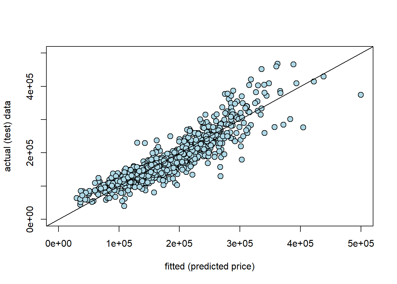
Here y_new is our prediction for the test set (the fitted values, \(\hat{Y}\)); the actual \(Y\) is our actual sales prices from the test set. Generally, these line up fairly well. Clearly, as the true price gets higher, we tend to predict higher prices. That said, In particular, we seem to under-predict the actual values at medium-high (true) sales prices. For example, we predict a whole bunch of houses to be $ $300-400k$, which were actually sold for price around \(\$400-500k\). It seems that it is generally harder to predict the very high price sales.
5.5.8 Nearest Neighbor regression
Multiple regression is not the only way to work with continuous outcomes. Another option is to use our nearest neighbor ideas from before. Obviously, we won’t be taking a “vote” anymore, because the outcomes are not categories. Instead, we will find the \(k\) nearest neighbors and take the mean. This will be our prediction for the test set.
More specifically, to predict a value for a test set observation, we simply find the \(k\) nearest neighbors in the training set (in terms of the \(X\)s relative to our test set observation), and take the average of their outcomes.
To do this, we need functions similar to those we wrote before. With some minor changes we can produce a predictor of continuous outcomes.
# Compute Euclidean distance between two numeric vectors
distance <- function(pt1, pt2) {
  sqrt(sum((pt1 - pt2)^2))
}

# Compute the distance between two data frame rows (as vectors)
row_distance <- function(row1, row2) {
  distance(as.numeric(row1), as.numeric(row2))
}

# Compute distances between each row in training and the example
distances <- function(training, example, output) {
  attributes <- training[ , !(names(training) %in% output), drop = FALSE]
  dists <- numeric(nrow(attributes))

  for (i in seq_len(nrow(attributes))) {
    dists[i] <- row_distance(attributes[i, ], example)
  }

  training2 <- training
  training2$Distance <- dists
  return(training2)
}

# Return the k closest rows in training to the example
closest <- function(training, example, k, output) {
  dista <- distances(training, example, output)
  sort_dist <- dista[order(dista$Distance), ]
  return(head(sort_dist, k))
}
These four functions:
- take a Euclidean distance between two points (
distance) - allow one to take this distance for rows of data (i.e. attributes) (
row_distance) - produce a distance for an observation from every row of the data (
distances) - return the \(k\) rows in the data with the shortest distances from the point in question (
closest)
The prediction will be based on those \(k\) closest rows, and involves taking the mean of the \(k\) outcomes. This function will do that:
predict_nn <- function(example) {
  nearest <- closest(train, example, 5, "SalePrice")
  return(mean(nearest$SalePrice))
}
As written, this function passes the requisite \(k\) (5 here) directly to closest(), and it also specifies the outcome of interest SalesPrice.
We can apply this to our data, by first creating a test set of attributes only. Note that this code takes a little while to run (\(\sim2\) minutes).
# Drop 'SalePrice' column from test set
test_df <- test[ , !(names(test) %in% "SalePrice"), drop = FALSE]

# Apply predict_nn to each row of test_df
nn_test_predictions <- apply(test_df, 1, predict_nn)
In principle, we can just compare our “true” values of the sales price with our \(kNN\) predictions. So, something like:
##    actual predicted_by_knn
## 1  215000         262300.0
## 4  244000         260830.2
## 5  189900         183400.0
## 12 185000         145210.0
## 14 171500         167300.0
## 17 164000         187320.0
But we would like something more systematic, and that allows us to compare this model’s performance with that of the multiple regression.
5.5.9 Root Mean Square Error
Root Mean Square Error (RMSE) is a popular way to compare models, and also to get an absolute sense of how well a given model fits the data. We define each term in turn:
- error is the difference between the actual \(Y\) and the predicted \(Y\) and is \(( \mbox{actual } Y- \hat{Y})\). Ideally we would like this to be zero: that would imply our predictions were exactly where they should be.
- square simply means we square the error. We do this for reasons we met above in other circumstances: if we don’t square the error, negative and positive ones will cancel out, making the model appear much better than it really is. This is \(( \mbox{actual } Y- \hat{Y}) ^2\)
- mean is the average. We want to know how far off we are from the truth, on average. This is \(\frac{1}{n}\sum ( \mbox{actual } Y- \hat{Y}) ^2\)
- root simply means we take the square root of the squared error. We do this to convert everything back to the underlying units of the \(Y\) variable.
Thus, RMSE is
\[ = \sqrt{\frac{1}{n}\sum ( \mbox{actual } Y- \hat{Y})^2} \]
Note that this quantity is sometimes known as the Root Mean Square Deviation, too.
5.5.9.1 Features of RMSE
Clearly, a lower RMSE is better than a higher one. The key moving part is the difference between the prediction for \(Y\) and the actual \(Y\). If that is zero, the model is doing as well as it possibly can.
The size of the RMSE is proportional to the squared error. That is, it is proportional to \(( \mbox{actual } Y- \hat{Y})^2\). This means that larger errors are disproportionately costly for RMSE. For example, from the perspective of RMSE it is (much) better to have three small errors of 2 each (meaning \(2^2+2^2+2^2=12\)) rather than, say, one error of 1, one of zero and one of 5 (meaning \(1^2+0+5^2=26\)). This is true even though the total difference between the actual and predicted \(Y\) is 6 units in both cases.
A related metric you may see in applied work is the Mean Absolute Error (MAE). This $| Y- | $. The \(|\cdot|\) bars tell you to take the absolute value of what is inside them. Like the RMSE, MAE is on the same underlying scale as the data. Unlike the RMSE, however, the MAE does not punish bigger errors disproportionately more (but it does punish them more).
Intuitively, the RMSE tells us
on average, based on the attributes, how far off the model was from the outcomes in the test set.
5.5.9.2 RMSE in Practice
Despite the long description, the code to calculate the RMSE is simple. We first calculate the square of the difference of every predicted \(Y\)-value relative to every actual test set \(Y\) value, and take the average (np.mean) of those. Then we take the square root of that quantity.
For the multiple regression we have:
MSE_regression <- mean((y_new - test$SalePrice)**2)
RMSE_regression <- MSE_regression**(.5)

cat("\n the regression RMSE was:",
      RMSE_regression,"dollars")
##
## the regression RMSE was: 31644.44 dollarsSo the multiple regression was about \(\$31\)k dollars off (on average) for each predicted sales price. What about the \(kNN\) regression?
rmse_nn <- mean((test$SalePrice - nn_test_predictions) ** 2) ** 0.5
cat("\n RMSE of the NN model is:", rmse_nn, "dollars")
##
## RMSE of the NN model is: 41160.15 dollarsFor the \(kNN\) model it is a little higher, missing the actual value by about \(\$41\)k dollars on average. For this problem then, we would conclude the multiple regression was the better model.
5.5.10 Aside: using R for NN regression
Just for completeness, we show that we can replicate our results above with R’s packages. We can’t use the class package for regression, so we will use FNN instead. Let’s grab it:
We then pass in the training and test sets (without the SalePrice variable) and fit the \(k=5\) model.
trainX <- train[, !(names(train) == "SalePrice")] # drop outcome variable
result <- knn.reg(train = trainX, test = testX, y = train$SalePrice, k = 5)
fnn_predictions <- result$pred
Finally we calculate the RMSE again:
rmse_fnn <- mean((test$SalePrice - fnn_predictions) ** 2) ** 0.5
cat("\n RMSE of the fNN model is:", rmse_fnn, "dollars")
##
## RMSE of the fNN model is: 41160.15 dollars5.5.11 Additional aside: when to use \(kNN\) vs. multiple regression
Above, we showed that multiple regression performed a little better overall for predicting house sales prices. But, of course, we should not always expect this to be true. There is a big literature on anticipating what types of models do better on what types of data, and we will not try to summarize that here. Nonetheless, it is worth noting by its very nature \(kNN\) tends to do better when there are non-linear relationships in the data. This is because \(kNN\) uses points ‘local’ to the given observation to make predictions, and this allows the relationships between the \(X\)s and the \(Y\)s to be quite different for different values of \(X\). Whereas something like a linear regression does not allow this.
To get a sense of this, let’s make a toy data set. We will have a \(Y\) variable which is the sales price of houses again, but this time our (one) \(X\) variable is distance to the nearest train station. In general, we anticipate that being near the train station leads to a higher price (because people commute). But as we get very close to the train station, we expect prices to decline. This is because public transit stops can be noisy, attract traffic etc.
Here miles_from_station goes from a low number (0.2 miles, so about a five minute walk) to a high number (3 miles, which one would need to drive or cycle presumably). We will suppose that prices are a non-linear function of this distance.
prices <- 500000 - ((1.5-miles_from_station)*400)**2
actual_ps <- prices + rnorm(n = length(prices), 0, sd=40000)
Here, prices are a quadratic function of the distance from the station. They are maximized at 1.5 miles away: so walkable, but not too close in terms of the downsides of too short a distance. To construct actual_ps we just add some random noise to the prices to reflect the idea that markets aren’t perfect and things are measured with error etc.
If we plot the data, the pattern is clear:
plot(miles_from_station, actual_ps, pch=16, col="lightblue", ylab="price",
     xlab="distance from station")
Basically, a house close or far from the station is the cheapest option. One that is an “ideal” distance (1.5 miles) is the most expensive.
Let’s set up a training and and test set, and see how multiple regression versus \(kNN\) regression does on this problem. First we will put everything in a data frame.
set.seed(6)
the_data = data.frame('house_price'= actual_ps,
                         'miles'= miles_from_station)

traind_indices <- sample(1:nrow(the_data), size = 0.5 * nrow(the_data), replace = FALSE)
traind <- the_data[traind_indices, ]
testd  <- the_data[-traind_indices, ]
5.5.11.1 Regression model
Now we fit the regression model:
Now predict the test set:
And report the RMSE:
MSE_regression2 <- mean((y_new2 - testd$house_price)**2)
RMSE_regression2 <- MSE_regression2**(.5)

cat("\n the mileage regression RMSE was:",
      RMSE_regression2,"dollars")
##
## the mileage regression RMSE was: 100537.1 dollarsSo each prediction for the regression is about \(\$100\)k dollars off, on average.
5.5.11.2 \(kNN\) comparison
Now we will do the same thing, but for the \(kNN\) regression:
trainXd <- subset(traind, select=miles) # drop outcome variable
result2 <- knn.reg(train = trainXd, test = testXd, y = traind$house_price, k = 5)
fnn_predictions2 <- result2$pred
rmse_fnn2 <- mean((testd$house_price - fnn_predictions2) ** 2) ** 0.5
cat("\n RMSE of the miles fNN model is:", rmse_fnn2, "dollars")##
## RMSE of the miles fNN model is: 45895.42 dollarsHere, each prediction is about \(\$46\)k dollars off. This is a large improvement over the linear regression. And that makes sense: a linear model is the wrong choice for an obviously non-linear relationship.