2 Statistics and Hypothesis Testing Part 1
Welcome to the first statistics chapter of this book. We assume you have seen some statistics previously (e.g. POL345). Even if you have previously seen a fair amount of statistics, or perhaps econometrics, biostats, or the equivalent with particular focus on a specific field, we encourage you to read this chapter carefully and work through the code in your own time so that you make sure you are absolutely crystal clear on the terminology we are using.
Some thoughts for everyone, regardless of your prior experience:
- Statistics has a very specialized and precise vocabulary, and some of it can be tricky to keep clear – in our experience, especially if it’s been a bit of time since your last exposure to statistics, it is important to pay close attention to the terminology here so that you make sure you’re using and understanding it absolutely correctly.
- In addition to the vocabulary being very particular, there are also many terms that sound similar but refer to different concepts – for example, a sample vs. sampling distribution, which we will discuss shortly. Please read this chapter closely with an eye to these almost-overlapping terminologies. We endeavor to make the distinctions as clear as possible, but a bit of memorization will likely be helpful as you go.
- As with programming, and really all of data science, learning by doing is going to be your friend here. Don’t just read the examples – practice them yourself. Write out the code, try modifying it, run the simulations, and experiment. Remember, error messages can help you learn, so don’t worry if you generate a fair amount early on.
2.1 Population parameters and sample statistics
In most statistical reasoning problems, we are trying to make an inference about a population. The population is the > universe of cases we wish to describe.
It is easy to think of examples of questions that require us to learn something about a population:
- How will every voter (who turns out to vote) vote in the United States in the 2024 Presidential election? This is something opinion polls try to estimate.
- What is the average income (per household) in the United Kingdom? We might want to estimate this, so we can compare the UK to other countries, or for policy-making.
- What proportion of the people living in NYC have been a victim of crime this year?
- How common is a particular animal species (say, the red fox) in the world? is it becoming more or less numerous over time?
- How polluted is the Hudson River, on average, over its length?
We call the characteristic we care about—the vote choice, the proportion who have had COVID, the number of living animals from a species—the population parameter. Unfortunately, unless we do a census—where we record the status of every single member of the population—we cannot study the population directly. This may be because it is simply too time consuming, or too expensive to get that information (imagine asking every single one of the 200 million voters who they expect to cast their ballots for, or trying to survey every inch of the world to count up how many red foxes live there).
Consequently we will often resort to using a sample to make inference about the population. Specifically, we will use sample statistics to estimate population parameters. The use of the term “estimate” here is important: because we will not generally have access to the whole population, we can never know the population parameter value with absolute certainty. But we will be able to talk about our estimates of those parameters and the uncertainty around them.
In this course, we will mostly focus on large, random samples. This is in keeping with the sorts of datasets many data scientists find they have access to in the real world. In more traditional social science courses, one often has very small samples (< 30), which calls for some special techniques we will not cover.
2.1.1 Random Samples
When we talk about a sample being random we mean
the units in the sample are selected in a non-deterministic way, by chance
We will give more details, and examples, below. For now, by “non-deterministic” we mean that if we did the sampling all over again, we would expect it to come out differently—that is, the units (people, voters etc) we would draw would be different.
We met the idea of “random sampling” before, when we talked about randomized control trials. There, we wanted to randomize people to treatment or control. This was motivated by wanting to avoid the subjects self-selecting into a particular group; by extension this would eliminate potential biases or differences between the groups in terms of background characteristics.
There is a similar idea here, insofar as we don’t want particular types of units disproportionately ending up in the sample we use. Fortunately, computers are extremely good at generating all things random, including random numbers and random samples. So we will use them.
2.1.1.1 Probability Samples
For a probability sample
before we draw the sample, we can calculate the chance that any given unit (from the population) will appear in the sample
The most famous and obvious example is a simple random sample (sometimes “SRS”, sometimes “\(\frac{1}{n}\) sampling”) where
the probability of any given unit appearing in the sample is \(\frac{1}{n}\), where \(n\) is the size of the sample.
Some simple examples can help fix ideas:
- suppose we are randomly drawing balls for a draft lottery, and each ball has a day of the year on it. Ignoring leap years, the probability that we draw a given date, say September 9 is \(\frac{1}{365}\) or around 0.0027.
- suppose we are randomly drawing cards from a regular deck. The probability of drawing a King is \(\frac{4}{52}\) or around 0.077.
2.1.1.2 Sampling with and without replacement
Returning to the draft lottery idea, recall that each ball (if we ignore leap years) has a probability of \(\frac{1}{365}\) of being selected. Suppose I sample one ball (one date). I could then:
- replace it, meaning I just put it back with the others balls. Now the chance of picking any given date is, once again, \(\frac{1}{365}\). This is called sampling with replacement.
- not replace it, meaning I remove it from all the other balls permanently. Now the chance of picking any remaining date ball in the lottery is \(\frac{1}{364}\), and the probability of me picking the ball I already picked is zero. This is called sampling without replacement.
We can simulate this difference with basic code. First, we will define an object call days: it is just all the numbered balls in the lottery (there are 365 of them, but this needs to be set up as a range from 1 through 366).
Let’s draw a sample of size 100 with replacement (replace=TRUE):
If you take a look at days_draw_replace you should see some repeat days (why?). Let’s draw without replacement:
If you look at days_draw_noreplace you will see that, now, there are no repeats (why?).
2.1.2 Probability Distributions
Let’s start with a simple experiment. We will roll one “fair” (think: unbiased) six-sided die, and see how it comes up: i.e. what numbers we roll. What percentage of the time do we think it will come up “1” v “2” v “3” etc? Let’s plot all the values it could take, and the percentage of the time we expect each outcome. We will call this the probability distribution: it is how the data should stack up. It will look something like this:
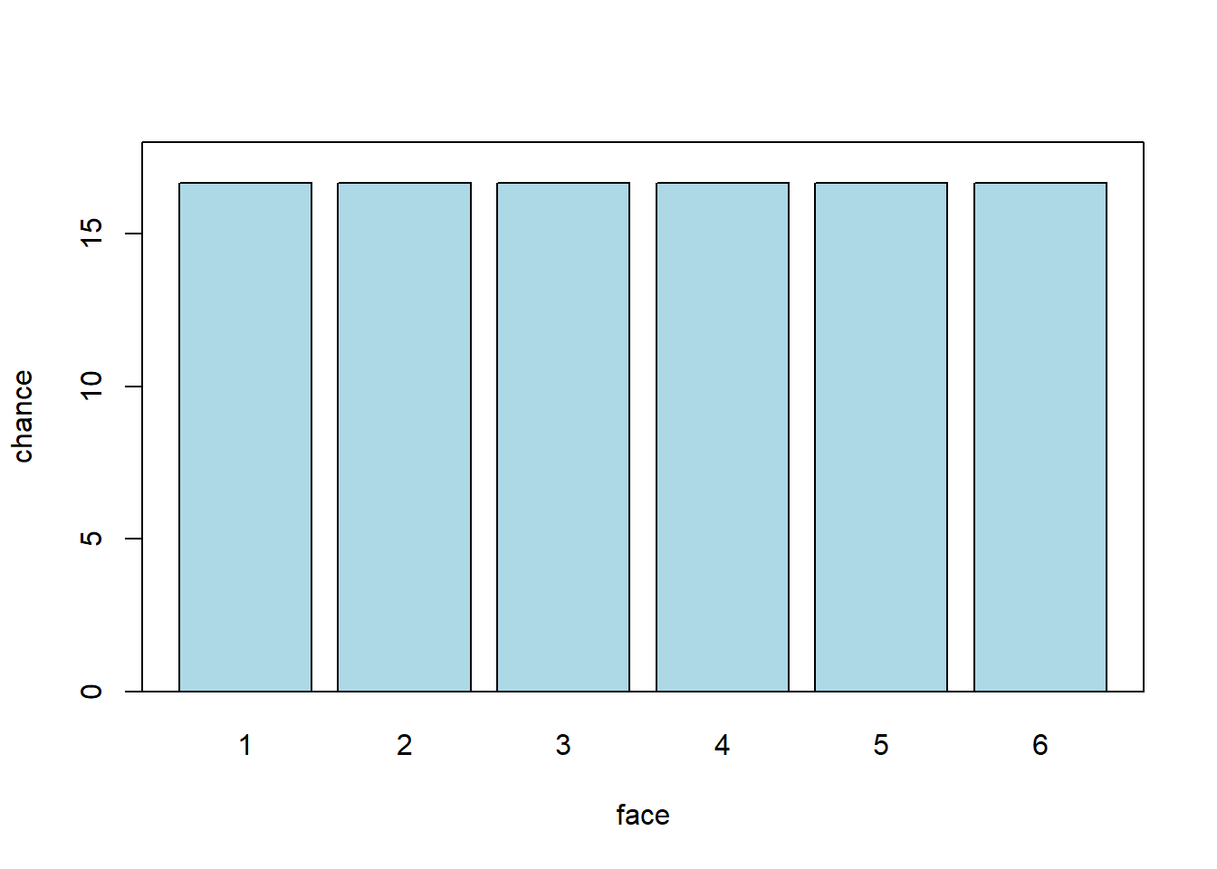
Each face should be rolled about \(\frac{100}{6}\) of the time. Which is somewhere around 17%. Notice that here, each possible outcome is in a separate ‘bin’—we cannot roll 5.5 or 3.234 etc. So we say this distribution is discrete. Second, you can see that all the faces are as likely as each other. We use the term uniform to describe such distributions. So: this is a discrete uniform distribution.
Now this is how we expect the die to behave. What will happen in a specific set of rolls that we do is called the empirical distribution.
2.2 Empirical distributions
Above, we talked about a probability distribution as the way we expect the die to behave, in theory. Empirical distributions, on the other hand, are distributions of actually observed data. They can be visualized by empirical histograms.
To see why an empirical histogram might differ to a probability distribution, suppose we roll our die ten times. It cannot (the numbers don’t add up) come up “1” \(\frac{10}{6}\) times, “2” \(\frac{10}{6}\) times, “3” \(\frac{10}{6}\) times etc.
To see what happens, let’s roll it ten times and simply draw the resulting histogram. Actually, we will simulate this via the computer. But the effect is the same (albeit much faster).
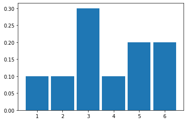
It looks like it came down “1” 1 time out of 10 (so 0.1), “2” 1 time, “3” 3 times, “4” happened once, and then “5” and “6” were rolled 1 time each.
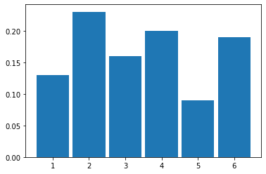
Let’s try 100 rolls:
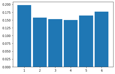
And then 1000 rolls:
2.2.1 Law of Large Numbers
As we increase the size of the sample (the ‘\(n\)’, which is the total number of rolls), we see that the histogram looks more and more like our probability distribution for a fair six-sided die. That is, it looks more and more similar to a discrete, uniform distribution.
This is an implication of a very general result called the Law of Large Numbers (LLN). It says that
if we repeat an experiment many, many times, the proportion of times we see a given outcome (say, a 3 or a 6) empirically will converge to the theoretical value we would expect (\(\frac{1}{6}\))
We can push this logic further. Suppose we are interested in the average (actually “mean”) value of a set of dice rolls. This average is \(\frac{1+2+3+4+5+6}{6}\), which is 3.5. That’s our expectation. As we take larger and larger samples of die rolls, the empirical average we calculate each time will converge to this theoretical, expected value. We see that in the plot below:
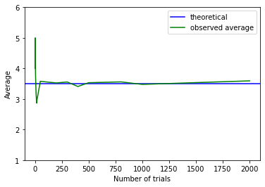
When the sample is small, the calculated empirical average (green) is quite far away from the expected value (blue). But it soon approaches it as \(n\) increases.
2.2.2 Sampling from a Population
So far, we have been sampling from (hypothetical) trials—like rolling dice. But we started out wanting to use samples to inform us about populations. And that’s where we now turn.
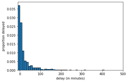
To represent our population, we will study \(14000\) United departing flights from San Francisco in 2015. Of course, this isn’t an especially unwieldy number as populations go, but we can still learn the key lessons. Let’s plot this population: in each case, our measurement of interest is how delayed each flight was. This can be anywhere from negative (the flight left early) to zero (it left on time) to a very large number of minutes (it was heavily delayed). Let’s plot this population distribution.
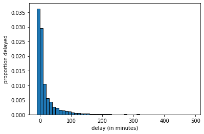
We see there are some flights that leave early or on time, and then a large number between zero and ten minutes late, a smaller number 10 to 20 minutes late and so on.
We can sample from this population. Let’s start with sample of size 10.
 united <- read.csv('data/united_summer2015.csv')
 delays <- united[,"Delay"]
 delays_sample = sample(delays, size=10, replace=FALSE)
The histogram of delays_sample looks like this:
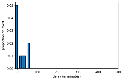
delays_sample, \(n=10\)
If we increase the sample size to 100 we get:
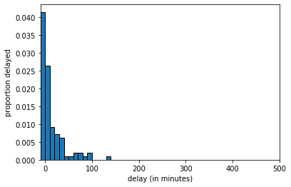
delays_sample, \(n=100\)
And at \(n=1000\) we get:
delays_sample, \(n=1000\)
The key thing to notice is that, as the LLN predicts, as we increase the sample size, we get a sample that looks increasingly similar to the population. But this means that quantities we calculate from the sample will become increasingly similar to the “true” quantities in the population.
2.2.3 Averages: Median
There are many features of the population we might wish to know. Let’s start with the median. This is defined as the
value “in the middle” when we rank all values of the variable; half the values are above, half the values are below.
This is equivalent to the 50th percentile, meaning
50 percent of all the values are above, 50 percent of all the values are below.
Suppose our sample of delays (in minutes) was
\[ 1,3,9,7,7,5,3,3,11 \]
We rank them
\[ 1,3,3,3, \fbox{5}, 7,7,9,11 \]
and the middle value, and thus the median, is 5. There are special rules when the total set of numbers is even, or we have ties, and different software resolve this different ways. We will return to that.
Now, suppose we want to know the median delay in the population. To estimate it, we take a sample of \(n=1000\) and calculate the median of that sample.
2.2.4 Parameters and Statistics
Suppose we take a random sample from our population, and calculate our statistic of interest, which is the median. For our first sample of \(n=1000\), the result is below:
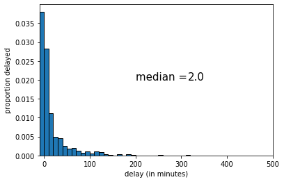
The median of this sample was 2 (minutes delay). If we draw another sample, we get the following:
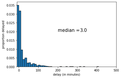
This time the median was 3 (minutes delay). Let’s draw one more random sample:
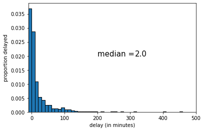
This time the median was 2 (again). Let’s try drawing 9 new samples, and recording the median each time.
par(mfrow = c(3, 3),         # 3x3 grid
    mar = c(2, 2, 2, 1),     # margins: bottom, left, top, right
    oma = c(0, 0, 0, 0))     # outer margins

for (i in 1:9) {
  ss <- sample(delays, size = 1000, replace = FALSE)
  hist(ss, main = paste("median =", median(ss)),
       xlim = c(0, 150), ylab = "", xlab = "",
       breaks = 25, col = "lightblue")
}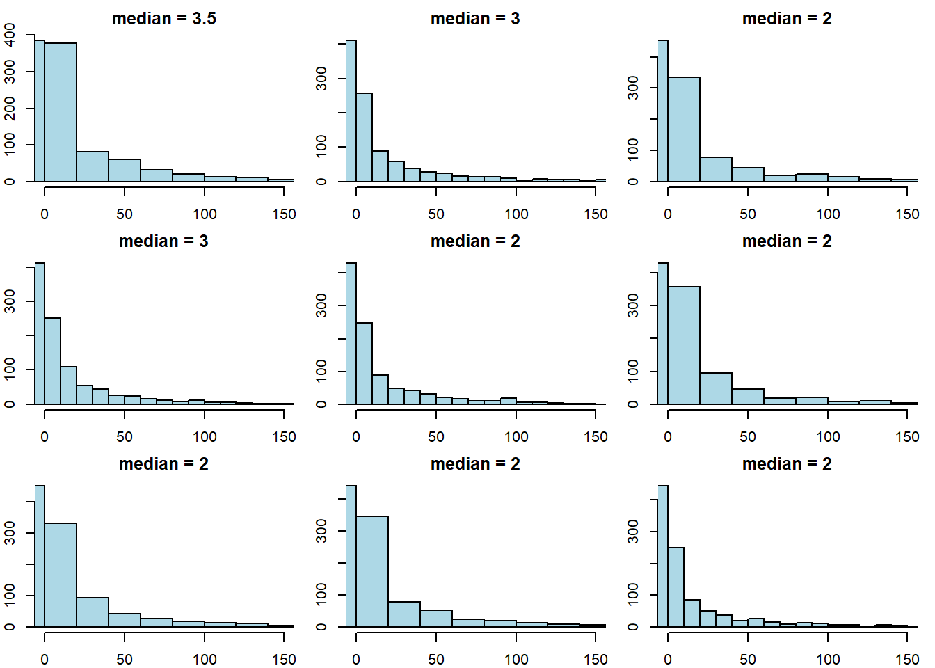
The key point here is that sample statistic depends on the random sample we happened to draw.
2.2.5 Sampling Distribution
To reiterate: every time we draw a random sample, we get a different histogram (because the sample is different), and the value of the median varies. Notice that our population parameter (the population median) is considered fixed but unknown to us—it is the sample statistic that varies, not the population parameter.
A natural question is how different the sample statistic could have been, which is informative about the possible values that the population parameter could take. Put differently: given the samples we drew, how large could the population parameter be? how small might it be?
In statistics, there are two main ways to calculate what the “true” value might be:
- analytically: this means we mathematically work out what values it could take.
- simulation: this means we take a very large number of (large) samples, calculate the sample statistic each time, and then plot the distribution of those sample statistics.
In either case, we are obtaining the sampling distribution of the statistic. This is
the probability distribution of the statistic from many random samples. Literally for us, it will be the histogram of all the values that the statistic takes from many random draws from the population.
The sampling distribution specifies the probabilities of the all the possible values that a sample statistic can take. Notice this is not the same as the sample distribution: that is simply the histogram of a given sample we drew (see above for examples of this with median of 2 and 3 for the United data).
The reason the sampling distribution is valuable, is because it enables us to how close a statistic will fall (on average) to the parameter we are trying to estimate. This will help us do hypothesis testing.
Here is the sampling distribution for the median of the United data set. In practice, we are drawing \(5000\) samples of size \(1000\), and each time recording the median. Then we are drawing a histogram of those \(5000\) medians.
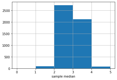
The \(y\)-axis here is just the raw number (out of 5000) of medians of a particular value. It looks like most of those medians are between 2 and 3, with a sizable number between 3 and 4.
There is a large literature beyond this course about how many samples one needs to draw, and how large each one should be. For our problem here, the numbers chosen should be enough, but there are some cases where you need many more (or perhaps less) samples to obtain an accurate sampling distribution.
2.3 Testing hypotheses: Swain vs. Alabama
Consider the following research questions:
- Is global warming responsible for forest fires?
- Does circumcision reduce HIV risk?
- Did austerity cause Brexit?
- Does breastfeeding increase IQ?
Some of these questions are amenable to randomized control trials, but some are not. But whether we can do an RCT or not, we need a model for the data generating process (DGP). The DGP is
the set of assumptions about the chance processes that gave us the data we actually saw in the world.
A simple example of a DGP is the assumptions that human heights follow a particular distribution (e.g. are normally distributed). But one can make many other assumptions.
A model is
a simplified version of reality that helps us link hypothesis to experiments or to observational data
The model tells us how to think about the “important” aspects of the data generating process. For example, a simple model of why people vote the way they do is that they work out which party will leave them better off financially, and vote for it. Like all models, this is wrong insofar as it doesn’t completely explain why everyone votes the way they do. But it is helpful in part because it may have some predictive power, and because it may tell us what types of hypotheses to test. For example, that model might tell us to test the hypothesis that richer people vote for the party that wants lower taxes.
2.3.1 Swain v Alabama
To get a sense of these ideas, we begin with a legal example. Robert Swain was a Black man on trial in Talladega County, Alabama in 1965. The 12 person jury allocated to the case was all white; this was despite the fact that approximately 26% of the local population eligible to serve was Black. Indeed, in this particular county, not a single Black person had served on a trial jury since 1950. Juries in the county were selected from panels of 100 people. On Swain’s panel, only 8 people (so, 8%) were Black.
Swain appealed his conviction to the Supreme Court on the basis that Black jurors had been deliberately excluded (“struck”), and thus he had not had a fair trial violating his 14th Amendment rights.
The task before the Supreme Court was to decide whether there was in fact evidence of systematic exclusion of Black people from juries by the county. Ultimately the court ruled against Swain; it acknowledged the nature of his panel, but argued that “the overall percentage disparity has been small and reflects no studied attempt” by the county to exclude based on race. Furthermore, unless Swain could demonstrate that the attempts were systematic, he could not show his trial was unfair. Ultimately, a later case—Batson v Kentucky—lead to the Supreme Court ruling that excluding only based on the race of a potential juror was not legal. But this was too late for Swain.
2.3.2 A model of jury panels
How plausible is it that there was “no studied attempt” to exclude Black people from serving on juries? That is, what model of the world is consistent with the Supreme Court’s judgment. We can simplify by focusing on the panel. To recap, this had 100 members, of which 8 were Black. Our central question is:
if the panel was picked at random from citizens (26% Black), how likely is it that it would contain (only) 8 Black men?
We will be more precise below, but for now:
- if the answer to this question is “pretty likely”, then the Supreme Court judgment is reasonable
- if the answer to this question is “pretty unlikely”, then the Supreme Court judgment is unreasonable.
2.3.3 A Simulation Study
We will investigate this question via simulation. In particular, based on what we know about the county, we will draw many jury panels and see how many of them looked like the one Swain received. If this number is small, then we have evidence consistent with systematic discrimination.
More precisely:
- we will simulate the drawing of 100 jurors from the county, where 26% of the population is Black.
- This simulation will show us what the panels would have looked like assuming the Supreme Court’s “model” was correct—i.e. if panels are indeed simply randomly drawn from the surrounding area, with no account for race.
- We will compare that simulation “model” outcome to the actual outcome experienced by Swain (8 Black jurors)
- If the model outcome looks very different to Swain’s actual, empirical outcome, we can conclude the model is a poor one: Swain’s outcome was not due to random chance. If the model outcome looks very similar to Swain’s outcome, we can conclude the model is a good one: Swain’s outcome was due to random chance.
2.3.3.1 Statistic Under The Model
What statistic shall we calculate and inspect? Presumably, it is the number of Black people in our jury panel simulations. There are two broad possibilities:
- this statistic is small (so, 8 or smaller), which means Swain’s outcome is consistent with random selection, and the Supreme Court is right or
- this statistic is not so small (so, more than 8), which means Swain’s outcome is not consistent with random selection, and the Supreme Court is wrong.
Notice the idea of a binary decision: either we find evidence in line with the model, or we don’t, and we reject it. We will return to this reasoning structure in more detail below.
2.3.3.2 Simulations
In words, we need to:
- draw 100 people from a distribution where the underlying proportions are 26% Black, and 74% non-Black
- study each 100 person draw; the number of Black people will differ slightly, randomly, with each draw: it might be 10, then 5, then 21 etc. We record these numbers.
- repeat steps 1. and 2. a very large number of times. This will enable us to build up an empirical distribution of the counts.
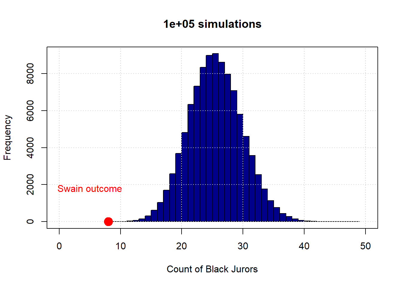
Let’s begin with 10 draws (of 100 people each). Here is the resulting distribution (in blue):
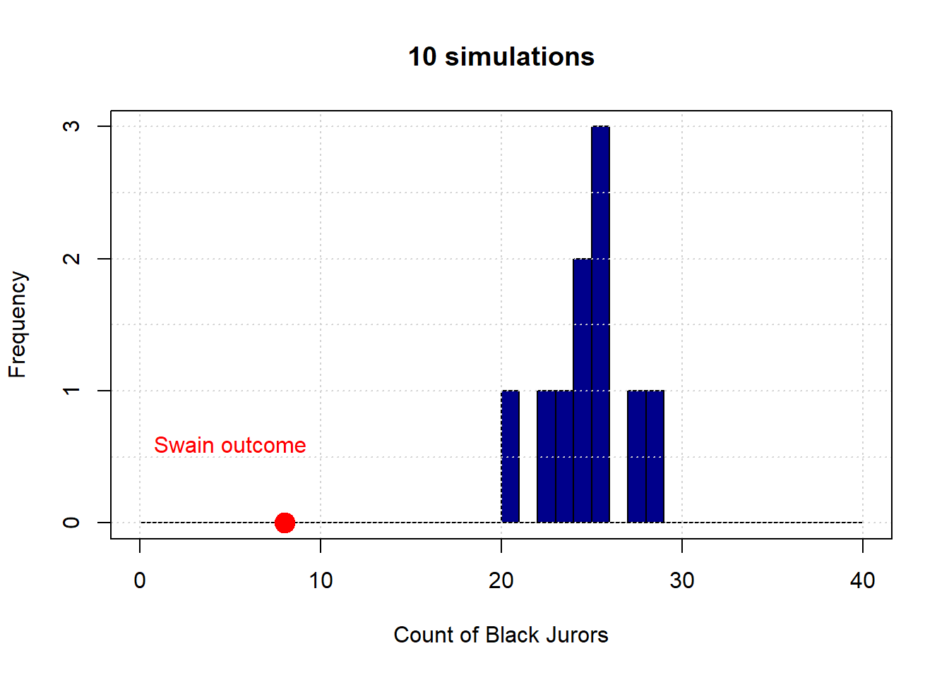
The observed outcome in Swain’s case is the red dot (at the count of 8). Let’s increase the number of simulations to 1,000:
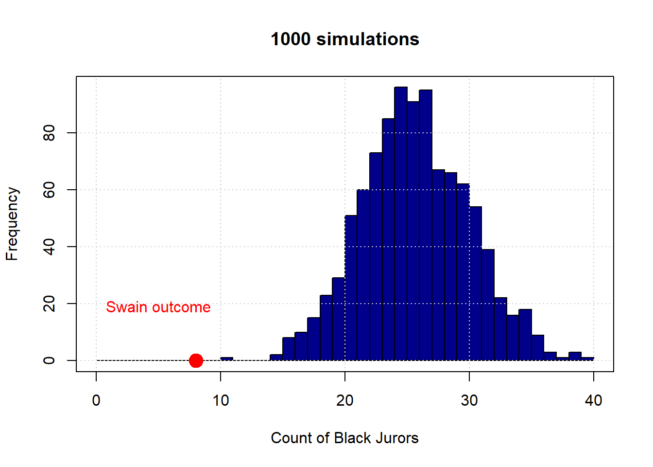
And finally to 100,000:

To reiterate, the distribution in blue is what the “random” model says are the possible outcomes—in terms of counts of Black jurors—for this data generating process. As we can see, this is always very far from the actual outcome Swain received. Put differently, it is not very plausible that Swain’s outcome is consistent with a no systematic discrimination model jury selections.
More formally, we say we have evidence to “reject” the hypothesis of random selection. And we have evidence consistent with an “alternative” hypothesis of discrimination. We will return to such ideas in some detail below.
2.3.3.3 Analytical Probability
In practice, none of the histograms above overlap with the Swain outcome. This means that there was never a single simulation draw which had 8 Black people (or fewer). Taken literally, this implies that the probability of 8 Black people or fewer is zero. But this is not true: it is in principle possible that we could select a panel with that number. Indeed, we could select a panel with 0 Black people or 0 non-Black people or any combination in between. But it is a very rare event.
How rare is this event? That is, what is the exact probability of drawing 8 or fewer Black people based on the demographic background of the county? Assuming independent draws from the population, and a binomial DGP (meaning there are two categories of outcomes), the probability is around 0.000047. Or around \(\frac{1}{212,000}\). Here’s the code in R:
## [1] 4.734795e-06To see a model distribution that overlaps with Swain’s outcome, we would (probably) need to do many more simulations. Even with say, one million, it is not guaranteed that our model distribution would overlap (feel free to experiment, but it might take a while!).
2.4 Testing hypotheses: Null vs. Alternative
We will now be more formal about some of the basic hypothesis testing ideas we established above.
2.4.1 Swain Recap
Here again is the 100,000 simulation version of the Swain case.
To reiterate, the distribution in blue is what the “random” model says are the possible outcomes—in terms of counts of Black jurors. This essentially never overlapped with Swain’s actual outcome, so we said we have evidence to “reject” the hypothesis of random selection. And we have evidence consistent with an “alternative” hypothesis of discrimination.
2.4.2 The Null Hypothesis
The null hypothesis, sometimes written \(H_0\), can be thought of as the skeptical position on the possibility of a given relationship (in the population). The null hypothesis, often referred to as the “null”, claims that
any relationship we observed in the sample was simply a matter of chance in terms of the particular sample we saw. This relationship does not exist in the population.
In the case of Swain, the null hypothesis is the hypothesis under which we generated the simulations: it is contention that juries are randomly drawn from the population (in proportion to the number of Black and non-Black people living in the county), and any seeming divergence from that randomness in Swain’s case was due to chance alone.
If we do not find much evidence against the null hypothesis, we will fail to reject the null hypothesis. In Swain’s case, the Supreme Court felt they could not reject the null.
2.4.3 The Alternative Hypothesis
Clearly, Swain and his lawyers felt they could reject the null, though of course they did not use those terms. They were arguing that the evidence was consistent with the alternative hypothesis, written \(H_1\) (“aitch one”) or \(H_A\). More formally, the alternative hypothesis says that
something systematic, other than chance, made the data differ from what we would expect under the null hypothesis. That is, there is a real difference or real relationship between the variables, and that this is true in the population.
Typically, the alternative hypothesis is our hypothesis of interest, and the one we have a theory about. Occasionally however, studies will argue that the null hypothesis is more interesting: e.g. studies that show there is no difference on medical outcomes between groups who take or do not take homeopathic treatments for ailments.
For Swain, the alternative hypothesis is that 8 (or fewer) Black people on the jury panel could not plausibly have occurred by chance for his “sample”, and instead reflects something systematic in the population. That is, it reflects a true bias in jury selection.
2.4.4 Decisions
A hypothesis test involves one decision, and there are two options. We either
- reject the null hypothesis, meaning we think the world is consistent with the alternative hypothesis
or
- fail to reject the null hypothesis, meaning we think the world is consistent with the null model.
There are no other options: we are never not able to make a decision, nor can we say “both”.
One immediate observation is that this logic is all with respect to the null hypothesis. There are various reasons for this, and one way to think about it is that we “privilege” the null insofar as we are generally skeptical that what we are seeing is anything other than chance.
Notice too that we don’t talk of “confirming the alternative hypothesis” or similar language, even if we reject the null. This is because, technically, rejecting the null is not evidence that our particular alternative hypothesis story must be true. Put differently, there are lots of alternative hypotheses consistent with the rejection of this one null hypothesis.
2.4.5 Test Statistics
For a hypothesis test, we need a summary of the data we saw that tells us how far it was from what would expect under the null hypothesis. This is the task of something we call a test statistic,
it is a value we calculate that tells us the relative plausibility of the null vs the alternative hypothesis
This course will not spend a great deal of time on the theory behind test statistics. But in general, we try to find ways to summarize our data such that large, absolute values suggest that \(H_A\) is more plausible than \(H_0\). Recall that the absolute value of some number \(x\)
is the magnitude of that number, regardless of its sign, and is written \(|x|\). That is, without regard to its sign. So if \(x\) is negative, we simply remove the minus sign; if it positive (non negative), we leave it as is.
2.4.5.1 Testing Procedure
Once we have decided on what our test statistic will be, we take the following steps:
- based on the set up of the experiment, we will simulate the test statistic many times.
- we compare the simulated test statistic from (1), with the actual observed statistic from the experiment itself
- then we make our decision about whether the evidence suggests we should reject the null, or fail to reject the null.
In practice, the observed statistic (and thus the test statistic) might be a difference or an average. We now give some examples to make this clearer.
2.4.6 One Sample Test: Life Expectancy in NYC
To see how some of our test machinery works, we will do a one sample (mean) test. The general idea is that we have an average (specifically, a mean) of a sample and we want to compare it to some specified value. We want to learn whether the average of our sample of interest is different (or not) from that other pre-specified mean; actually, we will start out just trying to ascertain if the mean is lower than another mean (“is different” is more general, and we will return to it).
Our example is of life expectancies, in years, for various parts of Manhattan. The actual data are not real, but are close to the real values. Consider the table below, and suppose it is drawn from random samples of death certificates in the various districts.
| Neighborhood | Midtown | Greenwich Village | FiDi | Stuy Town |
|---|---|---|---|---|
| Average life expectancy | 85.09 | 86.52 | 86.00 | 85.67 |
| Sample size | 36 | 30 | 24 | 31 |
Our interest is in the life expectancy in Midtown: at 85.09 years, it is shorter than the other districts. But that might have been just due to having an unusual (random) sample—we only had \(n=36\), after all, and perhaps we just got “unlucky” when we sampled those certificates, that day, in Midtown.
To tackle this problem, we will first assume that all the districts together constitute some population of interest—say, “Manhattan.” This obviously is not true—there are many other districts—but it doesn’t affect the main logic of what we will do in terms of hypothesis testing. That hypothesis test will boil down to asking whether the Midtown mean is “unusual” or “special” relative to the mean of the districts as a whole—specifically, that it is unusually low.
More formally, our question is:
is the average life expectancy that we recorded from the \(n=36\) sample for Midtown less than what we would have recorded had we just taken a random sample of \(n=36\) from the population as a whole?
In terms of hypotheses:
- our null hypothesis is that the answer is “no”. That is, there is nothing special about Midtown, and it does not differ relative to the other districts by anything more than chance sampling. The life expectancy there is not lower.
- our alternative hypothesis is that the answer is “yes”. That is, there is something different about Midtown. Beyond just chance sampling, it differs systematically from the other districts, and specifically it has lower life expectancies.
To return to the language above, this is a “one sample test” insofar as we have the mean of a specific sample (here, Midtown) and we want to know whether that mean differs from (actually, is lower than) a particular value (here, the mean of Manhattan).
In other courses, you might do a (one-sample) \(t\)-test at this point. But here we will do something different:
- First, recall that the null hypothesis is that our Midtown sample mean is not lower than the mean we would have seen had we generated a sample from Manhattan as a whole.
- In that case, let’s just draw a sample of \(n=36\) from our total Manhattan sample of 121 death certificates \((36 + 30 + 24 +31 =121)\). Then take the mean of that random sample. This is our test statistic.
- We want the distribution of that test statistic—all the different values it could take—so we can see how plausible our observed (test) statistic (the mean of Midtown) is. To get that distribution, pull many repeated samples of size 36, and record the mean.
- We will plot that distribution of hypothetical means, and then see how close or far away our Midtown mean is relative to that distribution.
Let’s work through some code on this.
2.4.7 Simulations for life expectancy
First, we will load the relevant ‘health’ data, and take the mean by district
health <-  read.csv("data/nyc_health.csv")
district_averages <- aggregate(health$life_expect, by=list(health$district), FUN=mean )
Let’s double check this data accords with our table above, at least in terms of sample size:
##
## financial_district  greenwich_village
##                 24                 30
##            midtown          stuy_town
##                 36                 31
Next, we need to sample, repeatedly, from the life_expect column. We will do this by dropping the district label on our data, and then writing a function to do repeated draws from the data.
This function will sample 36 units from the life expectancy data. And then it will take the average of those life expectancies via mean. We will call that function momentarily, but first we need an array ready to take all those averages:
Let’s call the function a large number (say, 10000) times. Each time, we will calculate the mean and append it (so, stick it on the end) of the array. That array will get longer as we do it:
set.seed(50)
repetitions <- 10000
for(i in 1:repetitions){
sample_averages <- c(sample_averages, random_sample_average() )
}
The set.seed command simply ensures that we get the same answers every time. To explain briefly: the computer is using an algorithm to create random numbers, which then allow it to generate random draws from the data. The random numbers are not truly random (but look random to us), and are produced via a ‘seed’. You can think of that as telling the computer where to ‘start’ looking for numbers. If we fix the seed, it will produce the same “random” numbers every time. This allows everyone using this code to get exactly the same answers below. But you can vary the seed (50) and see what happens. For this particular case, it shouldn’t lead to very different results.
Next, we define our observed statistic, which is just the (actual) mean we are interested in—the one for Midtown:
Now we have both the observed statistic, and the distribution of the test statistic under the null hypothesis of Midtown being a random draw (the simulations we did). We can just plot these together, a bit like in the Swain case:
hist(sample_averages, breaks=20, col="lightblue", main="", xlab="life expectancy")
points(observed_statistic, 0, col="red", pch=16, cex=3)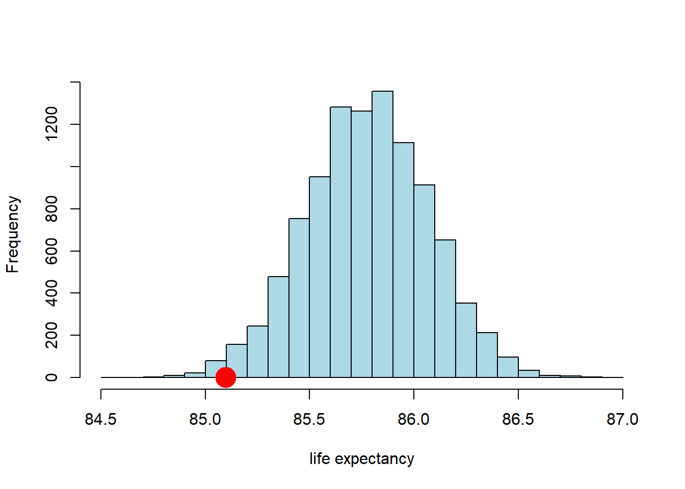
So far so good. It looks like the observed statistic (85.09 years) overlaps a little with the distribution of the statistic under the null. How much overlap is there? We can answer that directly by calculating the proportion of samples that had a mean higher (or lower) than the observed statistic. This is:
## [1] 0.0118Here, we are asking for the count of the sample averages that are less than or equal to (<=) the Midtown average, and then dividing out by the number of samples (the repetitions) to make it a proportion. Ultimately it is 0.0118 (this may vary a little if you use a different seed above).
2.4.8 p-values
We know that around 1.18% of all the random draws were less than or equal to our observed (test) statistic of 85.09 years. Put otherwise: if we drew a random sample of size 36 from our population, the probability that the mean of that sample would be less than or equal to the Midtown mean is 0.0118.
More formally: if the null hypothesis is correct (recall: Midtown not lower), the probability of observing a value for the test statistic (the mean of the random samples) as small or smaller than the observed statistic we saw in the data (85.09) is 0.0118. This number is our p-value. This tells us
the probability of observing test results like the ones we saw, given the null is true
In general, this number is very small, it implies that we were very unlikely to see data like we saw under the null hypothesis.
For our application, if the p-value is very small, it implies that we were very unlikely to see a life expectancy for Midtown as low as the one we saw (the actual data) if, in fact, Midtown does not have a lower life expectancy than the rest of the Manhattan (the null hypothesis).
What does it mean for a p-value to be “very small”? Historically, people used cut-offs of 0.01 or 0.05—the latter being very common. If the p-value for a test is less than the cut-off, we say the result is statistically significant. In more casual language, if a result is statistically significant it is very unlikely to have occurred just be chance (e.g. we just drew an unusual sample).
What about here? Our p-value was 0.0118. That is lower than 0.05, so…
- we could say that the mean life expectancy in Midtown is statistically significantly lower than that of Manhattan at the 0.05 level (or 5% level).
- we could also say that we reject the null hypothesis that Midtown does not have lower life expectancy at the 0.05 level.
But 0.0118 is larger than 0.01, so…
- we might say that the mean life expectancy in Midtown is not statistically significantly lower than that of Manhattan at the 0.01 level (or 1% level).
- we fail to reject the null hypothesis that Midtown does not have lower life expectancy at the 0.01 level.
In theory, a researcher is meant to select their proposed cut-off value for the test in advance (it is called ‘alpha’ or \(\alpha\)). And then, once the p-value is calculated, the researcher should make a binary (yes/no) decision:
- if the p-value is larger than the \(\alpha\) value, the result is not statistically significant, and we fail to reject the null.
- if the p-value is smaller than the \(\alpha\) value, the result is statistically, and we reject the null hypothesis.
In practice, many researchers don’t state their \(\alpha\) value in advance, and instead just report whether something is significant, and at what level. As a general rule, it is good to present your p-values, even if you want to use cut-offs (after the test is done).
2.4.8.1 What p-values are not
For what it is worth, there is considerable confusion about p-values, so here are some things p-values are not:
- they are not the probability that the null hypothesis is true: they come from a calculation that it conditioned on the null being true
- they are not the strength of evidence for the null or the alternative: results are either statistically significant or they are not—we don’t ‘score’ results via the p-value
2.4.9 Two-tailed tests
In our example above, we were interested in the idea that Midtown had (potentially statistically significantly) lower life expectancies than the rest of Manhattan. We can write this in terms of a null (\(H_0\) and alternative (\(H_1\)) hypothesis:
- \(H_0\): life expectancy of Midtown \(\geq\) life expectancy of Manhattan
- \(H_1\): life expectancy of Midtown \(<\) life expectancy of Manhattan
This is a directional hypothesis, in that we are asserting that the life expectancy of our particular area of interest (Midtown) is larger or smaller (here, smaller) than some other value (here, Manhattan). This led to a one-tailed test, in that we only looked at the proportion of random sample means on one side (one tail) of the null hypothesis distribution.
But we could have asked a more general question:
is the life expectancy of Midtown different to that of Manhattan (not simply “lower”)?
This implies:
- \(H_0\): life expectancy of Midtown \(=\) life expectancy of Manhattan
- \(H_1\): life expectancy of Midtown \(\neq\) life expectancy of Manhattan
To reiterate, our alternative hypothesis is that Midtown’s life expectancy does not equal that of Manhattan. There are two ways that can happen:
- Midtown has a lower average life expectancy.
- Midtown has a higher average life expectancy.
Above, we checked the evidence for the first of these, and just implicitly assumed the second was not possible. Now we want to check it explicitly. To see the intuition, let’s return to the idea of an \(\alpha\) value we met earlier. We said that we set this threshold in advance. Suppose we set it at 0.05 (which is a common choice). In that case, if we were redoing our analysis above, we would have said that Midtown life expectancy was statistically significantly lower had 0.05 (or 5%) of the randomly drawn means appeared below that point.
Suppose instead that we had an (alternative) hypothesis that the Midtown life expectancy was higher than the average for Manhattan. In that case, we would have said that Midtown life expectancy was statistically significantly higher had 0.05 (or 5%) of the randomly drawn means appeared above that point.
For a two-tailed test, we are asking about both of these possibilities. But if \(\alpha\) is fixed in advance at 0.05, it cannot be 0.05 in both tails because that would add up to 0.10…and we said \(\alpha\) was 0.05. It has to be 0.05 for both tails combined—and that means we have a 0.025 “zone” in each tail. What does this mean? An immediate consequence is obviously that, for us to declare something “statistically significant”, it must be a ‘bigger’ result than for our one-tailed test. In that case, if we found that say 0.049 of the draws (so 4.9%) were lower than our observed statistic, we could declare that Midtown was statistically significantly lower (at the 5% level) and we were done. But that won’t work now: if only 0.049 of the random draw means have values lower than our observed statistic, this won’t be lower than 0.025, and the result won’t be statistically significant.
So, what’s the rule? How do we convert a one-tailed p-value to a two-tailed one? In this case, we just double it. This is equivalent to imposing the more stringent 0.025 cutoff for a given one-tailed test. For us then, our p-value for this two-tailed test is \(0.0118 \times 2 = 0.0236\). This is still statistically significant at the 0.05 level (and not at the 0.01 level), but obviously it is larger.
Some important notes on this process:
- While doubling the p-value worked here, this is not actually the general rule, which depends on how the initial one-tail test was set up. And indeed, it also depends on some specifics about the nature of the test statistic. But we will keep things simple in this course, and present examples where the doubling rule works.
- Obviously, two-tailed tests are more conservative than one-tailed tests. By this we mean that, for a given \(\alpha\), a two tailed test is mechanically less likely to return a p-value below the cutoff. There may be good theoretical reasons to use one-tailed tests (e.g. when the hypothesis is directional), but this point still stands.
- For some techniques—like linear regression which we will meet later—we essentially always present two tailed tests (only)
- In general in this part of the course, we will use large samples. This doesn’t mean that the difference between a one-tailed and two-tailed test will be zero, but it should mean that for most problems the distinction won’t meaningfully matter for us.
2.5 Comparing two samples
Up to this point we have been interested in one-sample problems. In particular, we wanted to know if our one sample (Midtown) had a mean different to that of some hypothesized population value (the mean of Manhattan). But we often have situations where we want to compare two samples, perhaps most commonly where one receives a treatment and one does not, and we want to talk about the differences between those groups. Of course, two sample comparisons may also be interesting in a purely descriptive sense—for example, the incomes of Democrat v Republican voters, or the weights of birds with respect to their sexes.
2.5.1 Smoking v non-Smoking Mothers
Our worked example is of smoking versus non-smoking mothers: that defines the groups. The outcome of interest is (average) weights of their babies. In general, we think mothers who smoke have babies with lower birth weights (which is undesirable for health reasons), and we want to see if the data is consistent with this hypothesis.
First things first, let’s load up the data. We will work with two variables, the maternal smoking status and birth weight of that mother’s child. We will do this after loading some libraries we might need.
 births <- read.csv('data/baby.csv')
 smoking_and_birthweight <- births[,c('Maternal.Smoker', 'Birth.Weight')]
There are 1174 mothers, 715 who were non-smoking, 469 who smoked. Let’s create those two groups. It is always a good idea to plot our data, so let’s start by using yellow (sorry, “gold”) for the non-smokers, and blue for the smokers:
 smoker_bw <-  smoking_and_birthweight[smoking_and_birthweight$Maternal.Smoker == TRUE,]
 nsmoker_bw <-  smoking_and_birthweight[smoking_and_birthweight$Maternal.Smoker== FALSE,]

hist(nsmoker_bw$Birth.Weight, col="lightblue", xlab="birthweight", main="")
hist(smoker_bw$Birth.Weight, col="gold", add=TRUE)
legend("topright", c("nonsmoker", "smoker"), fill=c("lightblue", "gold"))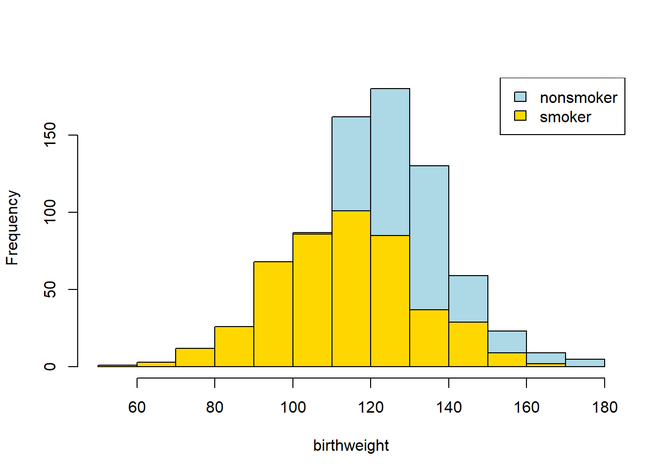
Looks like the blue (non smoker) mean is a little higher — it is as if the blue distribution is the gold distribution, but pulled up and shifted right. But we can confirm this by just looking at the means directly:
mean_frame <- aggregate(smoking_and_birthweight, list(smoking_and_birthweight$Maternal.Smoker), FUN=mean )
print( mean_frame )
## Group.1 Maternal.Smoker Birth.Weight
## 1 FALSE 0 123.0853
## 2 TRUE 1 113.8192In words: the smoker mean baby weight is 113 oz; the non-smoker mean is 123 oz. Let’s be more systematic:
- the null hypothesis is that, in the population, there is no difference (in means) between the groups. That is, we just drew unusual samples.
- the alternative hypothesis is that, in the population, there is a difference (in means). In fact, a directional hypothesis seems reasonable: smoker’s babies weigh less on average.
Our test statistic will be the difference between the two groups. Specifically:
\[ \mbox{mean weight of smoking group} - \mbox{mean weight of non-smoking group} \]
We will simulate that under the null of no difference. Our observed statistic is the actual difference for our samples, which is \(-9.27\) oz. In code:
2.5.2 Procedure
To reiterate, we observed an actual difference, and we want to know if a difference as large as this (or larger) is compatible with the null being true. Crudely: if it is possible, we fail to reject the null. If it isn’t possible, we reject the null.
We go about this in a way slightly different to previously, however. First, suppose that the null was true. This would mean there was no difference between the groups, which would mean the label “smoker” v “non-smoker” was completely uninformative about what baby weight we would expect a mother to have. That is, finding out whether someone was a smoker or non-smoker would not give us any more information as to whether their baby was likely to be heavier or lighter.
But if this is true, then we can just randomly assign labels to people, and then calculate the difference between the groups defined that “random” way. That will be equivalent to the difference we would expect under the null.
So, let’s find a way to give every observation a random label (smoker or non-smoker) many many times, and then see what differences in outcomes this would suggest as the null. Sometimes when we allocate random labels, the difference (smoking - non-smoking) will be positive; sometimes it will be negative; but on average it will be zero. The key thing is that we will now know the distribution of the difference if the null were true.
2.5.2.1 A Toy Example
Side note: a “toy” example is a very simple example that can be examined in detail such that the basic idea is readily understood. In our case, suppose we have three observations in our data: one smoker, two non-smokers. Their smoking status is \(X\), and their outcome (baby weight) is \(Y\):
| Y | X |
|---|---|
| 10.1 | smoker |
| 12.3 | non-smoker |
| 11.4 | non-smoker |
For this sample the difference in means is \(10.1 - 11.85 = -1.75\)oz.
Keep the \(Y\) column the same, and just randomly shuffle the labels, then calculate the difference, \(D\).
| Y | X |
|---|---|
| 10.1 | non-smoker |
| 12.3 | smoker |
| 11.4 | non-smoker |
\(D=1.55\).
Let’s shuffle them again:
| Y | X |
|---|---|
| 10.1 | non-smoker |
| 12.3 | non-smoker |
| 11.4 | smoker |
and \(D=0.2\).
Let’s shuffle one more time:
| Y | X |
|---|---|
| 10.1 | smoker |
| 12.3 | non-smoker |
| 11.4 | non-smoker |
and \(D=-1.75\).
We could gather all these values of \(D\) and plot them: this would be our distribution of the difference under the null.
2.5.3 Permutation Inference
The idea above is called permutation inference. It is
a way of re-sampling and rearranging our data, such that we can test statistical hypotheses.
For our current problem, we will shuffle or “permute” the labels and each time record the difference between smokers and non-smokers. We will do this in proportion to the frequency of the original labels in the data; so if, say, 39% of the subjects are smokers and 61% are non-smokers, we will randomly allocate 39% of the shuffled sample to be smokers, and 61% as non-smokers.
We will do this many, many times and then look at the histogram of the differences—this will represent our test statistic under the null. We will compare that null to our observed difference, and draw conclusions about statistical significance.
First, we will need a function that takes the difference in means between two groups:
  diff_by_group <- function(data=smoking_and_birthweight, outcome="Birth.Weight", group="Maternal.Smoker") {
  means <- tapply(data[, outcome ], data[, group], mean, na.rm = TRUE)
  diff(means)  # Returns the difference (smoker - non smoker)
}
Then, we need a function that keeps the birth weight column constant, but shuffles the smoker/non-smoker labels:
shuffler <- function(data=smoking_and_birthweight, to_shuffle="Birth.Weight"){
  our_frame2 <- data
  our_frame2[,to_shuffle] <- sample(data[,to_shuffle])
  our_frame2
}
Those functions are the building blocks. We now need a function that combines them: that is, that shuffles the labels, and then takes the difference in means between the groups it creates. Here it is:
one_sim_time <- function(our_frame= smoking_and_birthweight){
  shuff_frame <- shuffler(our_frame)
  dm <- diff_by_group(shuff_frame, outcome="Birth.Weight",group="Maternal.Smoker")
  dm
}
We will create an array to take the re-sampled means (called null_differences), and then run the shuffling function a large number (say, 4000) times:
null_differences <- c()
repetitions <- 4000
for( i in 1: repetitions){
    new_difference = one_sim_time(smoking_and_birthweight)
    null_differences = c(null_differences, new_difference)
}
Now, let’s plot the null distribution, null_differences and put the observed difference on that plot in red:
hist(null_differences, col="darkblue", xlim=c(-10, 4), breaks=25,
     xlab = "Diff btwn group means", ylab="n cases", main="")
points(observed_difference, 0, pch=16, col="red", cex=2)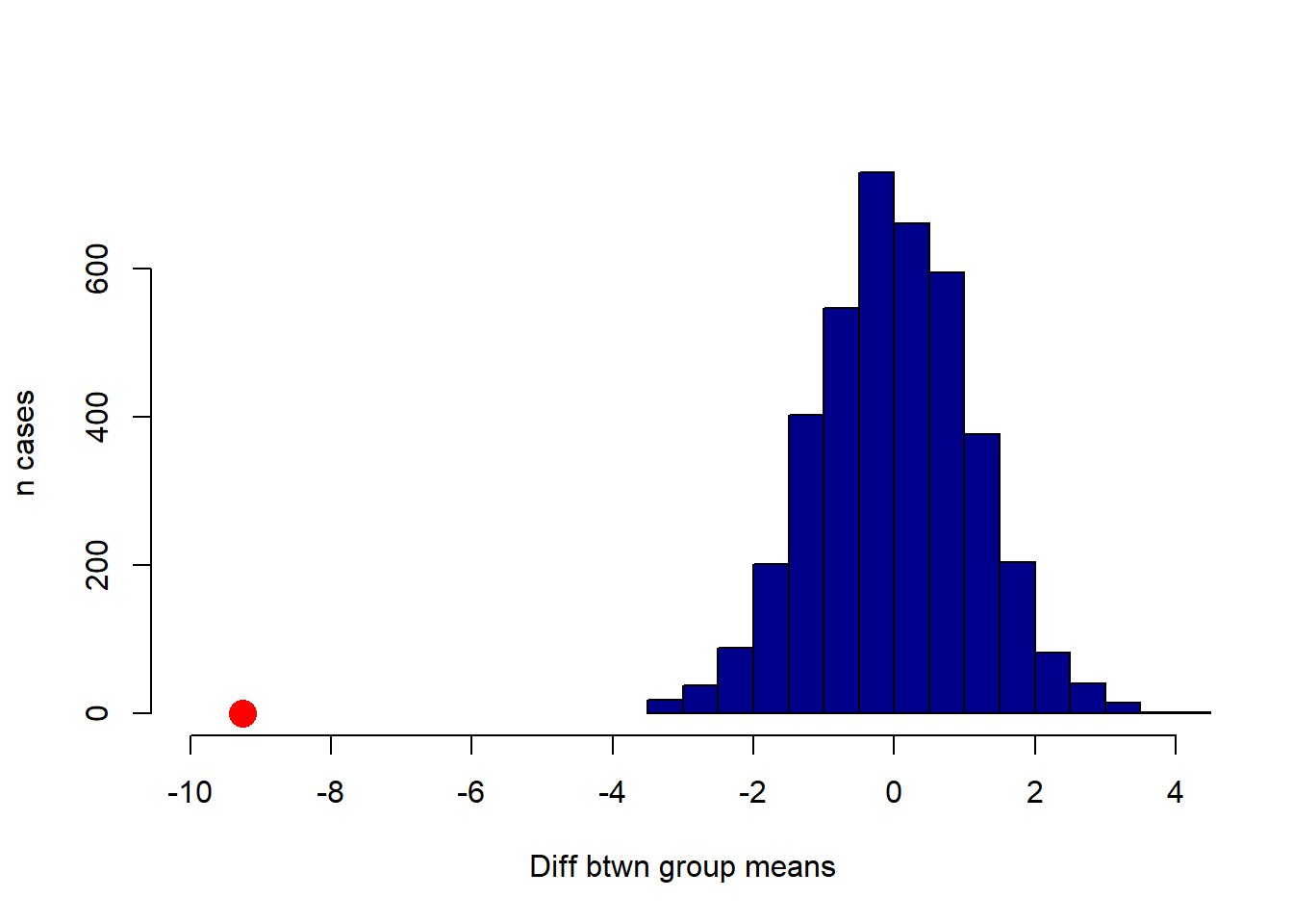
We will not do a formal test here, because it is apparent from the plot that the null distribution never overlaps with the observed difference. Another way to put this is that the p-value is essentially zero (as usual, it is not exactly zero—we just did not do enough simulations to ever get one that was lower). That is, the probability that we would see an observed difference like this, assuming that there is no real difference between smokers and non-smokers in the population, is extremely small.
2.5.3.1 Causal Claims?
Put differently, there is a statistically significant difference between smoker and non-smoker baby weights. Does this mean that we have shown that smoking causes baby weights to be lower? Not definitively, no: perhaps there is some confounder that causes both smoking and lower baby weights. But our evidence so far is consistent with a causal story.
2.6 Error probabilities
Above, we made the point that testing hypotheses is about binary decisions. We reject the null hypothesis, or we fail to reject the null hypothesis. Of course, we never know with certainty whether the null hypothesis holds in the population or not: the best we can do is use our sample, and some of the techniques we’ve learned, to try and make an inference about it. But even with large samples, we will not be “sure”.
This implies, that we could make an “error”—for example, deciding to reject the null when we should have, in fact, failed to reject it because it was true (which again, we cannot observe for sure). In fact, there are four possibilities:
| Null is true | Null is false | |
|---|---|---|
| Fail to reject null | correct inference | Type II error |
| Reject null | Type I error | correct inference |
This is an important table, so let’s run through what it means. First, the “easy” cells:
- top left: the null hypothesis is true, and we fail to reject the null. That’s correct: if there is, in fact, no relationship between these variables in the population we should not reject the null (of no relationship)
- bottom right: the null hypothesis is false, we reject the null. That’s correct: if in fact the null is false, then there is a relationship between these variables in the population, and we should reject the null hypothesis (and presumably claim we have evidence consistent with the alternative hypothesis).
Now the errors:
- top right: the null hypothesis is false, but we fail to reject it. This is saying that there is a real (in the population) relationship between the variables, but we concluded from our sample that there was not. This is called a type II error (said “type 2 error”, or “error of the second type”).
- top left: the null hypothesis is true, but we reject it. This is saying that there is, in fact, no relationship between the variables in the population but we looked at our sample and concluded that there was a relationship in the population. This is called a type I error (said “type 1 error”, or “error of the first type”).
The fact that type I errors are so named suggests that they are deemed very important or very concerning. And this is the right intuition; in general, we do not like situations in which we claim there a “real” relationship between variables, when in fact that relationship does not exist. One way to think about this is in terms of least harm: we might be very wary of saying that a drug works for a particular disease, when in fact it does not. But more broadly, worrying about type I errors is consistent with the ‘skeptical’ position that statistics tends to privilege. That is: the world is messy, knowledge is precious, and we are always concerned that we might be drawing overly optimistic conclusions about our (alternative) hypothesis. More crudely, data scientists generally prefer to claim “no evidence” of some treatment, rather than making big claims that turn out to be false.
How often will we make the errors in the table? Well, the type I error rate is \(\alpha\)—the cutoff for declaring “statistical significance” that we met above. Suppose, as is often the case, that it is set to 0.05. This means, out of 100 repetitions of an experiment, using our decision rules and the techniques they are attached to, we are prepared to make a type I error 5 times (on average). Or about \(\frac{1}{20}\) times. If we set \(\alpha\) to 0.01, we are saying we are prepared to make a type I error 1% of the time.
If making type I errors is “bad”, why not simply set \(\alpha\) to 0? Because at zero, we would never have evidence that any relationship holds: that is, the p-value can never be less than zero, so this is equivalent to never rejecting the null. A broader point here is that all statistical testing involves some implied balance between potentially making mistakes, and potentially never having a finding (other than the null). What, exactly, the correct balance should be is widely debated.
A final point here is that there are particular decisions that control our type II error rate (connected to something called the “power” of a test), but those are slightly beyond the scope of this course.
2.6.1 Replication and p-hacking
Above, we said:
out of 100 repetitions of an experiment, using our decision rules and the techniques they are attached to, we are prepared to make a type I error 5 times (on average). Or about \(\frac{1}{20}\) times
Suppose that a treatment has no “real” effect on an outcome—say, a drug does nothing for a particular disease. Suppose also that 100 different university teams or private labs are doing experiments on that drug. If they all impose an \(\alpha\) of 0.05, then five of those teams will find that the treatment has a statistically significant effect, just by chance. That is, they got an unusual sample of humans (or whatever), and it appears to them that the drug is genuinely efficacious. But, in fact, those five teams just made type I errors.
If all 100 teams are compelled to publish their results, then 95 of the teams will report null results (no effect), and 5 will report positive results. If we read all 100 studies, it should temper any hope we have that this drug works.
But now suppose there is a publication bias, that is
that studies which find no zero effects of treatments are much more likely to be published than those that find zero effects.
How could this happen? Well, perhaps researchers who find null effects think they aren’t interesting and put them in their “file drawer” to be forgotten, as they move on to try something else. Or perhaps researchers send their findings (including those who got null results) to scholarly journals, but those journals aren’t interested in publishing null results. This may be because editors or reviewers think such results aren’t particularly interesting: they don’t care about a drug that doesn’t work.
But the consequence of this pattern are very concerning: now, the only results that are published are type I errors (but no one who is publishing the results knows this). These are sometimes called “false positives” insofar as we think the drug does something (“positive”), but it doesn’t (so the positive is “false”).
Think about what this means for a researcher reading the journals: they only see accounts of the drug working—not the 95 times it did not. If they try to replicate the study with the drug—meaning they follow the same protocol, using the same drug, the same sample size of subjects etc—that replication will almost certainly result in a null. But this is because there is, to reiterate, no effect of the drug in reality.
One can imagine that if this practice of publication bias goes on at a large scale, we could have a replication crisis. That is, journals could be full of results that were all type I errors originally, and that simply do not hold up when other researchers attempt to repeat those experiments. And recent work looking at large numbers of studies, including “famous” ones, suggest considerable problems on this front. See, for example,
Camerer, Colin F., et al. “Evaluating the replicability of social science experiments in Nature and Science between 2010 and 2015.” Nature Human Behaviour 2.9 (2018): 637-644.
Notice that to get these concerning results, researchers need not do anything “wrong” or with bad intentions. They just need to be unlucky (or lucky) and part of a publication system that overly rewards non-null findings. Things can also go wrong, and perhaps be worse, when researchers play an active role in potentially misleading the field. One concern is p-hacking which occurs
when researchers collect, manipulate or test data until they have a statistically significant result
For example, a researcher might gather data and run a one-tailed test as above. Perhaps this doesn’t yield a statistically significant result, so they draw a new sample, or recode a sample slightly in line with another part of their theory about NYC districts. Now the result is statistically significant, so they write it up and submit it to a journal. One can easily imagine why this too would have bad consequences for the replicability of findings.